95% CI Lower Bound First: Reproducible A/B Analysis for Researchers

Confirm randomization held, guardrails show no meaningful degradation, and your p-value was interpreted against a pre-specified alpha. Then translate the lower confidence bound, not the headline number, into business impact. Monitor production for 2 to 4 weeks before calling the result final.
TL;DR:
- Confidence intervals, especially the lower bound, provide a more reliable measure of true effect, and should guide revenue projections.
- P-values indicate the probability of observing the data under the null hypothesis but do not measure effect size or treatment success probability.
- Rigorous validation checks, including sample ratio match and elimination of contamination, are essential before trusting experimental results.
- Sample size calculations depend on the business-defined minimum detectable effect and account for metric variance, especially with skewed revenue data.
- Pre-registering analysis plans and maintaining an audit trail ensures experiment credibility and reduces bias or data manipulation risks.
Table of Contents
- What Does A/B Test Analysis Actually Require?
- How Do You Validate an Experiment Before Trusting the Results?
- How Much Sample Size Do You Need to Detect a Real Effect?
- Do Multiple Variants and Repeated Peeking Inflate Your Error Rate?
- When Is Segmenting Your Results Valid, and When Is It Fishing?
- Which Guardrail Metrics Should You Check Before Shipping?
- What Statistical Traps Threaten the Validity of Your Results?
- What Belongs in a Final A/B Test Analysis Report?
- Research-Grade A/B Analysis: Building an Audit Trail
- What I’ve Learned From Watching Experimentation Programs Succeed and Fail
- How PlotStudio Supports Reproducible A/B Test Analysis
- Sources
What Does A/B Test Analysis Actually Require?
A/B test analysis is the process of turning raw conversion counts into a defensible claim about causal effect, and that claim only holds up if you did four things before you looked at the “winner” banner on your dashboard. You calculated the lift. You bounded it with a confidence interval. You validated that the randomization actually worked. And you checked whether the p-value means what you think it means.
Most teams get the arithmetic right and the inference wrong. They compute a 12% relative lift, see p = 0.03, and ship it. The problem isn’t the math. It’s what gets skipped: the confidence interval that would have shown the true effect could plausibly be 2% or 22%, and the guardrail metric that quietly dropped 4% in the same window.
Start with the point estimate. Both numbers matter and they tell different stories. Absolute lift is what you’d apply to your total traffic to estimate incremental conversions. Relative lift is what most stakeholders will quote in a meeting, and it’s the one most likely to mislead when baseline rates are small.
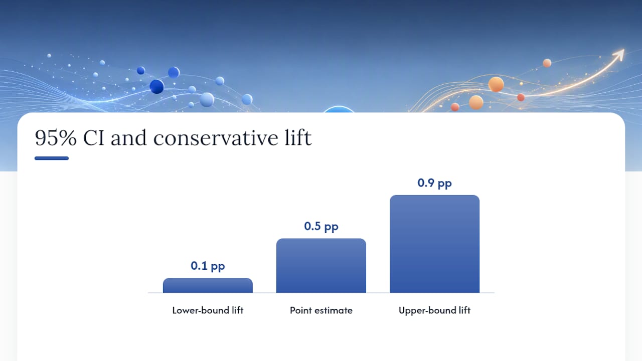
The confidence interval is where the real information lives. A 95% CI of [0.1%, 0.9%] on that 0.5-point lift tells you the true effect is very likely positive, but could be five times smaller than your point estimate suggests. This is why the confidence interval matters more than the single number your dashboard highlights in green. Treat the lower bound as your working number for any revenue projection. It’s the conservative estimate, and conservative estimates are the ones that survive scrutiny from a skeptical stakeholder or a peer reviewer.
Pro Tip: When a stakeholder asks “how much revenue will this generate,” answer with the lower bound of the CI multiplied by traffic volume, not the point estimate. If the lower-bound projection still justifies the engineering cost, you have a genuinely strong result. If it doesn’t, you’re relying on optimism, not evidence.
Now the part that trips up even experienced analysts: what a p-value is and isn’t. It is not the probability the treatment works. It is not the probability the null is false. And it says nothing about effect size on its own. A test with 500,000 users per arm can produce p = 0.001 on a lift so small it wouldn’t cover the cost of the engineering ticket that shipped it. Firebase’s own A/B testing documentation frames this correctly: p-values and CIs are reported together because neither is sufficient alone, and a result needs both statistical and practical significance before you act on it.
Practical significance is where you convert the abstraction into a decision. Take your lower-bound lift, apply it to monthly active users or transaction volume, and multiply by average order value or revenue per conversion. A 0.1 percentage point lift on 200,000 monthly conversions, each worth $45, works out to roughly $9,000 a month at the conservative bound. That’s the number that belongs in a launch memo, not the flashier point estimate.
CXL’s breakdown of the core statistics behind A/B testing lists eight elements that separate rigorous analysis from dashboard-reading: mean and variance, statistical significance, p-values, power, confidence intervals, regression to the mean, segmentation, and confounding variables. Skip any one of them and you’ve built your decision on an incomplete model.
- Report absolute lift, relative lift, and the point estimate together, never relative lift alone.
- Treat the 95% CI lower bound as your business-facing number, not the mean.
- State the p-value alongside your pre-specified alpha, not after the fact.
- Convert lift into projected revenue or downstream metric impact before presenting results.
The order matters here. Analysts who lead with “we’re statistically significant” invite the wrong question.
How Do You Validate an Experiment Before Trusting the Results?
Run diagnostics before you interpret anything. A test that looks clean on the surface can still be broken by a sample ratio mismatch, an instrumentation bug, or duplicate assignment across devices, and any of these can produce a “significant” result that has nothing to do with your treatment.
Sample ratio mismatch, or SRM, happens when the actual traffic split diverges from what you configured. It’s often bots, redirect bugs, or caching issues assigning users unevenly, and it can bias your metric in either direction.
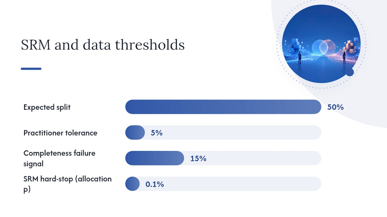
- Run a chi-square test on your allocation counts. For a two-arm test, this is equivalent to a simple proportion test against the expected 50/50 (or your configured) split. A p-value below 0.001 on the allocation itself, not the outcome metric, is a hard stop signal.
- Check instrumentation timing. Confirm that the metric event fires after treatment assignment, not before, and that both arms log events through the same pipeline version.
- Verify unit-of-analysis consistency. If users can appear on multiple devices or in multiple sessions, decide up front whether you’re randomizing and analyzing at the user, session, or device level, and make sure your data matches that decision.
- Deduplicate aggressively. A user who gets bucketed twice due to a login state change or a cache miss contaminates both arms.
- Check for completeness. Compare expected event volume against historical baselines; a 15% drop in logged events for one arm usually means a tracking failure, not a behavioral effect.
The tolerance for SRM checks should be tight. A chi-square p-value above 0.05 on the allocation test is the bar most practitioners use, but the guidance on segmentation and honest interpretation from Atticus Li is blunt about the consequence of failing it: if randomization didn’t hold, the experiment’s outcome metric can’t be trusted regardless of how clean the p-value looks. You don’t adjust for SRM after the fact. You stop, diagnose, and often rerun.
Pro Tip: Keep a standing SRM check as the first cell in every analysis notebook, before any outcome metric loads. Making it structurally impossible to skip is more reliable than remembering to run it.
Data completeness deserves the same scrutiny as allocation balance. Missing rows aren’t random by default. If your treatment introduced a slower page load, users on poor connections might drop out of your logging pipeline before the conversion event fires, which creates survivorship bias that looks exactly like a lift.
Unit-of-analysis mistakes are subtler and more common than most teams admit. If you randomize by user but accidentally analyze session-level conversion rates, you inflate your effective sample size and understate your true variance, which makes marginal effects look more significant than they are. Decide the unit before the test launches, not while writing the report.
When any of these checks fail, document the failure explicitly in your analysis report rather than silently rerunning until it passes. A test that failed SRM once and passed on a second pull deserves a note explaining why, not a quiet omission.
How Much Sample Size Do You Need to Detect a Real Effect?
Shrink any one lever and you have to grow another to compensate. Want to detect a smaller effect at the same confidence? You need more traffic. Want to run a shorter test? You need either a bigger effect or a higher tolerance for false negatives. There’s no way around this trade, only choices about which lever you’re willing to move.
The minimum detectable effect, or MDE, is the smallest lift your test is designed to catch reliably. Setting MDE isn’t a statistics problem first. It’s a business problem you then translate into statistics. If a lift smaller than 1 absolute percentage point wouldn’t justify the engineering cost of a permanent rollout, there’s no reason to design a test sensitive enough to detect a 0.2-point effect. You’d just be burning traffic and time to measure something you wouldn’t act on anyway.
For a binary metric like conversion rate, the standard approach uses a two-proportion z-test. The sample size calculation for proportions follows this logic: given your baseline rate, your MDE, your desired alpha (typically 0.05), and your desired power (typically 80%), you solve for the n per arm needed.
For a continuous metric, like average order value or session duration, a Welch’s t-test is usually the right tool rather than a standard t-test, because it doesn’t assume equal variance between arms. This matters more than analysts often realize: e-commerce revenue metrics are notoriously right-skewed, with a small number of large orders driving most of the variance, and assuming equal variance when it doesn’t hold will bias your standard errors.
- Effect size, sample size, alpha, and power are interdependent; fixing three determines the fourth.
- Business-relevant MDE comes first; statistical sample size calculation comes second, translating that MDE into a required n.
- A test that returns non-significant results at low power hasn’t proven “no effect.” It has failed to rule one out.
- Post-hoc, calculate how much additional sample would be needed to detect the observed effect size reliably, rather than treating the inconclusive result as a null result.
It tells you your test wasn’t sensitive enough to distinguish a real, moderate effect from noise. The correct move is a post-hoc power calculation: given the observed effect size and variance, how much sample would you have needed for adequate power?
Do Multiple Variants and Repeated Peeking Inflate Your Error Rate?
Yes, and the inflation is larger than most analysts expect.
The simplest fix is Bonferroni correction: divide your alpha by the number of comparisons. For four variants against control, your adjusted threshold becomes α′ = 0.05 ÷ 4 = 0.0125. Any comparison needs to clear that bar, not the original 0.05, to count as significant. Bonferroni is easy to explain to stakeholders and hard to argue against, which is exactly why it’s the default choice for most teams.
It’s also conservative to the point of costing you real detections. Bonferroni assumes independence between comparisons and treats every test as equally important, which sacrifices power you often can’t afford to lose, especially in a test already running near its minimum sample size.
Group-sequential methods, particularly the O’Brien-Fleming boundary approach, solve a related but distinct problem: repeated interim looks at accumulating data. O’Brien-Fleming boundaries set a stricter significance threshold for early looks and relax it as you approach your planned sample size, which lets you monitor a test in progress without inflating your error rate. This is alpha spending: you have a fixed error budget, and the method tells you how much of it you’re allowed to spend at each interim check.
| Method | Best for | Trade-off |
|---|---|---|
| Bonferroni correction | Testing several independent variants at one endpoint | Simple, but conservative; loses power fast as comparisons grow |
| O’Brien-Fleming (group-sequential) | Planned interim looks during a single test | Preserves power near the final look; requires the schedule fixed in advance |
| No correction | Never appropriate for multiple variants or unplanned peeking | Inflates Type I error, sometimes severely |
The operational rule that avoids most of this trouble: write your comparisons and your stopping plan into the analysis plan before the test launches. Decide how many variants you’re testing, how many interim looks you’ll take and when, and which correction method governs each. A multiple testing correction decided in advance is a methodology choice. The same decision made after seeing the data is p-hacking with better math.
When Is Segmenting Your Results Valid, and When Is It Fishing?
Pre-planned segments and exploratory segments require completely different statistical treatment, and conflating them is one of the most common ways rigorous-looking analyses go wrong.
A pre-planned segment, defined in your analysis plan before the test launched, is a legitimate part of your inference. If you specified in advance that you’d analyze mobile and desktop users separately because you had a prior reason to expect different behavior, that segment’s result is a confirmatory finding you can act on with appropriate power adjustments.
Exploratory segmentation, done after you’ve seen the topline result and started slicing by browser, geography, day of week, and account age until something turns green, is hypothesis generation, not confirmation. Nothing wrong with generating hypotheses this way. Everything wrong with reporting that finding as if it carries the same evidentiary weight as your primary result.
- Decide segments before the test runs and write them into the analysis plan alongside your primary metric and stopping rule.
- Apply a multiplicity correction (Bonferroni or a false discovery rate method) to any pre-planned segment analysis, since you’re running multiple tests even when they’re all specified in advance.
- Set a minimum sample threshold per segment before trusting its result. A segment with fewer than a few thousand users per arm rarely has the power to detect anything but a very large effect.
- Treat any post-hoc segment finding as a candidate for a dedicated follow-up test, not as evidence to act on directly.
- Use an interaction term in a regression model rather than running separate tests per segment, whenever you’re formally testing whether the treatment effect differs by segment.
Pro Tip: If you find yourself checking “did it work for mobile users” after the overall result came back flat, write down that you’re doing exploratory analysis in the report itself. That single sentence protects you from later treating a lucky slice as validated evidence.
The statistically cleaner approach to heterogeneity is a regression with an interaction term between treatment assignment and the segment variable, rather than running four separate two-sample tests. This directly estimates whether the treatment effect differs across segments, with a formal p-value for that difference, instead of comparing two significance results informally. For more complex segment structures, hierarchical or mixed-effects models let you borrow statistical strength across segments, producing more stable subgroup estimates than treating each segment as fully independent, particularly when some segments have thin sample sizes.
Which Guardrail Metrics Should You Check Before Shipping?
Guardrails exist to catch the ways a winning primary metric can mask a losing product. It’s a trade you need to see and decide on explicitly, not one your dashboard will surface on its own.
The common guardrails worth predefining:
- Downstream funnel metrics. A lift in add-to-cart that doesn’t translate to a lift in completed purchase suggests the change moved intent without moving revenue.
- Page speed and technical performance. Slower load times erode conversion over the following weeks even when the immediate test window looks fine.
- Error rates and exceptions. A spike in client-side errors in the treatment arm often signals a bug, not a behavior change.
- Support ticket or complaint volume. Confused users convert less over time even if the initial test window doesn’t show it.
- Revenue per user, not just conversion rate. A change that increases conversions but shifts customers toward lower-value options can lift one metric while hurting the business.
Set acceptable degradation thresholds before the test launches, in absolute terms tied to the metric’s own scale. “Page load time can’t degrade by more than 200 milliseconds” is a decision rule. “Page load time shouldn’t get much worse” is not.
When a guardrail conflicts with your primary metric, the decision isn’t automatic and shouldn’t be treated as one. Document the trade-off explicitly in your report, along with the reasoning for the call, so a reviewer or a future team can see the decision wasn’t accidental. What belongs in that report: the primary lift, every guardrail’s observed change against its predefined threshold, and a plain sentence explaining which way the decision went and why.
What Statistical Traps Threaten the Validity of Your Results?
Four problems account for most of the bad calls that survive a surface-level review: nonstationarity, regression to the mean, contamination, and confounding.
Nonstationarity shows up when your test period doesn’t represent typical behavior. Running a pricing test for four days that happen to include a weekend and a promotional email blast conflates your treatment effect with calendar effects you never controlled for. The fix is straightforward in principle and frequently skipped in practice: test for full weeks, and where feasible, run at least two full business cycles to average out day-of-week and week-of-month variation.
Regression to the mean exaggerates effects when you stop early. If you check results on day three and your treatment happens to be running hot due to normal variance, stopping there locks in an inflated estimate that would have moderated toward the true effect with more data. This is a distinct problem from peeking-driven Type I error inflation. Even with a correctly adjusted significance threshold, an early stop still captures a point estimate more likely to be an extreme draw than a representative one.
Contamination happens when treatment and control aren’t as isolated as your randomization assumed. A user who clears cookies and gets rebucketed, or a household sharing a device across both arms, blurs the line between groups and dilutes your measured effect toward zero. Cluster-level randomization, assigning by account or household rather than by session, reduces this risk for any product with shared devices or logged-out browsing.
Confounders enter when something other than your treatment differs systematically between arms. A marketing campaign that happens to launch mid-test and disproportionately drives traffic into one arm’s landing page will bias your result in a way no amount of post-hoc adjustment can cleanly fix.
- Test full weeks or multiple cycles to average out calendar-driven variance.
- Avoid declaring a winner on an early, hot-looking result; let the test run its planned duration.
- Use cluster-robust standard errors or mixed-effects models when assignment isn’t strictly independent per observation.
- Consider a bootstrap approach for skewed continuous metrics like revenue, where normal-theory confidence intervals can misstate uncertainty.
Pro Tip: If your metric is revenue per user and your data is heavily right-skewed by a handful of large orders, don’t trust a standard t-test’s confidence interval at face value. A nonparametric or bootstrap approach usually gives a more honest picture of uncertainty when the underlying distribution is far from normal.
What Belongs in a Final A/B Test Analysis Report?
A report that survives peer review or a skeptical stakeholder review contains the same core elements every time, in roughly this order:
- The hypothesis and the pre-registered analysis plan, stating the primary metric, alpha, MDE, and planned segments before results are shown.
- Sample sizes achieved per arm, and confirmation that the SRM check passed.
- The point estimate, absolute and relative lift, and the 95% confidence interval.
- The p-value, stated alongside the pre-specified alpha it’s being compared against.
- Guardrail metric results against their predefined thresholds.
- Pre-planned segment results, clearly separated from any exploratory findings.
- The decision made and the reasoning behind it, including any trade-offs accepted.
- Follow-up actions: a planned confirmatory test, a monitoring window, or a note that the effect needs a larger sample to confirm.
Translate the result into business terms using the lower CI bound, not the point estimate, and show the sensitivity.
- Archive the annotated analysis notebook alongside the report, not just the final numbers.
- Save the raw data snapshot used for the calculation, since production data changes and you need the exact frame the analysis ran on.
- Record the specific test statistic and CI calculations, including the software and method used, so the analysis can be rerun and checked.
Once the feature ships, the analysis isn’t finished. A 2 to 4 week post-implementation monitoring window checks whether the production lift matches what the test predicted. Divergence here usually signals one of two things: a novelty effect that fades as users adjust, or an implementation difference between the test build and the shipped version. Either way, it’s a finding worth recording and feeding back into how much you trust future test results from that team or that metric.
Research-Grade A/B Analysis: Building an Audit Trail
The gap between a defensible A/B analysis and a dashboard screenshot is almost entirely about what happens before and after the p-value gets computed. A pre-registered plan turns your analysis into something a reviewer can check against what you actually did, rather than trusting that you didn’t quietly change your primary metric after seeing a promising secondary one.
That plan should state, in writing, before any code runs: the primary metric and how it’s calculated, the alpha and power targets, the MDE, the planned segments, the guardrails and their thresholds, and the stopping rule. This is functionally a preregistration, the same discipline clinical trials have used for decades to prevent outcome switching, applied to a product experiment.
Every step from there needs to produce something a collaborator, supervisor, or peer reviewer can independently trace: an annotated notebook showing the data cleaning and test-statistic computation, the confidence interval formula actually applied, and the exact data snapshot the numbers were run against. Without that artifact trail, “we ran a chi-square test for SRM and it passed” is a claim. With it, it’s a checkable fact.
For any dataset governed by an institutional review board, patient-privacy rules, or GDPR special-category restrictions, that traceability has to coexist with the data never leaving a controlled environment. Analysis that runs locally on the researcher’s own machine, rather than through a cloud upload, is often the only workable path for that kind of data, and it removes an entire category of compliance risk from the reproducibility problem.
- An analysis plan reviewed before code runs functions as both a pre-registration and an audit trail.
- Annotated notebooks and exported reports let a reviewer trace every step from raw data to conclusion.
- Local execution keeps sensitive data inside the researcher’s own environment throughout the analysis.
- Skills-style methodology templates let a lab encode its own required checks, so every subsequent analysis follows the same discipline rather than a generic default.
This is the standard the effect size interpretation and reporting practices described throughout this guide are built to support: not a faster green light, but a result someone else could rerun and get the same answer from.
What I’ve Learned From Watching Experimentation Programs Succeed and Fail
The single biggest predictor of a trustworthy experimentation program isn’t statistical sophistication. It’s whether the analysis plan got written down before anyone saw the data. Teams that pre-specify their primary metric and stopping rule catch their own mistakes. Teams that decide what mattered after looking at the dashboard almost always find a story that confirms what they already wanted to ship.
Report conservatively. Use the lower confidence bound for every revenue projection you hand to a stakeholder, every time, without exception, even when the point estimate looks better. It’s the number that survives contact with reality.
Track your predicted lift against the realized lift after rollout. Most programs never close this loop, and it’s the single best calibration tool available: if your tests consistently overpredict production impact, you have a systematic bias worth diagnosing, not just bad luck.
Before declaring any winner, run through six checks: SRM passed, guardrails held, CI reported alongside the point estimate, segments were pre-planned or clearly labeled exploratory, the test ran full business cycles, and the decision rationale is written down. Skip one, and you’re not doing analysis. You’re doing narration.
— Aymen
How PlotStudio Supports Reproducible A/B Test Analysis
Every recommendation in this guide, the pre-registered plan, the SRM check, the conservative CI translation, the annotated audit trail, is easier to follow with a tool built around the same discipline. PlotStudio runs your analysis through a plan you review and approve before any code executes, stating the metrics, thresholds, and stopping rules up front, so the audit trail exists by default rather than as an afterthought you write up later.
It runs natively in R and Python, covers mixed-effects models and regression methods suitable for segment analysis, and exports reproducibility packages, annotated notebooks, PDF reports, and searchable analysis pages for traceability of lift and confidence interval computations. Because the analysis runs locally on your own machine, IRB-governed or GDPR special-category data never has to leave your environment to get a rigorous statistical workup.
If you’re running experimentation analysis under real institutional scrutiny, start by reviewing how PlotStudio compares to other AI tools for data analysis, or see how it works as a purpose-built alternative for advanced data analysis on your next test.
Sources
- The Art & Science of A/B Testing (Wharton AI & Analytics Initiative)
- A/B Testing Statistics: An Easy-to-Understand Guide | CXL
- Firebase A/B Testing concepts and inference
- A/B Experiment Analysis | Growth Opt Playbook
- How to Analyze A/B Test Results: Segmentation and Honest Interpretation | Atticus Li