5 Steps to Make AI Generated Charts IRB Ready and Privacy First

AI-generated charts are acceptable for reproducible research when the analysis runs locally on the researcher’s own machine, follows a preregistered analysis plan, and ships with a complete audit trail and captured software environment. Meeting that bar takes five steps: preregister the plan, run the analysis locally, log every decision as it happens, freeze the software environment, and package the whole thing for durable deposit. Skip any one of the five and the chart is decoration, not evidence.
TL;DR:
- Producing research-grade AI-generated charts requires a fully documented, preregistered, and locally executed analysis pipeline with an auditable record of decisions and environment.
- IRB and GDPR constraints prevent raw data from leaving secure devices, making local execution or synthetic data with clear audit trails essential for regulated datasets.
- An audit trail must include clear reasons for data exclusions, code versioning, environment details, and timestamped decisions, often generated automatically by workflow managers.
- Reproducibility depends on defining the pipeline in a machine-readable format, locking the software environment, and depositing code with persistent identifiers in durable archives.
- A comprehensive reproducibility package should contain code, data or its synthetic equivalent, a readme, environment specs, a variable codebook, and figures, verified by small-run checks beforehand.
Table of Contents
- What Makes an AI-Generated Chart Research-Grade?
- How Do You Produce Charts From Regulated Data Without Exposing It?
- What Belongs in a Chart’s Audit Trail?
- How Do You Make an R or Python Chart Pipeline Reproducible?
- What Belongs in a Reproducibility Package for a Manuscript?
- What Should a Pre-Analysis Plan Include Before You Generate Any Chart?
- Why Preregistration and Audit Trails Matter More Than the Chart Itself
- PlotStudio: Built for Research-Grade, Privacy-First Charts
- Where to Verify These Reproducibility Practices Yourself
- Sources
What Makes an AI-Generated Chart Research-Grade?
A research-grade AI-generated chart is one produced by a process a reviewer or IRB can fully reconstruct: local execution, a preregistered plan approved before code ran, a reproducible pipeline, and an auditable record of every transformation applied to the data. That is a materially narrower definition than “AI turned my spreadsheet into a chart.” It excludes any workflow where a cloud service ingests raw data with no pre-approval gate and no retained provenance.
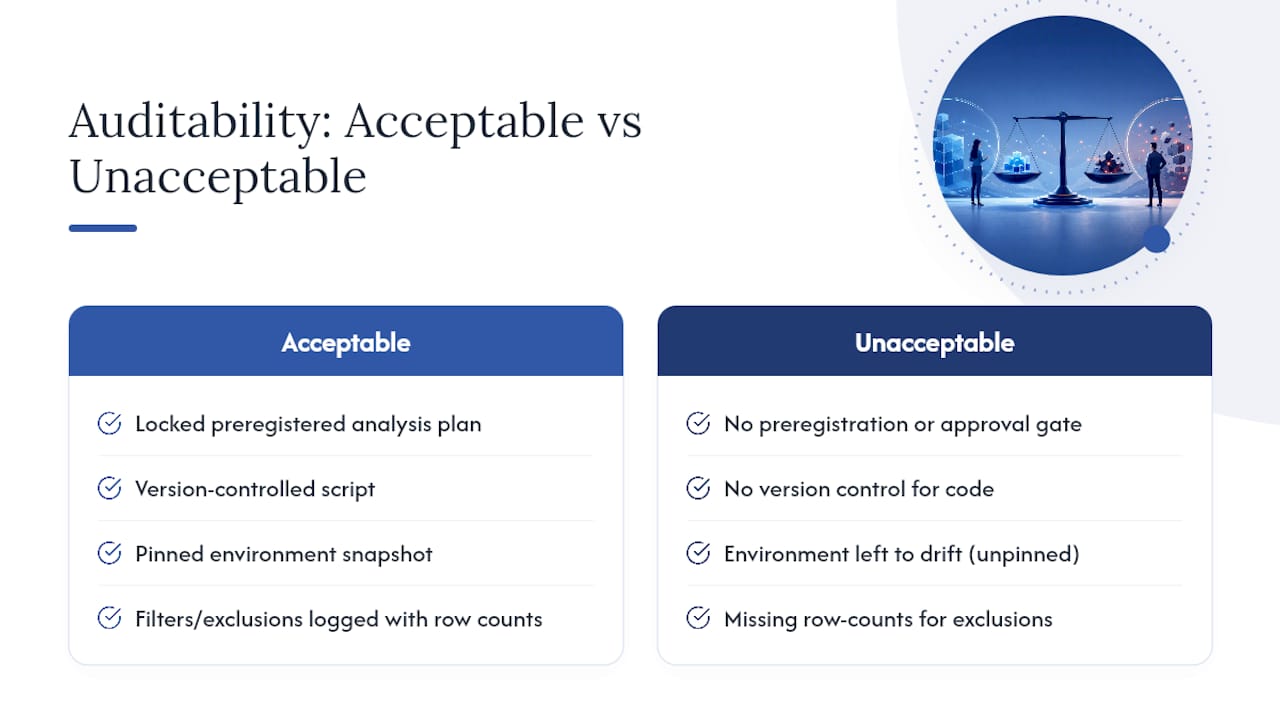
Reviewers and IRBs typically check three things: whether the analysis plan predates the results, whether filters and exclusions are logged with row counts, and whether the software environment is pinned rather than left to drift. Acceptable practice looks like a locked analysis plan, a version-controlled script, and an environment snapshot. Unacceptable practice looks like a chart with no record of which rows got dropped or why a particular statistical test was chosen after the fact.
How Do You Produce Charts From Regulated Data Without Exposing It?
Local execution matters because IRB-governed, GDPR special-category, and NHS datasets generally cannot leave the device that holds them, regardless of how well a cloud vendor encrypts data in transit. A chart pipeline that never uploads raw records to a third-party server sidesteps that constraint entirely rather than trying to manage it after the fact.
Synthetic data and differential privacy fill a narrower role. They are appropriate when you need to share a chart-generating pipeline publicly without exposing the underlying records, but both carry a real utility cost: synthetic datasets can distort tail distributions, and differential privacy noise can obscure small subgroup effects that matter in clinical or social-science work. Use them for public demonstration code, not as a substitute for validating results against the real dataset locally.
Your ethics and consent documentation should state plainly that data was processed on local infrastructure, name any anonymization or synthetic-data step applied before sharing, and point reviewers to where the full audit trail is archived.
- Confirm the consent language covers the specific analysis, not just data collection.
- Note whether any derived or synthetic dataset was shared externally and how it was generated.
- Reference the audit trail’s storage location rather than reproducing it in the consent section.
Pro Tip: Keep a one-line data flow diagram in your lab notebook showing where the data sat at each step. It takes five minutes and answers the IRB’s first question before they ask it.
What Belongs in a Chart’s Audit Trail?
An audit trail should capture the “why” behind a decision as much as the “what,” since that context is what saves a reviewer from reverse-engineering your logic months later. A minimal but sufficient trail includes:
- Row counts before and after every filter, with a one-line rationale for each exclusion.
- Timestamped decisions on test choice, model specification, or threshold changes.
- Code commit IDs or version hashes tied to the exact script that produced each figure.
- Random seeds used for any stochastic step, including AI-agent sampling.
- Environment metadata, including package versions and language runtime.
Workflow managers and electronic lab notebooks generate most of this automatically as a side effect of running the pipeline, which beats manual logging by a wide margin. A unified system that collates logs from multiple tools into one audit trail makes it possible to trace a result end-to-end even when the analysis touched several different platforms along the way. RO-Crate exports serve a similar function for packaging provenance metadata into a portable bundle.
Your methods section does not need the full trail. One paragraph describing the audit process plus a short summary table, similar to how qualitative researchers summarize audit trails rather than publishing them in full, is enough for a reviewer to trust the process while the complete log sits in a secure archive.
| Audit-trail element | Where it lives in the paper | Where the full record lives |
|---|---|---|
| Filter counts | Summary table, methods section | Analysis log/archive |
| Decision rationale | One-sentence note per test choice | Lab notebook or ELN |
| Code version | Commit hash cited in methods | Version control repository |
| Environment snapshot | Stated briefly (“R, renv lockfile”) | Archived container/lockfile |
Reviewers flag unexplained sample shrinkage faster than almost anything else.*
How Do You Make an R or Python Chart Pipeline Reproducible?
Reproducibility depends on three preserved layers working together: a machine-readable workflow, a captured software environment, and a durable identity for the code itself, and an excellent example appears in tick data backtesting for quant traders illustrating reproducible workflows; none of the three substitutes for the others.
- Define the pipeline in a workflow manager like Snakemake, Nextflow, or CWL so every step is machine-readable rather than described in prose.
- Pin the environment with a container digest, an
renvorcondalockfile, and the output ofsessionInfo()saved alongside the code. - Deposit the finished code in a durable archive: a Zenodo DOI for citation and a Software Heritage SWHID for hash-based long-term preservation, since the two complement rather than duplicate each other.
- Include a
CITATION.cfffile so the deposit is machine-citable by other tools and reference managers. - Save intermediate outputs at each pipeline stage and provide a small-run example so a reviewer can verify correctness without rerunning a computationally expensive full analysis.
A few practical notes make this easier in practice:
- Workflow managers and lab notebooks generate provenance logs automatically, which is more reliable than reconstructing them by hand after submission.
- A small-run example, the same code with fewer replications, is a pragmatic way to let a reviewer confirm the pipeline behaves correctly in minutes rather than hours.
- Researchers moving off scattered notebook files sometimes consolidate this into an integrated platform. Reviewing Jupyter notebook alternatives built for reproducibility is worth a look before you standardize a lab-wide workflow.
What Belongs in a Reproducibility Package for a Manuscript?
A minimal reproducibility supplement contains the code, the data (or a documented synthetic equivalent), a README stating execution order, an environment specification, a codebook defining every variable, and a folder of the figures themselves. Skipping any one of these is the single most common reason a reproducibility check fails after publication.
RO-Crate packaging bundles all of this with machine-readable provenance metadata, and pairing it with a durable archive lets reviewers and future readers verify where the data came from and what happened to it without taking your word for it. Journal reproducibility checks increasingly expect exactly this structure rather than a loose folder of scripts.
- State the runtime and hardware used for the original run, especially for anything computationally intensive.
- Provide a documented data flow, including any transformation between chart records and preserved originals, as covered in guides on AI-assisted data visualization.
- Run a spot-check on a subset of the pipeline before submission rather than assuming the full run still works.
Reproducibility is better understood as a spectrum of verifiable repeatability than a strict pass or fail, which is exactly why a documented small-run reproducibility check carries real weight with reviewers even when a full rerun isn’t practical before a deadline.
What Should a Pre-Analysis Plan Include Before You Generate Any Chart?
A pre-analysis plan gates chart generation the same way a clinical trial protocol gates data collection: nothing runs until the plan is locked. A consensus checklist for reproducible research recommends covering planning, methods, analysis, and dissemination before a single line of code executes.
- State the objective and the specific visualization goal, not just the general research question.
- List hypotheses and the success criteria that will count as confirming or disconfirming them.
- Define exclusion rules and the statistical tests you will use, in advance, not after seeing the data.
- Fix the random seed and note where stochastic AI-agent steps occur.
- Name any planned sensitivity analyses so reviewers know they were anticipated, not improvised.
Once the plan is approved, record row counts, filter rationale, code commit IDs, and environment capture in real time rather than reconstructing them from memory later.
- Run the small-scale spot-check before submission, not after a reviewer asks for it.
- Confirm the environment lockfile still resolves cleanly on a fresh machine.
Pro Tip: Timestamp your pre-analysis plan the moment it’s approved, even if that’s just an email to your supervisor. That single timestamp is often the strongest evidence you have that the plan predates the results.
Why Preregistration and Audit Trails Matter More Than the Chart Itself
Most disputes over AI-generated results are not disputes about statistics. They are disputes about sequence: did the exclusion rule come before or after someone saw the outcome. A preregistered plan and a real-time audit trail settle that question without argument, which is why regulated-data studies increasingly require both regardless of which chart tool produced the figure.
The honest constraint is compute and time. Full workflow-manager provisioning and container builds are overkill for a quick exploratory pass, and a small reproducibility spot-check or a synthetic-data dry run is often the more sensible middle step before committing to a full pipeline.,.
— Aymen
PlotStudio: Built for Research-Grade, Privacy-First Charts
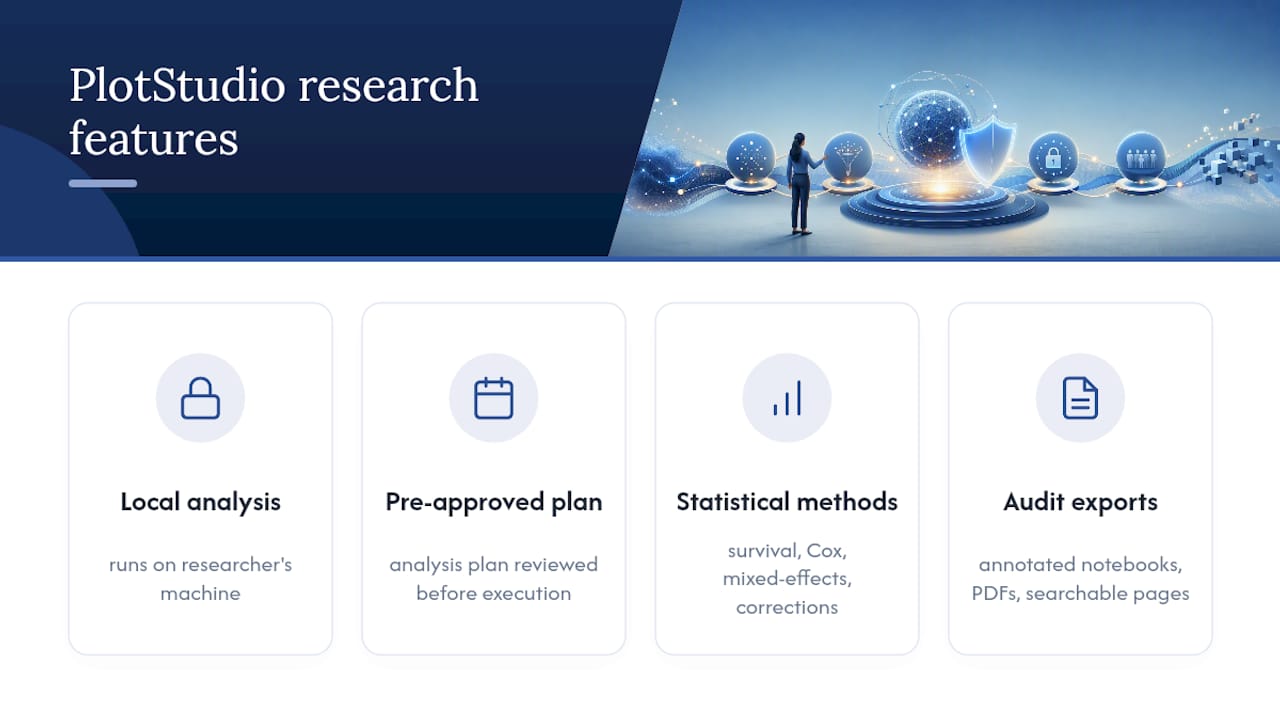
Every checklist item above maps to functionality that some research-grade analytics platforms include by design. Analysis often runs locally on a researcher’s own machine to ensure IRB-governed and GDPR special-category data does not leave the device. Charts are typically generated following an analysis plan reviewed and approved before code execution, serving as preregistration and audit trail.
Some platforms run R and Python natively and support analytical methods like survival analysis, Cox proportional hazards, mixed-effects models, and multiple-comparison correction. They often export annotated notebooks, PDF reports, and searchable analysis pages to simplify audit trail reconstruction. Labs may encode discipline-specific conventions and requirements to ensure consistent analysis methodology in subsequent work.
If your next paper or thesis figure needs to survive a reviewer’s provenance questions, read how AI agents actually perform data analysis under the hood, then start a trial to see the analysis-plan gate in action on your own dataset.
Where to Verify These Reproducibility Practices Yourself
For readers who want to check these recommendations against primary sources rather than take them on faith: the CASRAI reproducibility infrastructure guide covers workflow files, container pinning, and durable code deposits in detail. The TRAIL project from TACC and NSF documents how collated audit logs enable end-to-end provenance tracing across multi-tool research computing. The OSIRIS consensus checklist in PLOS Biology lists the core reporting items reviewers expect across planning, analysis, and dissemination. And the CASRAI data provenance guide explains why documenting where data came from remains the foundation reviewers check first.
Sources
- TRAIL: Audit Trails for Enhanced Reproducibility and Observability of Research Computing (TACC / NSF)
- Minimum reporting items for reproducible research (OSIRIS consensus, PLOS Biology)