Audit Ready Local Anomaly Detection for Business Data Teams

Anomaly detection in business data is the practice of flagging records, metrics, or event sequences that deviate from an expected pattern, using statistical or machine learning models instead of static rules. The payoff is speed: teams catch revenue drops, fraud spikes, or broken pipelines while there is still time to act, rather than discovering them in a quarterly review. It applies to tabular KPIs, transaction logs, and streaming telemetry alike, and it exists specifically to protect decisions from bad or misleading data.
TL;DR:
- Anomaly detection is most effective for fraud, outages, and KPI shifts when alerts are owned, actionable, and reviewed within a defined window.
- Different anomaly types—point, contextual, collective, and process—necessitate tailored detection methods based on data and context.
- Forecasting models outperform static thresholds for KPIs by accounting for seasonality and relationships between metrics, especially in streaming data.
- Data-quality checks, such as schema validation and null filtering, are critical before applying anomaly detection to prevent false positives from pipeline issues.
- Using local, audit-friendly tools like PlotStudio ensures privacy compliance, reproducibility, and better governance of anomaly detection workflows.
Table of Contents
- When to Use Anomaly Detection Instead of Fixed Thresholds
- Types of Anomalies You’ll Encounter in Business Data
- Methods and Algorithms: Matching the Tool to the Data
- Time-Series and KPI Detection: Forecasting Beats Thresholds
- What Data-Quality Checks Come Before Anomaly Scoring?
- What Metrics Actually Measure Detector Performance?
- Building the Operational Workflow: From Baseline to Disposition
- Common Pitfalls That Undermine Anomaly Detection Programs
- Business Use Cases Worth Studying
- How PlotStudio Supports Defensible Detection Work
- Three Priorities I’d Fight for on Any Detection Project
- Run Your Detection Work Somewhere You Can Defend It Later
- Sources
- FAQ
When to Use Anomaly Detection Instead of Fixed Thresholds
A fixed threshold tells you when revenue drops below $50,000. Anomaly detection tells you when revenue drops in a way that is statistically unusual given the day of week, the season, and last month’s trend, even if the raw number still looks fine. That distinction is the whole reason the field exists: thresholds break the moment your business has seasonality, growth, or multiple segments, and most real business metrics have all three.
This matters most in a handful of recurring scenarios: fraud teams watching for transaction pattern shifts, infrastructure teams tracking outages before customers notice, finance teams reconciling invoice anomalies, and product teams catching KPI shifts that a dashboard would just render as a slightly different-colored bar.
Not every metric deserves a detector. Before building one, run the metric through a short checklist:
- Owner — someone specific is accountable for investigating alerts on this metric, not “the team.”
- Action — a deviation actually changes what someone does that day.
- Review window — someone can realistically triage the alert within a defined time, not whenever they get to it.
If a metric fails any of the three, you’ll build a detector that generates noise nobody acts on, which is worse than not building one at all.
Types of Anomalies You’ll Encounter in Business Data
Business data produces four recognizable patterns of anomaly, and knowing which one you’re looking at determines which method actually works.
- Point anomalies are single values far outside the normal range, like one transaction for $80,000 in an account that usually moves $200.
- Contextual anomalies look normal in isolation but wrong given the surrounding context, like a 40% traffic spike that’s fine on Black Friday and alarming on a random Tuesday. A retail study found that comparing a store against its own history and against peer stores in the same time window produced notably higher precision and recall than treating raw values as extreme or not.
- Collective anomalies are groups of points that are unremarkable individually but suspicious together, like a cluster of small transactions that add up to a structuring pattern.
- Process or control-flow anomalies show up in event logs, not numbers: an approval step skipped, or steps executed out of order.
Time-series data tends to surface point and contextual anomalies. Event logs surface collective and process anomalies. And critically, not every flagged anomaly is a business event. Plenty are data-quality defects wearing a business event’s clothes, which is why validation has to happen before scoring, not after.
Methods and Algorithms: Matching the Tool to the Data
There is no single best algorithm for anomaly detection in business data. The right choice depends on whether you have labels, how much latency you can tolerate, and whether anyone downstream needs to understand why something got flagged.
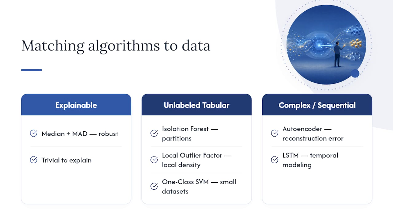
For low-complexity, highly explainable detection, start with robust statistics, specifically the median and median absolute deviation (MAD). Unlike mean and standard deviation, median and MAD aren’t dragged around by the outliers you’re trying to detect, and the output is trivial to explain to a non-technical stakeholder: “this value is six MADs from the median.”
For unlabeled tabular data with no obvious linear structure, Isolation Forest and Local Outlier Factor (LOF) are the workhorses. Isolation Forest isolates anomalies by recursively partitioning data. Points that isolate in fewer splits get flagged as anomalous, and scikit-learn’s documentation covers the path-length scoring and the contamination and offset parameters that control sensitivity. LOF instead compares a point’s local density to its neighbors, which makes it stronger than Isolation Forest at catching anomalies that only look wrong relative to a nearby cluster, not the whole dataset.
One-Class SVM models the boundary of “normal” and flags anything outside it, but it scales poorly on large datasets and tends to degrade in very high-dimensional feature spaces, which limits it to smaller, well-curated tabular problems.
For genuinely complex, sequential, or high-dimensional data, autoencoders and LSTM-based sequence models earn their added complexity. Autoencoders learn to reconstruct normal data and flag high reconstruction error; LSTMs model temporal dependencies directly, which matters for KPIs where yesterday’s value predicts today’s expected range.
On tooling: scikit-learn is the right environment for experimentation and model comparison across Isolation Forest, LOF, and One-Class SVM. For production streaming, native or managed database functions (covered in the next section) usually beat a custom model pipeline on operational simplicity.
Time-Series and KPI Detection: Forecasting Beats Thresholds
Forecast-based detection outperforms fixed thresholds on KPIs because it accounts for trend, seasonality, and calendar effects before flagging anything. A model that expects Monday traffic to run 20% above Sunday won’t cry wolf every week; a static threshold will. BigQuery’s ML.DETECT_ANOMALIES function illustrates the pattern well: it produces a model-derived anomaly probability rather than a binary yes/no, and lets teams set the probability threshold based on their own tolerance for false positives.
Single-metric detection misses an entire category of business problems. Multivariate detection catches relationship shifts, like CPU usage climbing while latency stays flat, which is a different (and often more useful) signal than either metric alone crossing a line.
For streaming or near-real-time KPIs, windowing choices matter more than most teams expect:
- Tumble windows aggregate irregular, high-frequency events into fixed intervals before scoring, which reduces noise from occasional spikes.
- Robust MAD-based methods are simpler to tune than ARIMA-style forecasters on noisy streams and less sensitive to one-off outliers, a pattern Confluent’s documentation covers for its own built-in detection functions.
- DB-native or stream-native functions make sense when you need near-ingest detection without standing up a separate model-serving layer.
Choose forecast-based methods when seasonality and calendar effects dominate, and multivariate methods when the real signal lives in the relationship between metrics, not any single one.
What Data-Quality Checks Come Before Anomaly Scoring?
Before you let a detector touch production KPIs, run through a short validation sequence. Skipping it is the single most common reason teams chase phantom incidents that turn out to be pipeline bugs.
- Check schema and partitioning. A renamed column or a shifted partition key can silently change what “the metric” even means.
- Check for duplicates. Duplicate rows inflate counts and create anomalies that don’t exist in reality.
- Check missingness. A sudden spike in null values often means an upstream source broke, not that customer behavior changed.
- Check freshness. A stale data load can look exactly like a real drop if nobody notices the pipeline stopped running.
- Exclude known abnormal intervals from training history, including outages, promotions, and pipeline breaks, so the model doesn’t learn a contaminated baseline as “normal.”
When a check fails, you have three real options: stop scoring until the issue is fixed, qualify the alert as a data-quality flag instead of a business anomaly, or mark the interval as a known measurement issue and exclude it going forward. Building a data quality scorecard to formalize these checks keeps them from becoming ad hoc judgment calls made under alert pressure.
What Metrics Actually Measure Detector Performance?
Accuracy is close to useless for anomaly detection, because anomalies are rare by definition, and a model that never flags anything can still score above 99% accuracy. The metrics that actually matter:
- Precision and recall, reported separately, not blended into one number.
- PR-AUC, which behaves far better than ROC-AUC on imbalanced problems.
- Precision@K, meaning precision among only the top K ranked alerts, since that’s what an analyst actually reviews.
- Detection delay, how long between the anomaly occurring and the alert firing.
- False-alert volume, the raw count your team has to triage per week.
Pro Tip: A model can post a strong ROC-AUC and still be nearly worthless in production if precision collapses among its highest-ranked alerts. A 2026 financial-stream evaluation documented exactly this gap: high overall ROC-AUC alongside poor Precision@100, the metric that actually determines whether an analyst’s morning is well spent.
When labels are scarce, which is most of the time in business settings, use expert-review sampling on a subset of flagged records and track downstream business outcomes instead of waiting for a labeled dataset that will never fully exist. At the program level, track the percentage of alerts that were actually actionable, the mean time to disposition, and the missed-incident rate as your three health indicators.
Building the Operational Workflow: From Baseline to Disposition
A detector without a workflow around it is a model, not a program. The practical sequence looks like this:
- Build the baseline. Capture trend, seasonality, segment-level behavior, and known business rules so “normal” reflects reality, not a naive average.
- Score deviations against that baseline using whichever method fits the data shape.
- Set thresholds based on review capacity and business cost, not a statistical convention. A threshold is a governance decision: how many alerts can your team actually review this week, and what does a missed incident cost if you set it too loose?
- Assemble an alert evidence packet before routing anything to a human. That packet should include the metric’s own definition, the expected range, the segments and records that explain the deviation, the freshness state of the source data, and any known events that might explain it.
- Record disposition, assign an owner, and feed the outcome back into future threshold and model updates.
Pro Tip: An alert that says “revenue dropped” is nearly useless. An alert that says “revenue dropped 12% in the Northeast region, driven by 340 fewer transactions in the mid-tier SKU segment, and the source table refreshed on schedule” gets resolved in minutes instead of hours. The smallest actionable explanatory unit, not the aggregated headline number, is what makes an alert worth reading.
Common Pitfalls That Undermine Anomaly Detection Programs
Most detection programs don’t fail because the algorithm was wrong. They fail because of process gaps around it.
- Contaminated training history. If your baseline includes an unlabeled outage or a promotional spike, the model learns that abnormal state as normal. Maintain an incident and change calendar and exclude those intervals explicitly.
- Concept drift. What counts as “normal” shifts as the business changes, and a model trained six months ago may be scoring against a world that no longer exists. Periodic re-evaluation, or a dedicated drift-detection check, catches this before it erodes trust in the system.
- Alert fatigue. Thresholds set without regard to review capacity guarantee that alerts get ignored, which defeats the entire point of building the detector.
- Mixing data-quality alerts with business-behavior alerts. These need separate handling paths, because a broken pipeline and a real revenue drop require completely different responses.
Pro Tip: Concept drift rarely announces itself. Track your false-alarm rate and detection timing over time rather than trusting a single aggregate accuracy score. A quiet upward drift in false alarms is often the first sign that “normal” has moved and your baseline hasn’t caught up.
Business Use Cases Worth Studying
Four scenarios show how the methods above map onto real problems.
- Transaction fraud: pattern-shift detection combined with Precision@K evaluation, since fraud analysts only ever review the top-ranked alerts, not the full flagged set.
- KPI drop investigation: segment and record-level evidence, not a headline number, so the analyst starts the investigation already knowing which region or product line moved.
- Process anomaly: an approval sequence executed out of order, or a required step skipped entirely, both detectable at the event-attribute level as BINet’s research on business process logs demonstrates.
- Manufacturing and industrial control systems: behavioral anomaly detection (BAD) approaches, network-based, agent-based, or historian and sensor-based, mapped against the NIST Cybersecurity Framework for both operational reliability and security.
How PlotStudio Supports Defensible Detection Work
Anomaly detection results only carry weight if someone else can verify how they were produced, which matters most when the underlying data is sensitive. Plotstudio was built around that constraint.
- Local execution. Analysis runs on the researcher’s own machine, which makes it a workable option for IRB-governed, NHS, or GDPR special-category data that can’t be uploaded to a cloud tool.
- Analysis plans as an audit trail. Every run is gated behind a plan the analyst reviews and approves before code executes, with methods and assumptions stated up front, functioning as a form of pre-registration.
- Skills for discipline-specific methodology. A lab or team encodes required steps, statistical thresholds, and forbidden shortcuts once, so every subsequent anomaly analysis follows the same conformant procedure instead of a generic default.
For deeper implementation reading, Plotstudio’s guide on outlier detection methods and its breakdown of anomaly detection methods for analysts cover the mechanics in more depth.
Three Priorities I’d Fight for on Any Detection Project
If I had to compress this into three arguments: build the evidence packet before you touch a model, because a fast, well-explained alert beats a marginally better ROC curve every time. Start with one owned metric and let real disposition data from human reviewers shape the next iteration, rather than trying to cover every KPI on day one. And treat every threshold as a governance decision tied to review capacity, not a statistical default nobody actually chose on purpose.
— Aymen
Run Your Detection Work Somewhere You Can Defend It Later
Most anomaly detection tools ask you to upload your data to someone else’s cloud, which is a nonstarter the moment you’re working with IRB-governed, NHS, or GDPR special-category records. Plotstudio runs the entire analysis locally on your own machine, so sensitive business or research data never leaves the device, and every run is gated behind an analysis plan you approve before any code executes, giving you a built-in audit trail instead of a black box.
Skills let your team encode your own thresholds, required checks, and reporting conventions once, so anomaly detection work stays reproducible across analysts instead of drifting analyst to analyst. If you want to test this on your own KPI data, the Free Trial and paid plans start at $39.99 per month for Bring Your Own Key or $69.99 per month for Managed Credits, and researchers can check the academic Bring Your Own Key program at $399.90 per year for IRB and GDPR-constrained work.
Sources
- Outlier detection — scikit-learn
- Detect anomalies — BigQuery ML documentation
- Securing manufacturing industrial control systems: Behavioral anomaly detection (NIST IR 8219)
- BINet: Multi-perspective business process anomaly classification (arXiv)
FAQ
What Are the Main Types of Anomaly Detection?
Anomaly detection generally covers point anomalies (single extreme values), contextual anomalies (values that are only wrong given their context, like time or location), and collective anomalies (groups of points that are only suspicious together). Business process data adds a fourth category, control-flow anomalies, where steps happen out of order or get skipped entirely, as BINet’s process-log research shows.
How Do You Detect Anomalies in a Dataset?
Start with data-quality checks, schema, freshness, missingness, and duplicates, before scoring anything, since pipeline defects easily masquerade as business anomalies. Then apply a method suited to your data: robust statistics or Isolation Forest for unlabeled tabular data, or forecast-based detection for KPIs with trend and seasonality, as covered in scikit-learn’s documentation.
Can You Give an Example of Anomaly Detection in Business?
A common example is KPI drop investigation: revenue falls 12% in one region, and instead of a single alarm, the system produces the specific segments and records driving the drop. Fraud detection is another, where a transaction pattern shift gets ranked and reviewed using Precision@K rather than a flat threshold.
What Is the Best Tool for Anomaly Detection?
There’s no single best tool; the right choice depends on your data shape and labels. Scikit-learn works well for experimenting with Isolation Forest, LOF, and One-Class SVM on tabular data, while managed functions like BigQuery’s ML.DETECT_ANOMALIES suit production KPI streams. For teams that need the analysis itself to be reproducible and privacy-safe, Plotstudio’s local execution and analysis plans fill that gap, with pricing available on the Plotstudio pricing page.
How Does Concept Drift Affect Anomaly Detection Models?
Concept drift means the definition of “normal” changes as the business evolves, which can quietly degrade a model trained on older data. Teams should track false-alarm rate and detection timing over time and schedule periodic re-evaluation rather than relying on a single aggregate accuracy score to catch the shift.