IRB Compliant Automated Charting for Preregistered Academic Research

Automated charting, in the research-grade sense, means the automated production of statistical plots inside preregistered, local R or Python workflows that export annotated notebooks and audit trails suitable for peer review. It meets the reader’s needs when the workflow enforces local data processing and a methodology-gated analysis plan before any code runs. Without both, the output may look like a figure but won’t survive a reviewer’s second question.
TL;DR:
- Local data processing and environment capture are essential to ensure reproducibility and compliance, especially under privacy regulations like GDPR or NHS data policies.
- A research-grade pipeline requires preregistered analysis plans, native R and Python execution, and thorough audit trails for peer review.
- Moving from raw data to a defensible plot involves following a strict sequence: preregistration, proper data handling, code review, environment capture, and archiving outputs.
- Reproducibility rot can be prevented by locking package versions, modular scripting, and testing end-to-end regeneration with a single command.
- Methodology-gated automation improves review efficiency, but requires cultural change and early gating of analysis steps to balance exploratory work with compliance needs.
Table of Contents
- What Counts as Automated Charting in Academic Research?
- What Makes a Charting Workflow Research-Grade?
- How Do You Move From Raw Data to a Reproducible Plot?
- Is Your Workflow Reproducible Enough for Peer Review?
- Why Do Reproducible Pipelines Break Down Over Time?
- Where Does Methodology-Gated Automation Actually Pay Off?
- PlotStudio: Automated Charting Built for Peer Review, Not Just Presentation
- Sources
What Counts as Automated Charting in Academic Research?
Automated charting in this context has nothing to do with clinical documentation or electronic health record notes. It refers strictly to software that generates statistical plots and analysis code within a reproducible research pipeline, typically R or Python, and produces artifacts a supervisor or journal reviewer can inspect line by line.
The distinction matters because most general-purpose AI chart tools optimize for speed and visual polish, not defensibility. Academic work needs something different: a plot whose underlying test, sample size, and assumptions can be traced back to a written plan.
That need becomes non-negotiable once the data itself carries legal weight. Studies governed by an Institutional Review Board, NHS data-sharing agreements, or GDPR’s special-category provisions generally cannot move to a cloud platform at all. GDPR research FAQs from Tufts University note that local processing avoids the privacy risk and legal liability created by transferring identifiable data to third-party servers. Where local processing genuinely isn’t feasible, federated analysis, bringing code to the data rather than data to the code, is the recognized alternative. Both are compliance strategies, not conveniences.
What Makes a Charting Workflow Research-Grade?
A tool that merely draws attractive charts fast isn’t automatically usable for a thesis defense or a grant appendix. Five capabilities separate a research-grade pipeline from a consumer one.
- Local data processing. Analysis has to run on hardware the researcher or institution controls, with no upload step. Local differential privacy can add noise at the source when some sharing is unavoidable, but it demands careful privacy-budget management, and it does not substitute for keeping raw data off external servers.
- Methodology-gated analysis plans. The workflow should require a reviewed, approved plan, stating hypotheses, model choices, and success thresholds, before code execution starts. This is preregistration by design rather than by discipline, and it produces the audit trail reproducible-research guidance treats as essential for peer review.
- Native R and Python execution. Survival analysis, Cox proportional hazards, mixed-effects models, ANOVA, regression, and multiple-comparison correction all need real statistical engines, not chart libraries pretending to be statistics software.
- Environment capture. Package versions, containerization, and dependency locks have to travel with the output so a figure can be regenerated exactly, not approximately, years later.
- Governance and Skills. Templates that encode a lab’s required steps, forbidden shortcuts, and reporting conventions keep every subsequent analysis aligned to the field’s own standards instead of a generic default.
Differential privacy deserves a caveat here: it can conflict with conventional frequentist inference, since confidence intervals and hypothesis tests grow unreliable at finite sample sizes under DP noise. Research on this incompatibility suggests Bayesian alternatives or narrower DP scope rather than treating DP as a drop-in replacement for local processing.
How Do You Move From Raw Data to a Reproducible Plot?
The path from dataset to a defensible figure follows a fixed sequence, and skipping a step is usually what produces the reviewer comment nobody wants to answer.
- Preregister the analysis plan. Write down assumptions, the specific model (a mixed-effects model, a Cox regression, a repeated-measures ANOVA), and the criteria that will count as a positive result. Structured method-selection guidance exists precisely because matching test to data type and hypothesis is where analyses go wrong first.
- Handle the data appropriately. Depending on constraints, that means local processing, anonymization or masking of identifiers, or a federated code-to-data pattern when the dataset can’t leave its steward’s environment at all.
- Generate code with a human review gate. Code should be produced against the approved plan, then reviewed by a person before anything executes. This is the checkpoint that catches silent deviations from the plan.
- Execute inside a captured environment. Versioned dependencies and containerization mean the run today and the run in eighteen months produce identical output, not merely similar-looking output.
- Export and archive. An annotated notebook, a PDF report, a searchable analysis page, and an audit log together let a supervisor or reviewer trace exactly how a number became a bar on a chart.
Pro Tip: Treat step one as the actual bottleneck. Labs that rush the plan to “get to the fun part” almost always end up re-running analyses after a reviewer asks why a threshold changed midstream. A tight plan up front saves two reruns later.
Automation frameworks built for simulation and figure reproducibility show this sequencing works at scale: structuring tasks and regenerating every figure with a single command is achievable when the pipeline enforces order rather than improvisation.
Is Your Workflow Reproducible Enough for Peer Review?
Before trusting any pipeline with a thesis chapter or a grant deliverable, run it against a short checklist. Missing more than one item is a signal to keep looking.
- Does the tool process data locally, with no forced cloud upload for sensitive files?
- Is code execution gated behind a written, approved analysis plan?
- Does it run R and Python natively, not through a thin wrapper around one language?
- Does it capture the full environment (package versions, container image) alongside the output?
- Does export include an annotated notebook, a PDF report, and a permanent, searchable analysis record?
Ask any author claiming reproducibility to hand over the notebook, the environment lockfile, and the analysis plan itself. If any of the three is missing, the “reproducible” claim is aspirational rather than actual.
On the privacy-utility trade-off: work on local differential privacy for organizational data shows that as the privacy parameter shrinks, linkage risk drops, but distributional distortion rises and can degrade downstream task accuracy. A pipeline that claims strong privacy and zero utility cost deserves a second look.
Why Do Reproducible Pipelines Break Down Over Time?
Reproducibility rot is rarely dramatic. It’s a package silently updating, a script that only the original author understood, or an exploratory step nobody wrote down.
- Lock your environment. Record exact package versions and use containers (Docker or an equivalent) so a figure regenerated in three years looks identical to the one submitted with the paper. Guidance on avoiding reproducibility rot treats this as the single highest-leverage habit a lab can adopt.
- Skip the master script. One giant file that produces every figure in a paper is fragile and nearly undebuggable. Modularized, targeted scripts, one plot per script where practical, make failures traceable.
- Log exploratory data analysis. When a study will be published or touches regulated data, EDA isn’t a private scratchpad. It belongs in the analysis plan and the audit trail, not off to the side.
- Budget privacy deliberately. If differential privacy is required, current research recommends confining DP to summary statistics or exploratory steps and reserving conventional or Bayesian inference for the final inferential claims, documenting the privacy budget in the plan itself. Federated analysis is often the cleaner option when sharing any noised output is still too risky.
- Test for single-command regeneration. If a figure can’t be rebuilt end-to-end with one command and produce a byte-identical or statistically identical result, the pipeline isn’t finished.
Pro Tip: Enforce a “one script, one plot” rule and hash each script’s input data alongside its exact environment. When a figure looks wrong six months later, you’ll know in minutes whether the data changed, the code changed, or the environment did.
Where Does Methodology-Gated Automation Actually Pay Off?
Most resistance to methodology-gated automation isn’t philosophical, it’s logistical. Labs worry that preregistering an analysis plan will slow down exploratory work, and junior researchers often see it as bureaucratic friction layered on top of an already slow process.
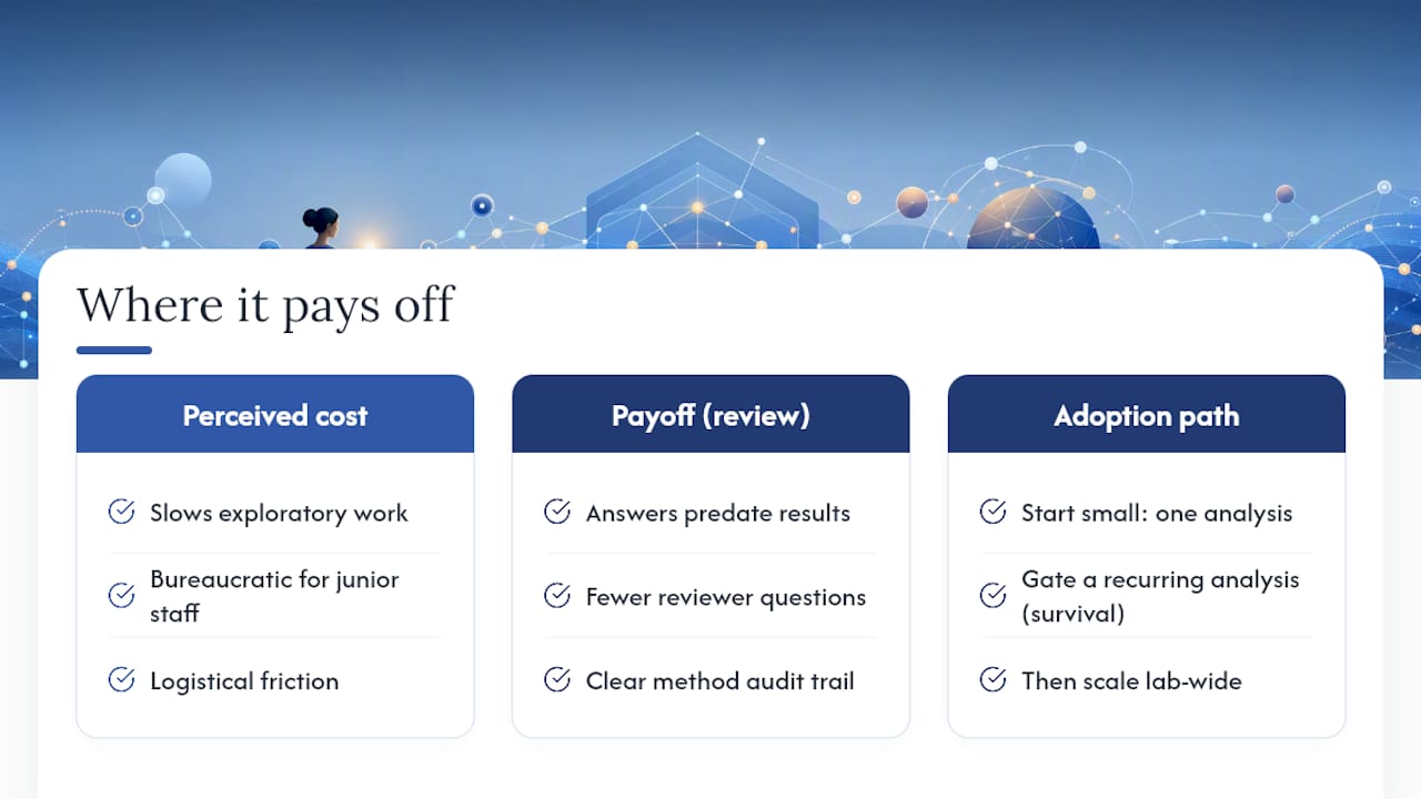
In practice, the payoff shows up at exactly the moment it’s needed most: during review. A plan reviewed and approved before code runs means a supervisor or committee member can ask “why this test?” and get an answer that predates the result, which is a fundamentally different conversation than justifying a choice after seeing the p-value. Reviewers ask fewer clarifying questions about method selection when the audit trail already shows the reasoning.
The real barrier is cultural: getting a lab to accept that some exploratory steps need to be declared, not improvised. Labs piloting this successfully start small, gating one recurring analysis type (say, survival curves for a single ongoing study) before rolling methodology-gating out lab-wide.
— Aymen
PlotStudio: Automated Charting Built for Peer Review, Not Just Presentation
If your data can’t leave your machine and your committee expects a paper trail, PlotStudio is the tool built around exactly that constraint. It runs analysis locally, so IRB-governed, NHS, or GDPR special-category data never touches a cloud server. Every run starts from an analysis plan you review and approve first, stated methods, thresholds, and success criteria functioning as your preregistration and audit trail. It executes native R and Python, covering the methods academic work actually needs: survival analysis, Cox proportional hazards, mixed-effects models, regression, ANOVA, and multiple-comparison correction. Skills let your lab encode its own required steps once, so every subsequent analysis follows your discipline’s standard instead of a generic default.
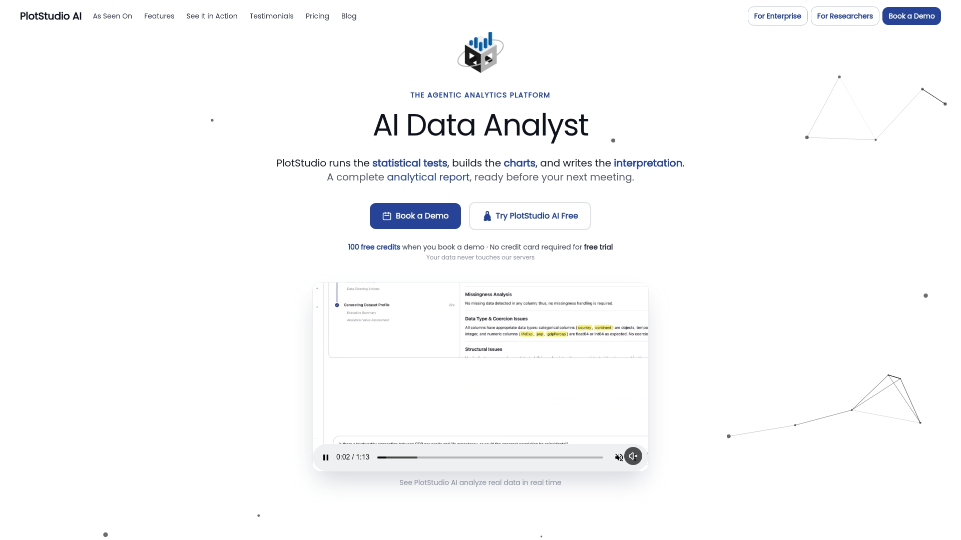
What comes out the other end is a full reproducibility package: an annotated notebook, a PDF report, and a permanent searchable analysis page a supervisor or reviewer can trace step by step. If your workflow currently produces figures without that trail, start with a free trial or request a demo of PlotStudio’s data analysis tools to see how an analysis plan gate changes what a reviewer sees when they ask how a result was produced.
Sources
- GDPR research FAQs — Tufts University
- Reproducible research in R: A tutorial on how to do the same thing more than once — MDPI
- Comprehensive guidelines for selecting statistical analysis methods — PMC
- Incompatibilities between current statistical practice and differential privacy — arXiv
- Best practices to avoid reproducibility rot — PMC