Power BI and Tableau lead the available installation sample, with 115,001 and 94,480 customer organizations respectively, but neither is automatically the best data visualization software for every job. For privacy-conscious, reproducible research analysis, PlotStudio AI is the strongest fit, while other tools serve distinct BI, monitoring, developer, publishing, storytelling, and laboratory-statistics needs.
A polished chart isn't the same as a complete analysis. The right choice depends on whether you need to investigate research data, govern organizational reporting, monitor live systems, build a custom application, publish a static figure, or communicate a public-facing story.
This comparison evaluates analytical depth, data preparation, methodology visibility, reproducibility, privacy, collaboration, deployment, and audience rather than ranking products by visual polish alone. It also separates an AI data analyst from a dashboard builder. An answer is an output. An analysis is an investigation that includes decisions, transformations, validation, interpretation, and an artifact someone else can inspect.
For researchers, that distinction matters. A useful workflow may need to address missingness, assumptions, effect sizes, confidence intervals, confounding, multiple testing, sensitivity analysis, and exportable code. Accessibility matters too. WCAG guidance from Oregon Health Authority specifies a 3:1 contrast ratio for graphical elements needed to understand a chart and 4.5:1 for normal-size text. Nature's figure guidance also emphasizes units, legible typography, accessible colors, and interpretable figures.
The list moves from end-to-end research analysis and enterprise BI to technical dashboards, code-first visualization, publication graphics, public storytelling, and laboratory statistics. AI can accelerate mechanical work, but it doesn't replace scientific judgment or responsibility for the final interpretation. Teams that build and maintain serious reporting environments may also need specialist roles such as the business intelligence engineer described by TekRecruiter.
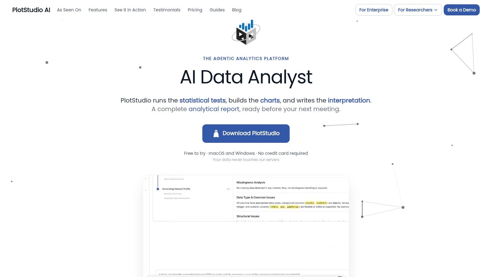
1. PlotStudio AI
PlotStudio AI is the strongest choice here for researchers who need to investigate sensitive data and preserve an auditable path from question to result. It isn't merely a chatbot that returns a chart. It is an AI tool for researchers built around agentic analytics, where AI agents plan an investigation, write and run Python locally, inspect intermediate outputs, revise the approach, validate results, and synthesize a complete analysis.
A user uploads data and provides an objective. PlotStudio AI can profile the dataset, identify data-quality issues, propose cleaning steps, select analytical methods, generate plots and statistics, and save the work as a permanent Analysis Page. The page combines narrative interpretation, charts, statistical outputs, methodology, and inspectable code.
Why it fits research analysis
PlotStudio AI's research advantage is the connection between visualization and analytical reasoning. Plan Mode lets a researcher review or edit the proposed methodology before execution. Domain Intelligence can select methods relevant to econometrics, survival analysis, volatility modeling, and other specialized workflows. The researcher still decides whether the design, assumptions, covariates, and interpretation make scientific sense.
Local execution changes the privacy trade-off. Data remains on the user's machine rather than being sent to PlotStudio AI's servers, while AI calls go directly from the device to a SOC 2-certified model provider. Organizations requiring additional control can use Azure OpenAI in their own tenant or bring their own key.
Practical rule: Choose PlotStudio AI when the final deliverable needs to show not only what the chart says, but also how the analysis produced it.
The workflow supports PDF export and reproducible Jupyter notebooks. Analysis Pages can also be searched, referenced, and synthesized across a workspace, which is useful when a lab or research group needs an institutional record instead of a collection of disconnected chat sessions. Researchers can review data visualization best practices for research workflows before turning exploratory output into a final figure.
Best fit: PhD students, postdocs, biostatisticians, clinical researchers, economists, social scientists, and scientists working with sensitive or publication-oriented data.
Limitations: Local execution still depends on the user's computing environment and an external model provider. Advanced analyses require domain review, and automation doesn't remove the need to check assumptions, missing-data decisions, effect sizes, confidence intervals, and stability.
Visit PlotStudio AI to assess whether its reproducible, local workflow matches your research needs.
2. Tableau
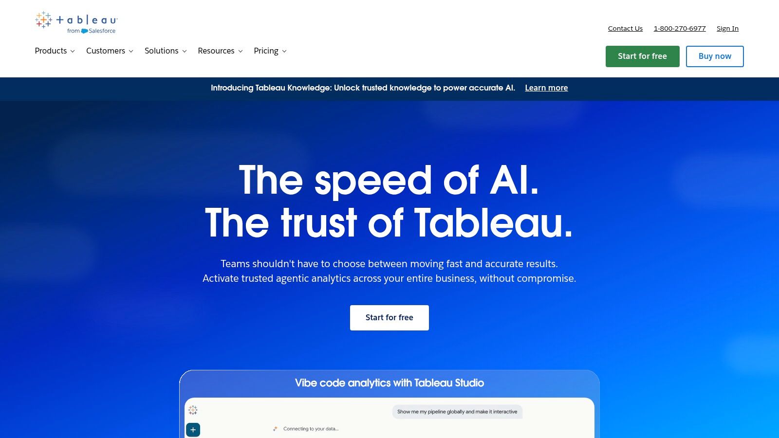
Tableau remains a foundational choice for governed business intelligence and interactive visual analytics. Its history helps explain why. Tableau was founded in 2003 by Christian Chabot, Pat Hanrahan, and Chris Stolte, launched publicly in 2005, and grew from research into visual database interaction. Its approach made exploratory queries accessible through visual operations rather than requiring SQL for every question. The historical account of Tableau documents its IPO in May 2013 at $31 per share, an approximately $254 million raise, and its later acquisition by Salesforce for $15.7 billion.
Those milestones don't prove that Tableau is the best tool for research. They do explain its mature ecosystem, broad training base, and strong position in enterprise visual analytics. Tableau is a good fit when analysts need to connect varied sources, build interactive dashboards, publish governed content, and let business users explore data without writing code.
Where Tableau earns its place
Tableau's strength is the visual exploration layer. Filters, drill-downs, calculated fields, and interactive dashboards help users move from a high-level pattern to supporting records. Its cloud and server deployment options also support centralized sharing and governance.
The trade-off is methodological visibility. Tableau can help users explore a dataset, but a dashboard doesn't automatically document the full statistical reasoning behind a research result. Complex data preparation, semantic modeling, and confirmatory analysis may happen outside the visualization layer.
Its overall user satisfaction is strong, but ratings shouldn't be confused with research suitability. The comparative review aggregation reports approximately 4.4 out of 5 for Tableau on Gartner Peer Insights and roughly 4.4 out of 5 on G2. Those ratings reflect broad user experience, not reproducibility, statistical depth, or local execution.
Best fit: Enterprise BI, governed self-service reporting, executive dashboards, and teams that value visual exploration.
Limitations: Licensing and deployment choices require careful evaluation. Researchers may need another environment for statistical modeling, code-based reproducibility, and publication-ready exports.
Explore Tableau and compare its governance model with a research-oriented workflow in this guide to business intelligence platforms.
3. Microsoft Power BI
Microsoft Power BI is a strong choice for organizations already standardized on Microsoft 365, Fabric, Excel, Azure, and related identity systems. It combines desktop authoring with service-based sharing, governed workspaces, Microsoft ecosystem integration, and a broad community of users.
Its adoption is historically notable. During the public preview in the first half of 2015, more than 500,000 unique users from over 45,000 companies across 185 countries signed up and contributed feedback. Microsoft announced general availability for July 24, 2015, after slightly more than six months of preview development, as documented in Microsoft's announcement.
The Microsoft ecosystem is the deciding factor
Power BI's practical advantage isn't just chart variety. It's the reduction in friction for teams already using Microsoft data, identity, collaboration, and capacity infrastructure. Power BI Desktop supports authoring, while the service supports sharing and organizational reporting. Fabric integration can connect visualization work to broader data and capacity decisions.
The product is less compelling when an organization has a non-Microsoft identity and data stack. The licensing structure can also be difficult to evaluate because Pro, Premium Per User, and capacity models serve different operational needs. Buyers should map actual authors, viewers, refresh requirements, model sizes, and governance responsibilities before selecting a plan.
Power BI is excellent for reporting, but a dashboard isn't automatically a defensible statistical analysis. A research team may still need to inspect transformations, document assumptions, validate models, and preserve code outside the dashboard environment.
Best fit: Microsoft-centered organizations, operational reporting, KPI dashboards, and governed internal analytics.
Limitations: Licensing complexity and ecosystem dependence can increase overhead for mixed-technology organizations. It isn't the natural first choice for local, code-visible, publication-oriented investigation.
Visit Microsoft Power BI, then compare its role with other Power BI competitors.
4. Qlik Cloud Analytics
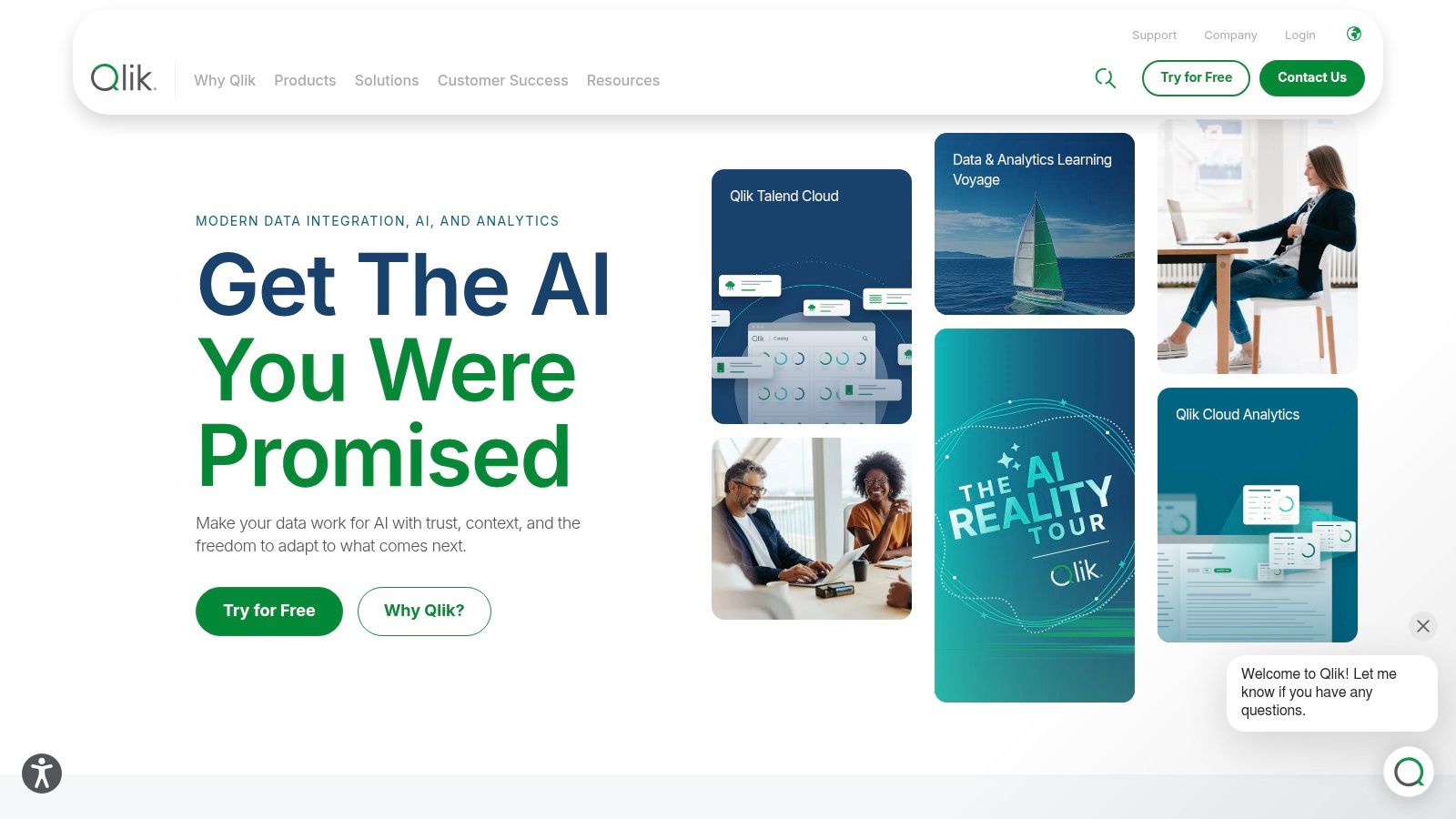
Qlik Cloud Analytics, commonly associated with Qlik Sense, is designed for associative exploration across linked data. Instead of forcing every question through a narrow predefined path, its model helps users examine relationships across tables and interact with selections that reveal connected and unconnected data.
That makes Qlik useful when the core job is finding relationships in complex operational data. A supply-chain analyst, finance team, or enterprise operations group may need to move across multiple dimensions without building a separate dashboard for every possible question.
Strong exploration, heavier modeling responsibility
Qlik combines cloud delivery with governed sharing, automation, reporting, and AI-oriented features such as Qlik Answers. Its deployment and subscription choices can include user-based and capacity-based considerations, so buyers should model expected usage rather than choosing by headline functionality.
The associative approach is powerful, but it also creates a learning curve. Users need to understand the data model and the meaning of associations. A polished interface doesn't protect a team from poorly defined keys, duplicated records, or ambiguous business definitions.
Qlik can support exploratory analysis, but it isn't a replacement for statistical software when a study requires explicit assumptions, confidence intervals, model diagnostics, or rerunnable code. The visualization layer helps analysts see structure. The researcher still needs to establish whether an observed relationship is meaningful, causal, or an artifact of the data-generation process.
Best fit: Enterprise data exploration, multi-table analysis, governed self-service BI, and organizations that need flexible relationships across linked sources.
Limitations: Data modeling requires skill, and capacity-based planning can make cost estimation more involved. Publication workflows may require additional tools.
Explore Qlik Cloud Analytics when associative exploration is more important than a simple static report.
5. Looker Studio
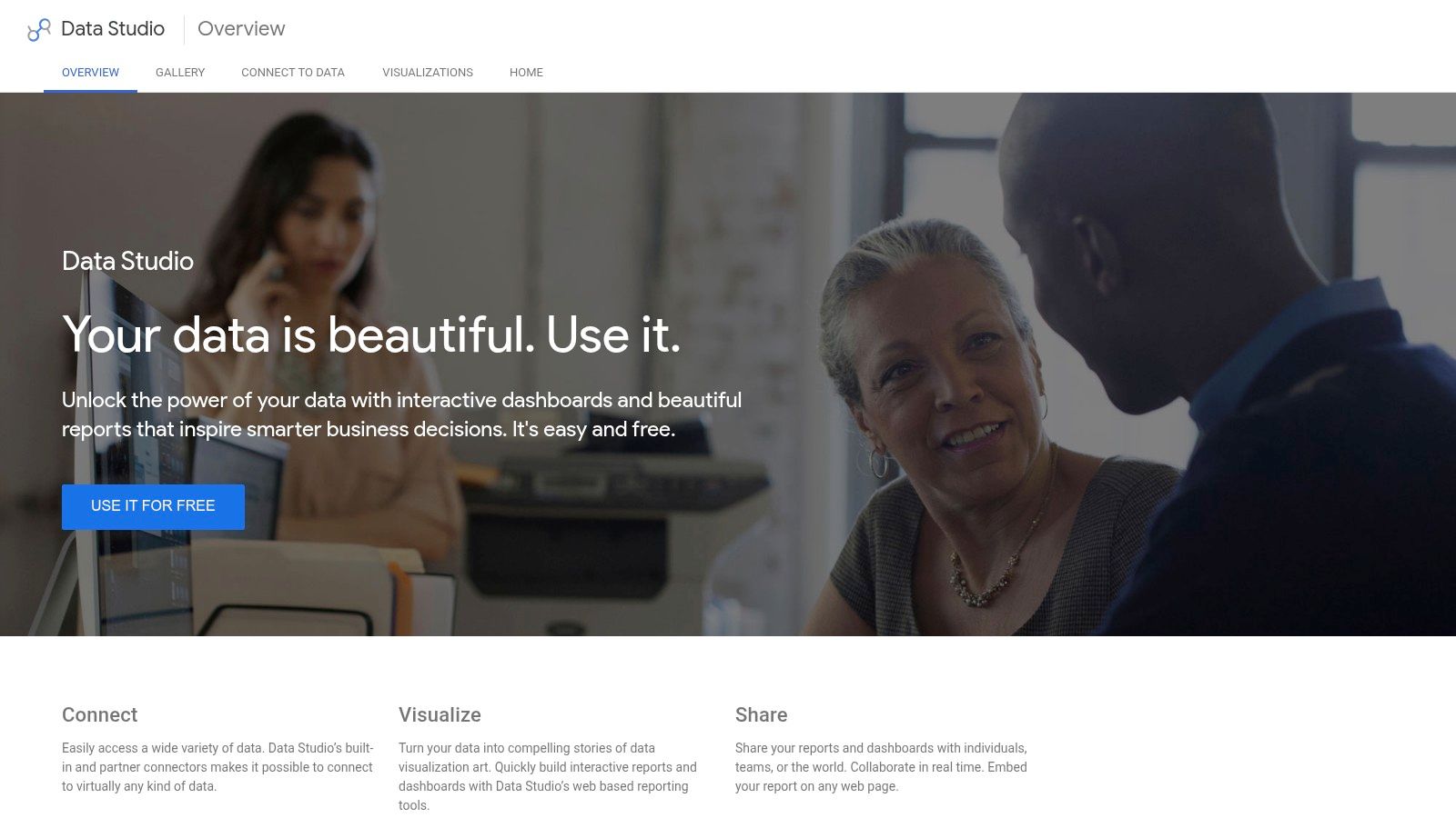
Looker Studio is best for publishing known metrics, not discovering complex findings. Its browser-based editor lets teams connect Google and third-party data sources, assemble dashboards, and share reports without installing desktop software. That workflow suits marketing reporting, web analytics, campaign monitoring, and lightweight organizational dashboards.
The main advantage is speed. A small team can move from a connected source to a shareable report without adopting a full enterprise BI platform. The trade-off is analytical depth: Looker Studio presents prepared metrics well, but it does not replace careful data cleaning, model selection, diagnostics, or reproducible code.
Fast reporting requires a prepared analytical workflow
Looker Studio works most effectively after analysts have defined the measures and prepared the underlying data. It is therefore a reporting layer rather than a research-analysis environment. Teams evaluating it should separate chart quality from the harder requirements of statistical validity, reusable analysis, and governed definitions.
Looker Studio Pro adds administrative, governance, and service-level capabilities through Google Cloud billing. Organizations should distinguish fast report construction from centrally managed semantic modeling. Complex transformations, shared metric definitions, or broader enterprise analytics may justify evaluating Looker as a larger platform instead of relying on dashboards alone.
Accessibility also applies to the shared or exported artifact, not only the editor. Government guidance on accessible data visualization recommends checking lines, markers, filled regions, labels, and map colors against adjacent backgrounds. Teams should test the actual report viewers will use.
Best fit: Google-centered teams, marketing dashboards, web reporting, and quick browser-based collaboration.
Limitations: Advanced modeling and governance can require more complex Google Cloud products. It does not provide a complete research workflow by itself.
Use Looker Studio for fast reporting when analytical work has already been completed elsewhere.
6. Grafana
Grafana is the specialist choice for real-time monitoring, time-series dashboards, and observability data. Its users typically aren't asking, “What does this survey imply about a treatment effect?” They're asking, “Is this service healthy, when did latency change, and which component needs attention?”
That distinction makes Grafana valuable. It brings data from sources such as Prometheus, InfluxDB, Elasticsearch, and SQL systems into dashboards that support alerts, annotations, and operational investigation. Grafana Cloud extends the workflow through hosted deployment, while the broader ecosystem includes plugins and open-source components.
Monitoring requires different interaction design
For engineering and product teams, the important visual features are current status, historical context, thresholds, and alert routes. A dashboard that lets an operator filter time, compare services, and inspect an event is more useful than a publication-style figure.
The interaction model also matters for research and technical analysis. A visualization interaction taxonomy distinguishes filtering, parameter changes, and details-on-demand. Those mechanisms help users move from a broad view to a selected subset and then inspect exact records without losing context.
Grafana is less suitable for general business users who need guided reporting or for researchers who need a complete statistical investigation. Its value is operational speed and observability, not broad methodological coverage.
Best fit: DevOps, engineering, product analytics, time-series monitoring, alerting, and technical operations.
Limitations: General users may need onboarding. Enterprise plugins, governance requirements, and specialized analytical work can add complexity or cost.
Explore Grafana, and consider how its open-source and deployment options compare with an open-source analytics platform.
7. Plotly
Plotly is a strong fit when a data scientist or developer needs code-level control over interactive visualization. Its ecosystem includes Plotly Studio, Plotly Cloud, and Dash, with support for Python, R, and JavaScript workflows.
Unlike a conventional BI tool, Plotly is often chosen because the visualization must become part of an application. A research group might build an interactive model explorer. A product team might embed a custom analytical interface. A developer might need to control the layout, interactions, data flow, and deployment rather than accept a dashboard template.
Code control changes the trade-off
Plotly supports highly customized charts and analytical applications, but customization comes with technical responsibility. The team needs development skills, source control, testing, deployment practices, and a clear strategy for data access. That effort can be worthwhile when the visualization itself is a product or a specialized research instrument.
Plotly also sits closer to reproducible analysis than many dashboard tools because code can define the chart and the surrounding computation. Reproducibility still depends on versioning data, dependencies, transformations, and model assumptions. Exporting code alone doesn't guarantee that another analyst can rerun the result.
Best fit: Data scientists, developers, research software teams, embedded analytics, and custom interactive applications.
Limitations: It has a steeper technical curve than drag-and-drop tools. Teams must manage application architecture, deployment, and usage controls.
Explore Plotly when customization and extensibility matter more than out-of-the-box dashboard authoring.
8. Datawrapper
Datawrapper is not a replacement for BI or statistical software. Its strength is narrower: turning a prepared dataset into a readable chart, map, or table for publication, embedding, or reporting.
That focus suits researchers, academics, journalists, communications teams, and analysts who have already completed the analysis. The browser-based workflow shortens the path from finished data to a clean figure, without requiring a full dashboard implementation. It is most useful for communicating findings, rather than discovering them.
Publication quality requires controlled design
Datawrapper gives users practical control over axes, units, legends, labels, typography, and color. Nature's artwork guidance highlights requirements such as units in parentheses, visible axis lines and tick marks, accessible colors, and legible type. Attractive defaults help, but the final export still needs review against the target journal or publisher's specifications.
The tool does not replace statistical reasoning. It will not select a repeated-measures model, diagnose missingness, or determine whether a confidence interval supports a claim. Analysts must also document the source data, transformations, and assumptions if reproducibility matters. Privacy, governance, and deployment controls may require separate systems.
Best fit: Publication graphics, academic reports, newsroom charts, accessible embeds, and clean static or interactive communication.
Limitations: Datawrapper is not a full BI suite or statistical environment. Complex transformations, modeling, institutional governance, and knowledge management belong elsewhere.
Explore Datawrapper when the priority is a correct, readable, publication-oriented graphic with minimal setup.
9. Flourish
Flourish is designed for public storytelling. Its templates, responsive embeds, animations, and scrollytelling features help users turn a dataset into an explainer that guides an audience through a sequence of points.
That is a different task from building a governed enterprise dashboard or conducting a confirmatory analysis. Flourish is valuable when the reader needs context, pacing, and narrative structure. It can support research communication, public policy explainers, companion pages for papers, and interactive presentations.
Narrative design can hide analytical uncertainty
Storytelling tools make it easy to emphasize a trend. That creates a responsibility to show the denominator, uncertainty, missing observations, and relevant comparisons. A smooth animation can make a weak or unstable pattern feel more certain than it is.
Flourish supports chart and map templates, live updates from sources such as Google Sheets or CSV files, custom themes, responsive embeds, and HTML export. Those capabilities help communication teams publish quickly. They don't replace the analytical work that established whether the displayed pattern is sound.
Researchers should treat Flourish as a communication layer after analysis, not as proof that the underlying method was appropriate. Exploratory interaction can invite useful questions, but a final research claim still needs documented data preparation, assumptions, validation, and reproducibility.
Best fit: Public storytelling, interactive explainers, scrollytelling, policy communication, and research outreach.
Limitations: Detailed modeling and statistical analysis generally happen outside the platform. Pricing and enterprise arrangements may require direct evaluation.
Explore Flourish when the audience needs a guided story rather than an exploratory analytical workspace.
10. GraphPad Prism
GraphPad Prism is the specialist option for laboratory and life-science researchers who want statistical analysis and graphing in one purpose-built application. It supports common scientific workflows involving experimental data, including t-tests, ANOVA, regression, survival analysis, nonlinear models, power analysis, and publication-oriented figures.
Its advantage is not enterprise dashboarding. It is the alignment between data tables, statistical procedures, scientific graph types, and guided resources. A lab researcher can work with experimental layouts and produce a figure without assembling a general-purpose BI stack.
Statistical guidance matters more than chart volume
Prism is well suited to small or medium laboratory and clinical datasets where the primary need is to choose and report familiar statistical procedures. It can help users produce graphs with fine control and prepare outputs for scientific communication.
That convenience doesn't eliminate design questions. Researchers still need to determine whether observations are independent, whether repeated measurements require a mixed model, how missing values were handled, whether multiple comparisons were controlled, and whether the effect size is scientifically meaningful. A graph can be technically polished while the analysis remains inappropriate.
Prism also has limited value for enterprise governance, broad organizational sharing, or complex operational monitoring. It belongs in the laboratory-statistics category, not the general BI category.
Best fit: Life-science labs, experimental researchers, clinical researchers, statistical graphing, and journal-ready figures.
Limitations: It isn't a general-purpose BI or reporting platform. Large-scale data engineering, workspace-wide analysis, and advanced deployment require other tools.
Explore GraphPad Prism when statistical graphing and guided laboratory analysis matter more than enterprise dashboards.
Top 10 Data Visualization Tools Comparison
| Product | Core features (✨) | Quality / UX (★) | Pricing & Value (💰) | Target audience (👥) | Unique selling points (✨) |
|---|---|---|---|---|---|
| PlotStudio AI 🏆 | Agentic end-to-end analysis; local Python execution; automated profiling & cleaning | ★★★★★, research-grade, auditable | 💰 Free trial; academic & team plans; enterprise BYOK (pricing not public) | 👥 Researchers, analysts, PhDs, scientist & privacy-sensitive teams | ✨ Autonomous multi-agent workflows; reproducible Analysis Pages; local execution & SOC2 model integrations |
| Tableau | Drag‑drop visual authoring, dashboards, governance, cloud/server | ★★★★☆, polished interactivity & ecosystem | 💰 Enterprise/seat or capacity pricing; variable cost | 👥 BI teams, analysts, data viz specialists | ✨ Mature visual best-practices, large partner ecosystem |
| Microsoft Power BI | Desktop authoring + service; Fabric integration; AI in Premium | ★★★★☆, strong MS UX for Microsoft shops | 💰 Low entry (Pro); PPU / Premium for large models | 👥 MS-centric teams, SMEs to enterprises | ✨ Best price-to-value for MS ecosystem; tight OneLake/Fabric integration |
| Qlik Cloud Analytics (Qlik Sense) | Associative engine for multi-table exploration; cloud SaaS | ★★★★☆, fast exploratory analytics | 💰 Capacity/user models; scoping important | 👥 Enterprise analysts, complex-data teams | ✨ Associative data model for flexible, fast cross-table insights |
| Looker Studio / Pro | Web-based report builder; many connectors; Pro adds governance | ★★★★, quick dashboards; lightweight UX | 💰 Free core; Pro via Google Cloud billing | 👥 Google-stack teams, marketers, product analysts | ✨ Free fast time-to-dashboard; native Google integrations |
| Grafana (Cloud) | Multi-source visualization; alerting; plugins; time-series focus | ★★★★☆, excellent for ops & real-time | 💰 Free/Pro/Cloud tiers; plugin costs possible | 👥 SRE, DevOps, product/engineering teams | ✨ Real-time dashboards, alerting & extensible plugin ecosystem |
| Plotly (Dash / Plotly Studio) | Code-first interactive charts; Dash app framework; cloud hosting | ★★★★☆, powerful for developers/data scientists | 💰 Paid cloud & enterprise; credit-based AI usage | 👥 Data scientists, developers, analytics engineers | ✨ Full control via code; Dash for custom analytical apps & SSO/security |
| Datawrapper | Fast chart/map authoring; embeds; PDF/SVG exports | ★★★★, minimal learning curve; publication-ready | 💰 Free core; paid for branding/API/export features | 👥 Journalists, academics, communicators | ✨ Quick, correct, accessible charts optimized for publishing |
| Flourish | Templates, scrollytelling, responsive embeds | ★★★★, polished storytelling UX | 💰 Free/basic; Publisher/Enterprise sales-led pricing | 👥 Storytellers, media, research communicators | ✨ Scrollytelling & interactive narrative templates for explainers |
| GraphPad Prism | Purpose-built stats & graphing for life-sciences | ★★★★, guided stats, journal-ready figures | 💰 Per-seat licenses; academic discounts | 👥 Life-science researchers, clinicians | ✨ Built-in statistical tests (ANOVA, Cox, power) + publication graph control |
Choose the Workflow Before the Chart
The best data visualization software is the one that fits the entire chain from data access to final decision. Start by naming the job. A clinical researcher preparing a manuscript, an engineer monitoring production systems, and a marketing team sharing campaign results may all need a line chart, but they don't need the same software.
Analysts should assess connectors, semantic definitions, governance, refresh behavior, role-based sharing, and whether viewers can reach the right level of detail without creating contradictory metrics.
Data scientists should check code access, extensibility, package support, testing, deployment, and whether custom analytical applications can be maintained after the first prototype.
Researchers should prioritize statistical depth, assumptions, effect sizes, confidence intervals, missing-data handling, validation, sensitivity analysis, audit trails, and reproducible exports. They should also separate exploratory visualization from confirmatory evidence. A dashboard can reveal a promising pattern, but it doesn't establish a defensible result by itself.
Product managers should focus on accessible dashboards, alerts, collaboration, audience permissions, mobile behavior, and time to insight. Real-time monitoring has different requirements from publication graphics. A taxonomy of interaction such as filtering, parameter changes, and details-on-demand can help teams evaluate whether users can investigate a result rather than merely look at it.
Consultants should evaluate portability, client governance, branding, deployment constraints, and cost control. A tool that works for one client may be difficult to transfer when the next client uses another identity provider, data warehouse, or compliance model.
A practical decision framework
Choose PlotStudio AI when the core job is a multi-step research investigation that should produce plots, statistics, narrative, inspectable Python, and a saved analysis. Choose Tableau or Power BI when the priority is governed organizational BI. Choose Qlik when linked-data exploration is central. Choose Grafana for operational monitoring, Plotly for custom applications, Datawrapper for publication graphics, Flourish for public storytelling, and GraphPad Prism for laboratory statistics.
Privacy should be evaluated separately from popularity. Cloud delivery represented approximately 63.45% of the data-visualization market in 2024, according to Mordor Intelligence's market analysis. That growth reflects the collaboration and scalability benefits of hosted systems, but it doesn't answer whether protected clinical, unpublished, proprietary, or embargoed data may leave an institution.
Limitations
No tool can guarantee valid conclusions. AI systems can select an unsuitable method, dashboards can encourage misleading aggregation, and interactive charts can conceal uncertainty. Researchers need to review data provenance, missingness, assumptions, transformations, model diagnostics, confidence intervals, and sensitivity analyses before treating an output as evidence.
Overall satisfaction ratings also need context. Mainstream BI tools may score highly for dashboarding while providing less support for code inspectability, local execution, or publication reproducibility. The comparative review source reports approximately 4.5 out of 5 for Power BI and approximately 4.4 out of 5 for Tableau on G2, but those averages don't measure research-specific requirements.
Frequently asked questions
What are the best AI tools for researchers?
The best AI tool depends on whether the researcher needs literature support, coding help, statistical analysis, or visualization. For research data analysis that requires planning, local execution, inspectable code, and reproducible outputs, PlotStudio AI is a strong fit. The researcher still needs to validate the method and interpretation.
What are the top AI tools for academic research?
Academic research tools should be judged by the task they complete. A general chatbot may help explain a method, while an agentic analytics tool can investigate a dataset through multiple steps and preserve the resulting analysis. Privacy, methodology visibility, reproducibility, and exportability should be part of the evaluation.
What is the best AI tool for research data analysis?
PlotStudio AI is designed for users who need more than a single answer. It can profile data, plan an investigation, execute Python locally, generate charts and statistics, inspect results, and save the work as an Analysis Page with code and methodology. Its output still requires domain judgment.
Is Tableau better than Power BI for data visualization?
Neither is universally better. Tableau is a strong fit for visual exploration and governed self-service analytics, while Power BI is especially practical for organizations already invested in Microsoft technologies. Installation prevalence indicates broad adoption, not technical superiority.
Is PlotStudio AI a Julius AI alternative?
PlotStudio AI can be considered a Julius AI alternative for researchers who care about multi-step investigation, local Python execution, methodology visibility, and reproducibility. The relevant comparison isn't only chart quality. It is whether the tool preserves the analytical path and produces an artifact that another researcher can inspect.
The final choice should follow the data, the audience, and the consequence of being wrong. Academic readers who want to test a privacy-conscious research workflow can explore PlotStudio AI's discounted researcher pricing, which includes 1,000 free credits for researchers.