A Practical Framework for Data Quality Assessment

A data quality assessment (DQA) is a structured measurement of how well a dataset serves its intended use, scored against defined dimensions and business rules rather than a general sense of “clean data.” ISO/IEC 25024 frames this correctly: quality is judged relative to system context and user needs, not fixed universal thresholds. The EPA’s DQA guidance reinforces the same logic for environmental data. The action to take right now:
- Select 5 to 8 critical data elements tied to a real decision or process.
- Run dimension-level checks (accuracy, completeness, consistency, validity) against those elements.
- Convert results into a scored evidence pack, not just a pass/fail note.
Pro Tip: If you only have time for one thing this week, profile completeness and uniqueness on your top three tables. Those two dimensions surface more downstream breakage than any other pair.
TL;DR:
- Focus assessments on 5 to 8 critical data elements directly tied to specific decisions to avoid scope creep and ensure actionable results.
- Run dimension checks on accuracy, completeness, consistency, timeliness, validity, and uniqueness for each element, then compile a detailed evidence pack.
- Use a six-step, repeatable process: scope, gather context, profile, validate, score, and report, without skipping steps to ensure trustworthiness.
- Automate structural, validation, and anomaly checks at ingestion and ETL layers, but evaluate false positives carefully to prevent noise and maintain reliability.
- Conduct ongoing monitoring based on data volatility, establishing clear ownership, SLAs, and versioned evidence packs to maintain data quality over time.
Table of Contents
- What Counts as a Data Quality Assessment (and What Doesn’t)
- What Are the Core Data Quality Dimensions and How Do You Measure Them?
- How Do You Run a Data Quality Assessment Step by Step?
- How Should You Prepare and Scope a Data Quality Assessment?
- What Tools Support Automated Data Quality Profiling?
- How Do You Score, Report, and Prioritize Fixes?
- How Often Should You Monitor Data Quality After the Assessment?
- How Does PlotStudio Support Auditable, Privacy-First Data Quality Work
- Key Takeaways
- Where to Verify These Standards and Methods
- Why Most Data Quality Assessments Fail Before They Start
- Run Your Next Data Quality Assessment Without Sending Sensitive Data Anywhere
- Sources
What Counts as a Data Quality Assessment (and What Doesn’t)
A DQA measures fitness for use. It asks: does this dataset support the decision it’s about to inform? That’s a different question than an audit asks, and a different cadence than monitoring runs on.
An audit checks compliance against a policy or regulation, often for a point-in-time attestation. Continuous monitoring runs automated checks on a schedule, catching drift after the fact. A DQA sits between the two: a deliberate, time-boxed evaluation that produces a decision-ready verdict on whether the data is good enough, right now, for a specific purpose.
Teams usually trigger a DQA around one of these moments:
- A data migration or system consolidation, when structural assumptions get tested for the first time.
- A model deployment, when training data quality directly determines production reliability.
- A periodic compliance review, often annual or tied to an external audit cycle.
- Donor or funder reporting, where grant conditions require documented data integrity.
Whatever the trigger, the deliverables look the same: a scorecard showing pass rates by dimension, an evidence pack documenting how each score was derived, and a prioritized remediation plan ranking fixes by impact. Skip any one of the three and the assessment becomes an opinion instead of a defensible result.
What Are the Core Data Quality Dimensions and How Do You Measure Them?
Six dimensions dominate modern frameworks, and a recent peer-reviewed analysis of DQA pipelines confirms this set remains the backbone even as ML-enabled tooling handles increasingly unstructured data. Each dimension needs a concrete check, not just a vibe.
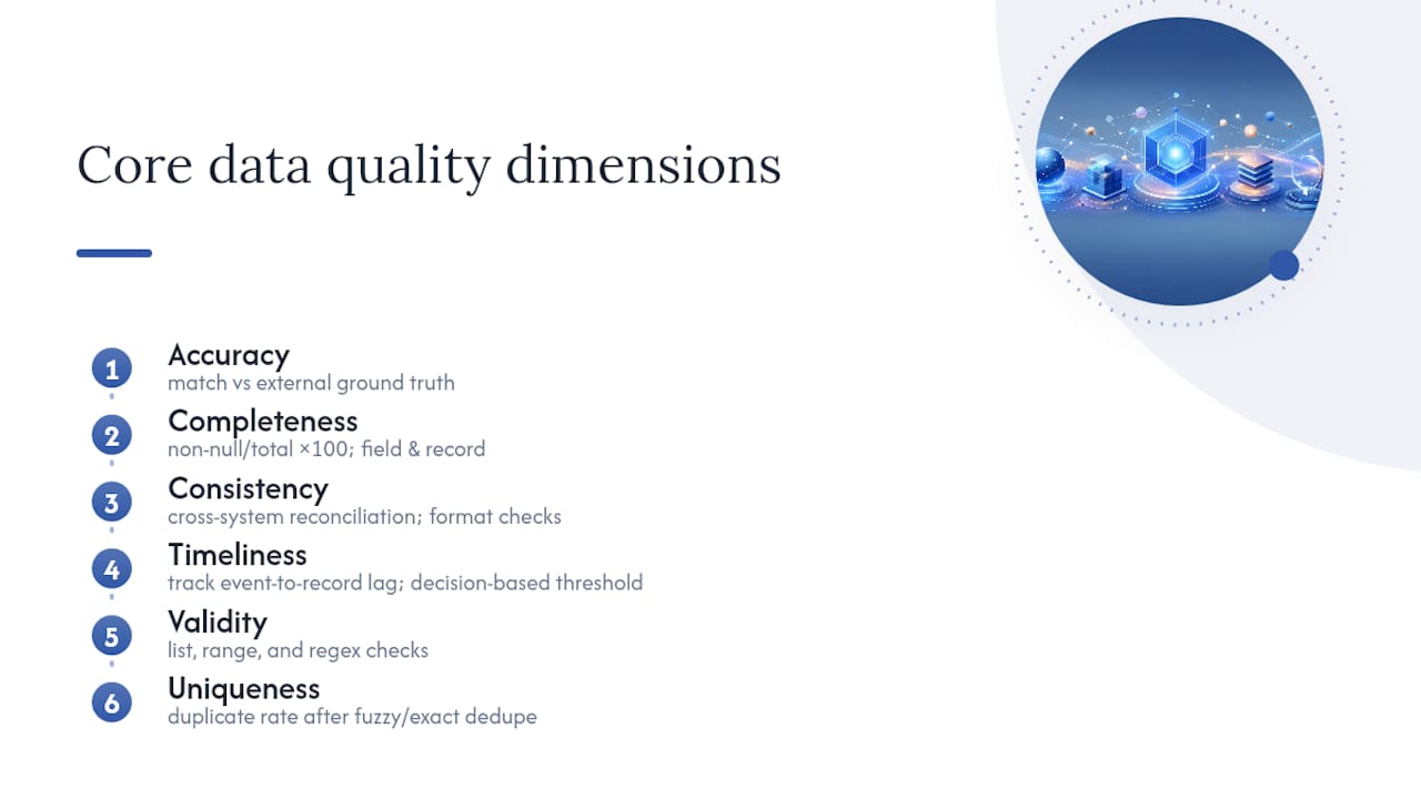
Accuracy measures whether a value reflects reality. Check it with an external reference match rate (comparing customer addresses against a postal database, for instance) or a spot-audit against a known ground truth source.
Completeness measures whether required values are present. Calculate completeness percent as (non-null records / total records) × 100, and track it at both the field level and the record level, since a record can be technically complete while missing the one field that matters for your use case.
Consistency measures whether the same fact agrees across systems or records. Cross-system reconciliation counts, format-consistency checks (all dates in ISO 8601, for example), and coefficient of variation on numeric fields that should behave predictably all apply here.
Timeliness measures whether data is current enough for its purpose. Track the lag between event and record creation, and set the acceptable threshold based on decision speed, not on what’s convenient to measure.
Validity measures whether values conform to defined rules or formats. Microsoft’s data validation documentation shows the building blocks well: list constraints, range checks, and regex pattern matching against a field’s expected shape.
Uniqueness measures duplication. Duplicate rate (duplicate records / total records) is the standard metric, usually run after a fuzzy-match or exact-key deduplication pass.
Treat these as starting points, not gospel. A Sigmodrecord makes the point sharply: data can be technically accurate and still fail because a downstream task expects different formatting or semantics. Your threshold has to map to the decision the data supports, exactly as ISO/IEC 25024 recommends.
How Do You Run a Data Quality Assessment Step by Step?
A DQA works best as a repeatable six-step sequence. Skipping steps to save time is the single most common reason assessments produce results nobody trusts later.
- Scope. Pick your critical data elements and write down, for each one, the decision or process it feeds. If you can’t name the consequence of that field being wrong, it doesn’t belong in this round.
- Gather context. Collect the data dictionary, ETL specifications, source system documentation, and any reference files you’ll use as ground truth. Define what “correct” actually looks like before you start measuring against it.
- Profile. Run automated checks against schema, value distributions, null rates, and expected ranges. This is where profiling software earns its keep, surfacing anomalies a manual review would take days to find.
- Validate and verify. Match a sample against an external or authoritative reference source, and layer in human review for edge cases automated checks can’t judge, like semantic correctness in free-text fields.
- Score and roll up. Convert raw check results into a percent-pass score per dimension, then combine dimension scores into an element score and an element scores into a domain score.
- Report and plan remediation. Produce the DQA report with the scorecard, the evidence pack, and a prioritized list of fixes ranked by impact and effort.
Pro Tip: Keep step 2 and step 3 separate in your timeline, even under deadline pressure. Teams that jump straight to profiling without agreeing on ground truth first end up arguing about what “correct” means after the numbers are already in front of stakeholders, which is a much harder conversation to have.
This sequence mirrors what Paris21 and Eurostat recommend for statistical producers: scoping, indicator definition, and repeatable measurement as the foundation, with scoring and reporting built on top. The order matters more than the tooling. A team with spreadsheets that follows all six steps in sequence will outproduce a team with expensive software that skips scoping.
How Should You Prepare and Scope a Data Quality Assessment?
Scope creep kills more DQAs than bad data does. Limit yourself to 5 to 8 critical elements per assessment cycle, and for each one, write a one-sentence justification naming the specific consequence of it being wrong: “customer email accuracy determines whether renewal notices reach the account holder,” not “email is important.”
Sampling strategy depends on table size and stakes:
- Full-scan for tables under roughly 100,000 rows, or for any field feeding a regulatory report.
- Stratified sampling for larger tables, pulling proportional samples across known segments (region, product line, time period) to avoid a biased read.
- Sample-size heuristics for medium tables: a few thousand records typically gets you a 95% confidence interval tight enough for a scorecard, though the exact number depends on your baseline error rate assumptions.
Timelines follow two common patterns. A focused profiling pass runs about two weeks and covers automated checks only. A full assessment with validation, scoring, and remediation planning runs 30 to 90 days depending on element count and how many manual verification steps you need.
Before you start, gather these artifacts:
- The data dictionary and current ETL specification.
- Process documentation for how the data gets created and updated.
- Written acceptance criteria for each critical element.
- A contact list of the people who own the source systems.
What Tools Support Automated Data Quality Profiling?
Automation earns its cost when checks are cheap to run and expensive to skip. The reverse is also true: a heavily automated pipeline with no one reviewing alerts just generates noise nobody trusts.
Four tool categories cover most DQA needs:
- Profiling tools scan structural characteristics automatically: value distributions, null rates, cardinality, and type inference. OpenRefine remains a solid, open-source option for profiling and cleaning mid-sized datasets before you invest in a heavier pipeline.
- Validation libraries enforce rules at the row or field level, catching violations against schema, range, or pattern constraints as data moves through a pipeline.
- Monitoring platforms track quality metrics over time and alert on drift, which matters more for high-velocity data than for a static research dataset.
- Diffing tools compare data snapshots to catch unintended changes before they reach downstream analytics.
Where you embed checks matters as much as which tool you pick. At ingestion, validate schema and required fields. In ETL, check transformation logic against known business rules. At the BI layer, reconcile aggregate totals against source counts to catch silent join errors.
Practical guidance from Data.org recommends running structural checks first, then layering statistical anomaly detection, then adding change-diffing inside CI pipelines as maturity grows. Datafold’s research on pipeline checks found that embedding validation directly in ETL and CI reduces the time teams spend firefighting downstream, because bad data gets caught before it reaches analysts instead of after. The tradeoff is real: more automated rules means more maintenance and more false positives to tune out, and compute cost scales with how frequently you run full-table checks versus incremental ones.
How Do You Score, Report, and Prioritize Fixes?
A defensible scoring model rolls up cleanly: percent pass per check becomes a dimension score, dimension scores combine into an element score, and element scores aggregate into a domain score. Keep the dimension-level breakdown visible at every level of the roll-up. A domain score of 92% is meaningless to a remediation team without knowing which dimension dragged it down.
Your scorecard needs these fields at minimum:
- Element name and owning system
- Dimension scores (accuracy, completeness, consistency, timeliness, validity, uniqueness)
- Sample size and pass rate
- Confidence level for the sample
| Scorecard Element | Purpose |
|---|---|
| Element and dimension scores | Shows exactly where quality breaks down, not just an aggregate number |
| Sample size and confidence | Tells reviewers how much to trust the score |
| Evidence pack link | Connects the score to the queries and rows that produced it |
| Priority ranking | Orders fixes by impact times effort, not by who complained loudest |
The evidence pack itself should contain the actual queries run, sample rows flagged as failures, side-by-side comparisons against reference sources, and a timestamped audit trail. This is what makes a score defensible in front of a reviewer or a funder rather than just a claim. A scorecard template built around these fields turns a one-off assessment into something repeatable next quarter.
Prioritize remediation using impact times effort: fixes with high impact and low effort go first, structural fixes with high effort get scheduled, and low-impact issues get logged but deferred.
How Often Should You Monitor Data Quality After the Assessment?
A DQA is a snapshot. Left there, it decays the moment source systems change. The fix is shifting from one-off assessment to ongoing monitoring, with cadence set by volatility and criticality rather than a fixed calendar.
- High-volatility, high-criticality data (transactional feeds, real-time pricing) needs near-real-time or daily checks.
- Moderate-volatility reference data works on a weekly cadence.
- Slow-moving dimension tables can run monthly without meaningful risk.
Data.org’s guidance on data quality practices makes the point directly: DQA works best as an iterative cycle, and teams that treat it as a set-and-forget exercise lose the gains within a few review cycles.
Governance needs named owners, not shared responsibility. Assign a data owner accountable for the element’s business meaning and a data steward responsible for day-to-day quality. Define SLAs for how fast a flagged issue gets triaged, and write runbooks so escalation doesn’t depend on one person’s memory.

Pro Tip: Version your evidence packs the same way you’d version code. When a score changes quarter over quarter, you want to know exactly which rule or source changed, not just that the number moved.
Maintain a rules registry alongside your data dictionary, and keep every evidence pack timestamped and archived. That combination is what lets a DQA output double as a governance artifact and support reproducible research downstream.
How Does PlotStudio Support Auditable, Privacy-First Data Quality Work
Research teams running a DQA on sensitive datasets face a constraint most commercial tools ignore: the data often can’t leave the building. Patient records under IRB oversight, GDPR special-category fields, and NHS datasets all carry restrictions that rule out uploading to a cloud profiling service, no matter how good the checks are.
- Local processing keeps data on the researcher’s own machine, satisfying IRB, GDPR, and NHS constraints that cloud-based profiling tools can’t meet.
- Every analysis runs behind a reviewed and approved plan, functioning as pre-registration and creating an audit trail that supports the evidence-pack requirement of a rigorous DQA.
- Skills let a lab encode discipline-specific thresholds and forbidden shortcuts once, so every profiling run follows the same methodology instead of drifting analyst to analyst.
- Native R and Python support covers the statistical methods research actually needs, and exports of annotated notebooks, PDF reports, and searchable analysis pages give reviewers something to trace.
A DQA is only as trustworthy as its audit trail. A scorecard with no reviewable methodology behind it is an assertion, not evidence.
Key Takeaways
A data quality assessment works when it scopes a small set of critical elements, scores each one against defined dimensions, and produces an evidence pack a reviewer can actually trace.
| Point | Details |
|---|---|
| Scope narrowly | Limit each assessment to 5 to 8 critical elements, each tied to a named decision or consequence. |
| Measure six dimensions | Score accuracy, completeness, consistency, timeliness, validity, and uniqueness separately before rolling up. |
| Follow the six-step process | Scope, gather context, profile, validate, score, and report, in that order, without skipping steps. |
| Automate where it earns its cost | Embed checks at ingestion, ETL, and BI layers, but tune for false positives before scaling up. |
| Use PlotStudio for sensitive research data | Local processing and reviewable analysis plans support IRB and GDPR-governed DQAs with a full audit trail. |
Where to Verify These Standards and Methods
Standards bodies and practitioner guides give you the primary sources behind every method in this piece, worth bookmarking for the next assessment cycle.
- ISO/IEC 25024:2015 defines the internationally recognized measures for data quality.
- The EPA’s Guidance for Data Quality Assessment walks through graphical checks and uncertainty characterization in detail.
- The Paris21/Eurostat Handbook on Data Quality Assessment Methods and Tools covers statistical-producer methodology in depth.
- A recent Springer paper on modern DQA pipelines documents how ML-enabled tooling is changing profiling at scale.
- Microsoft’s data validation documentation offers concrete, low-cost examples of validation rules you can implement today.
Why Most Data Quality Assessments Fail Before They Start
The conventional advice on data quality assessment obsesses over tooling. Pick the right profiling platform, the thinking goes, and the quality problems mostly solve themselves. That’s backwards. The DQAs that actually hold up under scrutiny succeed or fail at the scoping step, long before anyone opens a profiling tool.
Teams that scope 20 data elements because “we might as well check everything while we’re in there” produce reports nobody reads and remediation plans nobody funds. The ones that pick 6 elements and can name the exact decision each one supports produce evidence packs that survive a reviewer’s questions. That discipline matters more than any statistical technique in this article.
The other underrated point: a threshold isn’t a fact, it’s a judgment call tied to a specific use case, exactly as ISO/IEC 25024 argues. Borrowing someone else’s 98% completeness threshold without asking what decision it protects is how teams end up with scorecards that look rigorous and mean nothing. Start with the consequence, then work backward to the number.
— Aymen
Run Your Next Data Quality Assessment Without Sending Sensitive Data Anywhere
If your dataset carries IRB restrictions, GDPR special-category fields, or NHS constraints, most profiling platforms are off the table before you even start scoping. Plotstudio processes data locally on your own machine, so the automated checks, scoring, and reporting this guide walks through never require uploading a single row to someone else’s server.
Beyond privacy, Plotstudio’s agentic workflow handles the parts of a DQA that eat the most analyst time: profiling schema and distributions, running validation rules, and generating a reviewable analysis plan that doubles as your audit trail. Skills let your team encode discipline-specific thresholds once, so every assessment after the first one follows the same methodology automatically. Every run exports as an annotated notebook, a PDF report, and a searchable analysis page, giving you the evidence pack a reviewer or funder will actually accept.
If you’re scoping your next assessment, see how Plotstudio’s enterprise platform handles privacy-first, reproducible analytics for research and regulated datasets, and start your first scored evidence pack this week.
Sources
- ISO/IEC 25024:2015 — Measurement of data quality (ISO)
- Guidance for Data Quality Assessment (US EPA)
- Handbook on Data Quality Assessment Methods and Tools (Paris21 / Eurostat)