Regression Diagnostics: The Checks That Make Results Defensible

Run these six checks before you trust any regression output: residuals vs. fitted (nonlinearity and heteroscedasticity), a QQ plot (normality), a scale-location plot (variance structure), variance inflation factor for collinearity, Durbin–Watson if your data is time-ordered, and Cook’s distance with DFBETAS/DFFITS for influence. If any of those come back flagged, your coefficients, standard errors, or p-values may not mean what you think they mean.
A quick pass takes fifteen minutes and catches most problems that would otherwise surface during peer review, or worse, after publication. Here’s what a bad pass looks like:
- Curvature in residuals vs. fitted means a linear model on a nonlinear relationship. Fix: add a polynomial term, a spline, or reconsider the functional form.
- VIF above 5 to 10 signals collinearity is inflating your standard errors. Fix: drop or combine correlated predictors, center variables, or move to regularization.
- Durbin–Watson far from 2 (below 1.5 or above 2.5, roughly) flags autocorrelation in time-ordered residuals. Fix: switch to time-series methods, cluster standard errors, or model the error structure explicitly.
- Cook’s distance near or above 4/n, or DFBETAS exceeding roughly 2/√n, marks an observation reshaping your coefficients. Fix: refit without the case, report both models, and check for data-entry error before you consider removal.
Pro Tip: Run the graphical check and the matching numerical test together, never one alone. A residual plot that looks suspicious but fails to trip Breusch–Pagan is a different finding than one that fails both, and reviewers will ask which you saw.
Key Takeaways
Regression diagnostics work only when graphical checks and statistical tests are paired and re-run after every fix, not treated as a one-time gate before publication.
| Point | Details |
|---|---|
| Run the core six checks first | Residuals vs. fitted, QQ plot, scale-location, VIF, Durbin–Watson (time-ordered data), and Cook’s distance/DFBETAS. |
| Pair plots with tests | A flagged plot corroborated by Breusch–Pagan, White, or Ramsey RESET is stronger evidence than either alone. |
| Separate outliers, leverage, and influence | Each needs a distinct measure: studentized residuals, hat values, and Cook’s distance/DFFITS respectively. |
| Re-run diagnostics after every fix | A correction for heteroscedasticity or collinearity can introduce a new problem elsewhere in the model. |
| Document thresholds before you look at results | Pre-set cutoffs and a logged decision trail make a diagnostics section defensible under peer review. |
| Automate the repeatable parts | Plotstudio generates the matching plot and test pairs, re-runs them after fixes, and exports the reproducibility package automatically. |
Table of Contents
- What Regression Diagnostics Are and When to Run Them
- Reading Residual Plots, QQ Plots, and Scale-Location Charts
- Which Statistical Tests Confirm What the Plots Suggest
- Finding Outliers, Leverage Points, and Influential Observations
- Fixing What Diagnostics Find: Transformations, Robust SEs, and Re-Specification
- Extending Diagnostics to GLMs and Logistic Models
- Building a Reproducible Diagnostics Workflow
- Documenting Diagnostics So Reviewers Can Trust Them
- Frequently Asked Questions
- Sources
What Regression Diagnostics Are and When to Run Them
Regression diagnostics are the set of procedures that verify a fitted model, most often ordinary least squares, actually represents the data generating process it claims to model. They test the four assumptions OLS depends on: linearity between predictors and the outcome, independence of observations, normally distributed errors, and homoscedasticity, meaning constant error variance across the range of fitted values. Miss one of these and your model can still produce a fit line and a p-value. It just won’t mean what the printout implies.
The UCLA/Stata regression diagnostics webbook frames diagnostics as verification of exactly this: does the model represent the data, and do the assumptions hold up. That framing matters because it separates diagnostics from model selection. You’re not asking whether this is the best possible model. You’re asking whether the one you fit is trustworthy enough to interpret.
Diagnostics belong at a specific point in your pipeline, and skipping that step is where things go wrong: fit the model, run diagnostics, apply fixes or re-specify, then run diagnostics again before you touch the coefficient table for your results section. Analysts who jump straight from summary(model) to writing up p-values are the ones who get burned. Heteroscedasticity deflates standard errors, making marginal effects look significant when they’re not. Omitted nonlinearity biases coefficients in a fixed direction, not just adds noise. A handful of high-leverage points can flip the sign of a coefficient that looked rock-solid in the full sample.
Diagnostics should function as a dedicated modeling stage, run with both visual and statistical tools, not squeezed in as an afterthought once the results already look publishable.
That’s the core recommendation from the SSCC regression diagnostics guide, and it’s worth internalizing before you write a single line of interpretation. The guide also makes the point that after you apply any correction, whether a transformation, a robust standard error adjustment, or dropping a variable, you re-run every diagnostic. A fix for heteroscedasticity can introduce new leverage points. A fix for collinearity can change your residual distribution. Diagnostics aren’t a one-time gate; they’re a loop.
Reading Residual Plots, QQ Plots, and Scale-Location Charts
Six plots cover most of what you need, and each one answers a specific question about a specific assumption.
- Residuals vs. fitted values. Plot residuals against your model’s predicted values, with a lowess smoother overlaid. A flat, patternless band centered on zero is what you want. Curvature (a U-shape or arc) means the relationship isn’t linear. A widening or narrowing spread as fitted values increase means heteroscedasticity.
- Residuals vs. predictor. Same logic as above but plotted against individual explanatory variables, which is often more diagnostic for pinpointing which predictor needs a transformation or polynomial term.
- QQ (normal probability) plot. Standardized residuals plotted against theoretical normal quantiles. Points hugging the 45 degree line indicate normal errors. Departure in the tails (an S-curve or hook) signals heavy tails or skew, which matters most for small-sample inference since t-tests and F-tests lean on that normality assumption.
- Histogram of residuals. A cruder but complementary check on the same normality question. Useful as a sanity check alongside the QQ plot, particularly when the QQ plot’s tail behavior is ambiguous.
- Scale-location (spread-location) plot. Square root of absolute standardized residuals against fitted values. This is the sharper tool for detecting heteroscedasticity because it removes the sign of the residual, making a fanning pattern easier to spot than in the raw residuals-vs-fitted plot.
- Residuals vs. order (or time). Plot residuals in the sequence they were collected. Runs of consecutive positive or negative residuals point to autocorrelation, a serious problem for any time-ordered dataset and the visual companion to the Durbin–Watson statistic.
For time-ordered data specifically, Duke’s guide to residual plots and autocorrelation recommends exactly this pairing: plot residuals against time, then confirm with the Durbin–Watson statistic, since a value near 2 indicates no serial correlation while values pulling toward 0 or 4 flag positive or negative autocorrelation respectively.
Each plot maps to a remedy, and this is where diagnostics stop being an academic exercise and start driving your next model. Clear curvature in residuals vs. fitted usually means you need a quadratic term, a spline, or a log transform on a skewed predictor. A funnel shape means you reach for robust standard errors, a weighted least squares fit, or a variance-stabilizing transform on the outcome. Heavy tails in the QQ plot might push you toward a robust regression method or a nonparametric alternative if the sample is small enough that normality really drives your inference.
Interpretation quality drops fast when you plot raw residuals instead of standardized or studentized residuals. Raw residuals have unequal variance by construction, which makes visual comparison across observations misleading. Standardized residuals put everything on a common scale, so a value of 3 always means “three standard deviations from expected” no matter where it falls in the dataset. Also worth doing: label points beyond 2 or 3 standard deviations directly on the plot rather than eyeballing them, since that’s the fastest way to connect a suspicious point back to its row in your data.
Pro Tip: Annotate flagged points with their row index or ID directly on the plot before you move to numerical diagnostics. It saves you from re-deriving “which observation was that?” three steps later when you’re deciding whether to investigate a data-entry error.
Which Statistical Tests Confirm What the Plots Suggest
Visual patterns tell you something is wrong. Numerical tests tell you how confident to be about it, and they’re what a reviewer will ask for if your methods section only shows plots.
| Test | What it checks | Null hypothesis | Typical threshold |
|---|---|---|---|
| Shapiro–Wilk | Normality of residuals | Residuals are normally distributed | p-value rejects normality; sensitive in large samples |
| Breusch–Pagan | Heteroscedasticity | Error variance is constant | p-value flags heteroscedasticity |
| White test | Heteroscedasticity (no functional-form assumption) | Error variance is constant | p-value flags heteroscedasticity |
| Durbin–Watson | First-order autocorrelation | No autocorrelation in residuals | Statistic near 2 is clean; below 1.5 or above 2.5 flags concern |
| Variance inflation factor (VIF) | Multicollinearity among predictors | No formal null; a diagnostic statistic | VIF > 5 to 10 signals a problem |
| Condition index | Multicollinearity (matrix-level) | No formal null; a diagnostic statistic | High index values signal concern |
| Ramsey RESET | Omitted nonlinearity / functional form | Model is correctly specified | p-value suggests misspecification |
Sample size changes how you should read every row in that table. Small samples can fail to detect a real violation because the test lacks power, so a clean Breusch–Pagan result on 40 observations is weak reassurance. Large samples do the opposite: they’ll flag trivial deviations as statistically significant because the test has enough power to detect almost anything. Penn State’s STAT462 materials make this point directly, noting that residual-plot interpretation has to account for sample size to avoid over or under-reading apparent patterns. A Shapiro–Wilk p-value of 0.03 on n=5,000 observations often reflects a normality departure too small to matter for inference, not a fatal flaw.
That’s why concordance matters more than any single number. One flagged test with a clean plot is a candidate for “check it, don’t panic.” A flagged plot corroborated by two or three statistical tests pointing the same direction is a real signal you need to act on. The NIST Dataplot documentation on regression diagnostics recommends exactly this pairing approach, treating visual and statistical checks as complementary rather than either being sufficient alone.
What you run also depends on your data structure:
- Cross-sectional data: Breusch–Pagan or White for heteroscedasticity, VIF for collinearity, Ramsey RESET for functional form.
- Time-series data: Durbin–Watson (or Breusch–Godfrey for higher-order autocorrelation), residuals-vs-time plots, and stationarity checks before you even get to the standard battery.
- Clustered or panel data: Standard heteroscedasticity tests can mislead if you ignore the clustering structure; cluster-robust standard errors and a fixed-effects specification are often the more relevant checks than a textbook Breusch–Pagan test. If your diagnostics point toward a dependence structure standard OLS can’t handle, a fixed-effects approach is worth considering before you patch around the problem with robust SEs alone.
Finding Outliers, Leverage Points, and Influential Observations
These three terms get used interchangeably in casual conversation, and that’s a mistake, because they call for different diagnostics and different responses.
An outlier is unusual in its outcome value, meaning it has a large residual relative to the model’s prediction. Leverage describes a point unusual in its predictor values, sitting far from the center of the X space, regardless of whether its residual is large. Influence measures how much a single observation actually changes your coefficient estimates if you remove it. A point can have high leverage and low influence if it happens to fall right on the regression line anyway. This distinction matters because a high-leverage point often produces a small residual, which means it slips right past a standard residuals-vs-fitted check. The NIST Dataplot guidance flags this specifically: leverage points can evade residual analysis entirely. That is exactly why you need a separate class of measures for them.
| Measure | What it detects | Rule of thumb |
|---|---|---|
| Hat value (leverage) | Unusual predictor values | Flag if leverage > 2p/n (p = predictors, n = sample size) |
| Studentized residual | Unusual outcome value | Flag beyond roughly ±2 or ±3 |
| Cook’s distance | Combined leverage and residual effect on all coefficients | Flag near or above 4/n |
| DFFITS | Influence of one observation on its own fitted value | Flag beyond 2√(p/n) |
| DFBETAS | Influence of one observation on a specific coefficient | Flag beyond roughly 2/√n |
| Mahalanobis distance | Multivariate outlier in predictor space | Compare against chi-square critical value at df = p |
Once you flag a case, the response order matters more than the measure that flagged it. First, check for a data-entry error or a measurement problem. A leverage point that’s actually a typo, a decimal shifted, a unit mismatch, is the easiest fix you’ll ever make. If the value is legitimate, refit the model without that observation and compare coefficients, standard errors, and your substantive conclusions side by side. Robust regression, which downweights extreme residuals rather than deleting them outright, is often the more defensible move than automatic deletion, especially when you can’t independently confirm the point is erroneous. Our outlier detection methods guide walks through the mechanics of these sensitivity checks in more depth.
- Never delete an influential point without documenting why, and always report both the full-sample and excluded-sample results.
- Prioritize the effect on substantive conclusions over the effect on p-value thresholds; a coefficient that halves but stays significant tells a different story than one that flips sign.
- Treat repeated deletion (removing case after case until the diagnostics look clean) as a red flag for reviewers, since it usually means you’re fitting the diagnostics instead of the data.
Pro Tip: When you report a sensitivity analysis, give three numbers side by side: the coefficient with and without the flagged case, the standard error with and without it, and a plain statement of whether your conclusion changes. That’s the version reviewers can actually evaluate.
Fixing What Diagnostics Find: Transformations, Robust SEs, and Re-Specification
Each diagnosed problem has a small set of standard remedies, and picking the right one depends on whether the issue affects your coefficients, your standard errors, or both.
For nonlinearity, add a polynomial term, a spline, or a log/square-root transform on the offending variable. Polynomials are simple but can behave badly at the extremes of your data range; splines are more flexible and more defensible when the nonlinearity looks complex, but they add complexity to interpretation that you’ll need to explain in your write-up.
For heteroscedasticity, you have three real options. Robust (sandwich) standard errors correct your inference without touching the coefficient estimates at all, which makes them the least invasive fix and often the first one to try. Weighted least squares actually changes the estimation to account for the variance structure, which can improve efficiency but requires you to correctly model how variance changes. A variance-stabilizing transform, like a log or Box-Cox transform on the outcome, changes both the estimates and their interpretation, so it’s a bigger commitment. Our guide on robust standard errors covers the mechanics and the trade-offs in more detail.
For autocorrelation, robust SEs alone usually aren’t enough. Time-series methods that explicitly model the AR error structure, cluster-robust standard errors when the dependence is grouped rather than sequential, or a full generalized least squares approach are the standard toolkit. Durbin–Watson is the right test specifically when you suspect first-order autocorrelation in an OLS context; for anything more complex, you’ll want Breusch–Godfrey or a dedicated time-series diagnostic.
For collinearity, centering your variables can resolve VIF inflation caused purely by interaction terms or polynomials sharing a common scale. Genuine collinearity between substantive predictors calls for removing or combining variables, or moving to a regularized approach like ridge regression when you can’t justify dropping a theoretically important predictor. Be careful here: pruning based on VIF alone can remove a variable that’s doing real conceptual work, so document the reasoning, not just the statistic.
| Problem | First-line fix | When to escalate |
|---|---|---|
| Nonlinearity | Polynomial or log transform | Spline or additive model if pattern is complex |
| Heteroscedasticity | Robust standard errors | WLS or variance-stabilizing transform if severe |
| Autocorrelation | Cluster-robust SEs | Full time-series/GLS model if serial structure is strong |
| Collinearity | Center variables | Remove/combine predictors or regularize |
| Persistent misspecification | Re-specify functional form | Change model family entirely (GLM, mixed-effects) |
Sometimes the honest answer is that OLS is the wrong tool. If your outcome is binary or count data, no transformation fixes that; you need a GLM. If your data has a nested or repeated-measures structure, a mixed-effects specification handles the dependence that robust SEs can only patch around. Document that decision explicitly in your methods section rather than burying it as an aside, since it’s the kind of choice a reviewer will specifically ask you to justify.
Extending Diagnostics to GLMs and Logistic Models
Generalized linear models don’t get a pass on diagnostics just because they handle non-normal outcomes. The tools change shape, but the underlying questions, is the model well-specified, are there influential points, is the variance structure right, are the same ones.
Residuals for GLMs come in three main flavors. Deviance residuals are the most commonly plotted because they’re roughly normally distributed under a correctly specified model, making them the closest GLM analog to the OLS residuals-vs-fitted check. Pearson residuals are simpler to compute and more sensitive to outliers in the tails, which makes them useful as a cross-check. Response residuals, the raw difference between observed and predicted values, are the least useful on their own for binary outcomes since they’re bounded and non-normal by construction, but they matter for spotting gross misfit.
Overdispersion is the GLM-specific problem that has no direct OLS equivalent: the variance in your outcome exceeds what the assumed distribution (Poisson, binomial) predicts. Left uncorrected, it deflates your standard errors and inflates false-positive rates. The fix is either a quasi-likelihood approach, which adjusts standard errors for the extra variance without changing the model family, or switching to a negative binomial model for count data, which explicitly models the extra dispersion.
For binary and logistic models specifically, calibration and discrimination are the two checks that matter most. The Hosmer–Lemeshow test groups predicted probabilities into bins and compares observed versus predicted event rates within each bin, flagging poor calibration when they diverge. A calibration plot does the same thing visually and is often more informative than the single p-value the test returns. ROC/AUC measures discrimination, the model’s ability to rank positive cases above negative ones, but it says nothing about calibration, so a model can have excellent AUC and still produce badly miscalibrated probabilities. Report both, not just AUC, if the predicted probabilities themselves matter for your application. The PMC article on residual and regression diagnostics for logistic regression makes clear that influential-observation checks are just as critical here as in OLS, since a single case can shift a logistic model’s fitted probabilities in ways a standard residual plot won’t catch.
Influence diagnostics adapt to GLMs through approximations, since exact leave-one-out refitting scales poorly once your model gets complex. Most statistical software computes an approximate Cook’s distance and DFBETAS analog for GLMs using a single-step Newton approximation rather than a full refit for every observation, which keeps the computation tractable even for large samples.
Pro Tip: Never rely on AUC alone to declare a logistic model “good.” Pair it with a calibration plot; a model that discriminates well but assigns systematically wrong probabilities will mislead any downstream decision that depends on the actual predicted risk, not just the ranking.
Building a Reproducible Diagnostics Workflow
The mechanics of any individual test matter less than whether you can reconstruct the whole decision chain six months later when a reviewer asks how you handled a flagged observation.
- Fit the initial model and save the exact code, package versions, and data snapshot used to produce it.
- Generate the canonical plot set: residuals vs. fitted, QQ, scale-location, residuals vs. order if time-ordered, plus the matching numerical tests (Breusch–Pagan, VIF, Durbin–Watson as relevant).
- Interpret against thresholds, documenting which specific criteria you used before you looked at the results, not after.
- Run sensitivity analyses on any flagged influential points, comparing full-sample and excluded-sample estimates.
- Apply the chosen remedy and record the justification for choosing it over alternatives.
- Re-run every diagnostic on the corrected model. A fix for one problem can introduce another.
- Archive the full output: scripts, plots, numeric test tables, and a short narrative log of what you found and what you did about it.
That loop, fit, diagnose, fix, re-diagnose, is exactly the reproducible pattern the SSCC regression diagnostics guide demonstrates using a worked ACS sample, and it’s worth adopting as a standing checklist rather than reinventing it each project.
What you save matters as much as what you run. For each diagnostic, the minimum reproducible artifact is the script that generated it, the resulting plot or table, and a timestamp. Keep a running log of flagged observations by ID, the alternative fits you tried, and your justification for the final specification. If you’re generating diagnostic scripts in Python as part of this pipeline, our guide on safe Python code generation covers how to keep that automation auditable rather than opaque.
- Exact code and package/library versions used for each diagnostic.
- The specific dataset version and any sampling or cleaning steps applied before fitting.
- A list of flagged observations with the criterion that flagged them.
- Every alternative model fit, with a one-line justification for the final choice.
Documenting Diagnostics So Reviewers Can Trust Them
Small documentation habits are the difference between a diagnostics section a reviewer skims past and one they scrutinize looking for a gap. The habits that hold up under scrutiny are simple to describe and easy to skip under deadline pressure.
Decide your thresholds before you look at the results, not after. If you’re going to flag VIF above 5, or Cook’s distance above 4/n, write that down before you run the model, and note any case where you deviated from it. Post-hoc threshold shopping, quietly loosening a cutoff because the “right” answer didn’t clear it, is exactly the kind of thing that erodes trust in a diagnostics section once a careful reader notices the pattern.
A complete reproducibility package includes the raw data version, the cleaned data version and the script that produced the cleaning, the exact analysis code with package versions, any random seeds used, a log of every flagged case and what you did with it, and a short narrative explaining your reasoning at each decision point. That’s more than most papers currently include as supplemental material, and it’s precisely the gap that turns a borderline review into a rejection over “insufficient methodological transparency.”
- Log every post-hoc decision explicitly, including ones that didn’t change the final result.
- Version your data and your code together, not as separate untracked files.
- Keep a narrative log alongside the numeric outputs; a table of test statistics with no explanation of what you did about them is only half the record.
Pro Tip: Export your entire diagnostics run, notebook, plots, and numeric test tables, as a single package and attach it as supplemental material rather than summarizing it in prose. Reviewers who want to verify a specific claim should be able to trace it back to the exact code that produced it.
A Practical Take on Diagnostics Under Deadline
The mistake I see most often isn’t skipping diagnostics. It’s over-interpreting a trivial signal, a marginal Shapiro–Wilk p-value on a large sample, or reflexively deleting the point with the highest Cook’s distance without checking whether it changes anything that matters. Both waste time you don’t have.
Prioritize concordance over perfection: a plot and a test agreeing on the same problem deserves action; a lone flagged statistic on an otherwise clean model usually doesn’t. And always ask the practical question first, does fixing this change your substantive conclusion, before you spend an afternoon chasing a coefficient that moves by 0.003.
Running Diagnostics Without Losing an Afternoon to Boilerplate Code
Every check in this guide, residuals vs. fitted, VIF, Cook’s distance, the Hosmer–Lemeshow test, is standard statistical procedure, and you can run all of it in open R or Python with no platform required. The tradeoff shows up in the time between “I need six plots and four tests” and “I have a defensible results section,” which is where most of an afternoon actually goes: rewriting boilerplate, re-running the same script after a transformation, and keeping track of which version of the model produced which plot.
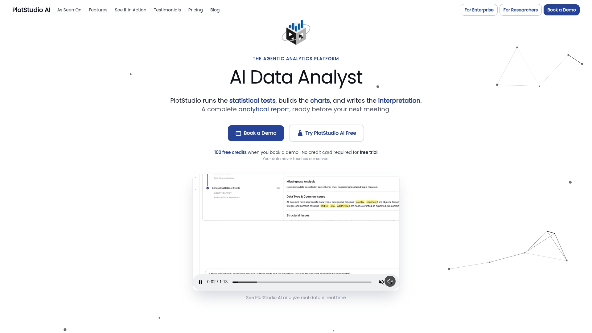
Plotstudio automates that loop. It generates the canonical diagnostic plots and matching statistical tests, re-runs them automatically after you apply a fix, and exports the full run as an annotated notebook and PDF report, so the audit trail a reviewer might ask for already exists rather than needing to be reconstructed after the fact. Because analysis runs locally on your own machine, it’s also a workable option for IRB-governed or otherwise restricted datasets that can’t go to a cloud tool. If your diagnostics workflow is starting to eat more time than the actual analysis, Plotstudio’s enterprise platform is worth a look, and research teams can check the research partnership program for credits to try it against a live dataset.
Frequently Asked Questions
What is the fastest way to run regression diagnostics on a new model? Start with the residuals vs. fitted plot and a QQ plot, since together they catch the majority of linearity, heteroscedasticity, and normality problems in under a minute. Follow with VIF and, if your data is time-ordered, Durbin–Watson.
Do I need every diagnostic test for every regression model? No. Cross-sectional data doesn’t need Durbin–Watson, and a model with only one or two predictors rarely has a meaningful collinearity problem worth a VIF check. Match the test battery to your data structure rather than running everything by default.
What VIF value means I have a collinearity problem? A VIF above 5 is a common caution threshold, and above 10 is widely treated as a clear problem. Neither is an absolute cutoff; interpret VIF alongside whether the inflated predictor is one you can afford to drop, combine, or center.
Can I just delete outliers to fix my regression diagnostics? Automatic deletion is discouraged. Investigate whether a flagged point reflects a data-entry error first, and if it’s legitimate, report a sensitivity analysis comparing the model with and without it rather than silently removing it.
How is diagnostics for logistic regression different from OLS? Logistic regression uses deviance or Pearson residuals instead of raw residuals, and adds GLM-specific checks like the Hosmer–Lemeshow test for calibration and ROC/AUC for discrimination, alongside adapted versions of Cook’s distance and DFBETAS for influence.
Why do my diagnostic tests flag problems that don’t show up clearly in the plots? Large samples give statistical tests enough power to detect trivial deviations that have little practical effect on inference. Weight visual patterns and effect size alongside the p-value rather than treating any significant test result as automatically disqualifying.
Sources
A handful of sources cover this material with enough rigor to serve as your primary references, whether you need the formulas, worked code, or the underlying theory.
- Regression with Stata Chapter 2 – Regression Diagnostics (UCLA/Stata webbook)
- Testing for Autocorrelation and Residual Plots (Duke/Robert Nau)
- Regression Diagnostics with R (University of Wisconsin–Madison SSCC)
- Regression Diagnostics (NIST Dataplot documentation)
- Residuals and regression diagnostics: focusing on logistic regression (PMC/peer-reviewed article)