A scatter plot and regression line answer a practical question fast: when two numeric variables move together in noisy data, what pattern is there, and how much of it can a straight-line model summarize? If you're staring at a cloud of points and wondering whether it supports explanation, prediction, or neither, that paired view is the starting point. In PlotStudio, this kind of work fits naturally into agentic analytics because the system can inspect the pattern, fit the model locally in Python, check assumptions, and save the full analysis as a reproducible page rather than leaving you with a one-off chat reply.
Table of Contents
- What a Scatter Plot and Regression Line Actually Shows
- How to Read a Scatter Plot Like an Analyst
- How the Regression Line Is Estimated and What It Means
- When to Use a Regression Line and When to Avoid It
- Diagnostics That Validate Your Regression Line
- Production Ready Workflow for Plotting and Analysis
- Frequently Asked Questions About Scatter Plots and Regression Lines
What a Scatter Plot and Regression Line Actually Shows
You probably have a dataset open right now where one variable might explain another: study hours and exam scores, ad spend and conversions, dosage and response, age and blood pressure. The problem isn't getting a chart. The problem is deciding whether the apparent pattern is signal or just a persuasive-looking mess.
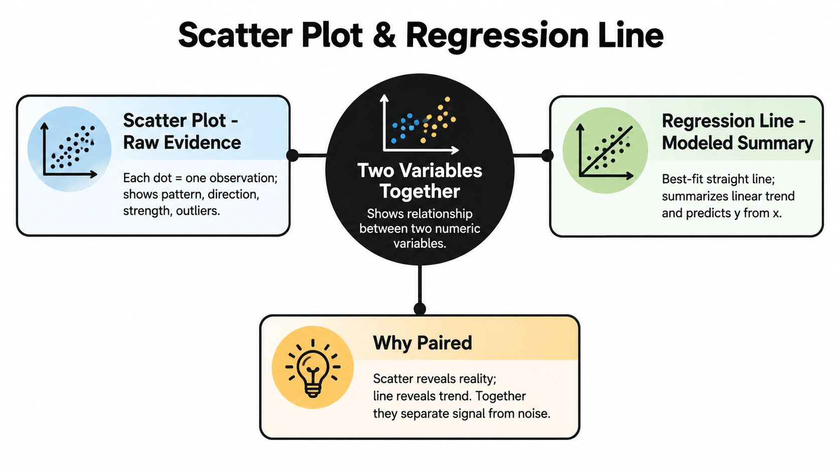
A scatter plot gives you the raw evidence. Each dot is one observation placed by its x-value and y-value. A regression line adds a modeled summary, usually a straight line that captures the average linear relationship between those two variables.
Two jobs in one view
These two elements belong together because they answer different parts of the same question.
- Scatter plot as evidence: It shows whether points rise, fall, cluster, curve, or break into subgroups.
- Regression line as summary: It compresses that cloud into an interpretable trend.
- Combined view as judgment tool: It lets you see whether the summary respects the data or hides something important.
If you want a practical primer on the descriptive side alone, this guide on what scatter plots are used for is a good companion.
What this view can answer, and what it can't
Used well, a scatter plot and regression line can help you answer questions like:
- Association: Do higher x values tend to go with higher or lower y values?
- Form: Does a straight line look reasonable, or is the pattern curved?
- Approximate prediction: If x changes, what y values seem plausible on average?
It can't establish causality on its own. It also can't rescue a poor variable choice, missing context, or hidden subgroup structure.
Practical rule: Trust the dots first, then the line. If the line tells a cleaner story than the data support, the model is oversimplifying.
There's also useful historical context here. The modern regression line traces back to the 1800s. Adrien-Marie Legendre published the method of least squares in 1805 for comet-orbit estimation, Carl Friedrich Gauss later tied the same idea to error theory and the normal distribution, Francis Galton introduced the term regression in 1886 while studying parent-child heights, and Karl Pearson formalized the correlation coefficient in 1896, giving scatter plots a quantitative companion for measuring linear association, as summarized in this historical overview of least-squares regression.
How to Read a Scatter Plot Like an Analyst
Before you fit anything, read the plot as if no model exists yet. Analysts who skip this step often end up interpreting a line that shouldn't have been drawn.
Start with axes and scale
First, check what each axis measures and in what units. A one-unit increase in temperature means something different from a one-unit increase in revenue, and compressed axes can make weak relationships look dramatic.
Then ask whether each dot represents one person, one firm, one experiment, or one time period. That determines what the cloud means.
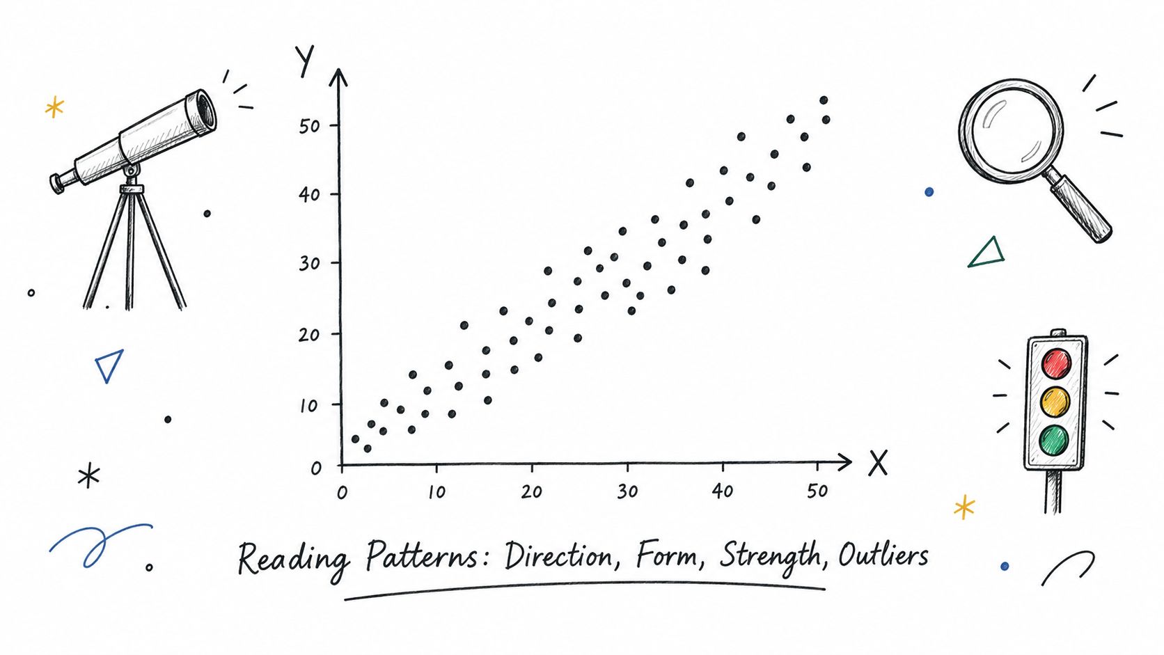
Scan for four visual cues
I usually read scatter plots in this order.
- Direction: Do points trend upward, downward, or nowhere obvious?
- Form: Does the cloud look roughly straight, clearly curved, or segmented into clusters?
- Spread: Is the vertical scatter around the trend tight in some regions and wide in others?
- Unusual points: Are there outliers, isolated clusters, or edge points that may dominate the pattern?
A simple analogy helps. Think of the dots as footprints in snow. You're trying to infer the path someone walked, but you also want to know whether there were detours, slips, or two different people crossing the field.
Decide whether linearity is plausible
A linear summary makes sense when the cloud looks like a tilted band. It makes less sense when the pattern bends, levels off, or turns around.
A scatter plot isn't just a picture. It's a model selection check done with your eyes.
That matters in real work. Suppose you're examining customer tenure versus monthly spend. If long-tenure customers flatten out at a spending ceiling, a straight line may understate early growth and overstate later growth. If you're looking at dosage versus biological response, the relationship may rise sharply then plateau. The chart should tell you that before the software does.
Watch for hidden groups
Many bad interpretations come from pooled data. A cloud may look weak overall but split into clear subgroups by region, treatment arm, device type, or cohort.
Here are quick signs that grouping matters:
- Parallel bands: Same slope, different baseline levels.
- Distinct clusters: Multiple populations mixed together.
- One dense core plus sparse extremes: Most observations follow one pattern, edge cases another.
A fast visual checklist
When I open a fresh scatter plot, I ask:
- Are both variables numeric and meaningfully paired?
- Does the cloud suggest a single relationship or several?
- Would a straight line describe the middle of the data?
- Would any one point materially change the impression?
If you can't answer those questions comfortably, don't move to interpretation yet. Stay with description until the plot itself makes sense.
How the Regression Line Is Estimated and What It Means
Once the scatter suggests a roughly linear pattern, the regression line gives you a disciplined summary. The most common version is ordinary least squares, often shortened to OLS.
Least squares in plain language
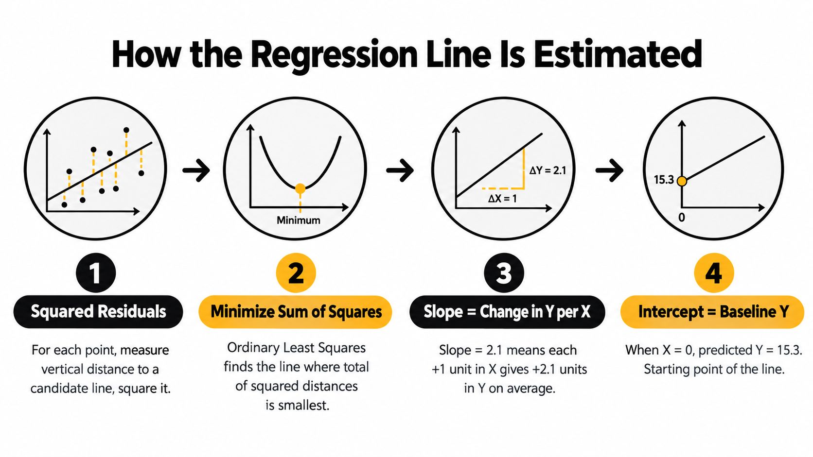
For every candidate line, each point sits some vertical distance above or below it. That distance is the residual. OLS chooses the line that makes the total squared residuals as small as possible.
Squaring does two things. It prevents positive and negative residuals from canceling out, and it penalizes large misses more heavily than small ones.
Later, if you're reviewing a fitted model output, this guide on how to interpret regression results is the next thing to keep nearby.
A short visual explanation helps here:
The coefficients people actually use
A fitted line is usually written as:
predicted y = intercept + slope × x
That gives you three concepts to interpret carefully.
- Slope: The expected change in y for a one-unit increase in x, on average, within the observed range.
- Intercept: The predicted y when x equals zero.
- Residual: The difference between an observed value and the value predicted by the line.
The slope is often the main business or research quantity. If x is hours studied and y is exam score, the slope says how much score changes on average per additional hour. If x is price and y is demand, the sign and magnitude of the slope matter, but only in the units you've chosen.
What R² means, and what it doesn't
R² tells you how much variation in y the linear model accounts for in a descriptive sense. It does not prove that x causes y. It also doesn't tell you whether the model form is appropriate, whether key variables are missing, or whether predictions will generalize well.
Interpretation shortcut: Slope answers "how much does y change with x?" R² answers "how much of y's variation does this line capture?"
That's why a model can have a meaningful slope and still have wide uncertainty for individual predictions.
Prediction is not the same as explanation
Regression lines are often used for prediction, but only within limits.
| Term | What it describes | Common mistake |
|---|---|---|
| Fitted value | Average predicted y at a given x | Treating it as a guaranteed outcome |
| Interpolation | Predicting within the observed x range | Usually reasonable if diagnostics support it |
| Extrapolation | Predicting beyond the observed x range | Often unjustified |
One more historical note matters here. A classic empirical foundation for regression came from Galton's height data and Pearson's later analyses. One historical source notes Pearson's work with 1,078 fathers and sons, while Galton's scatter-based observations showed regression to the mean, where extreme parent heights tended to move closer to the average in the next generation. That pattern is part of the conceptual basis for fitting a regression line through a scatter plot to summarize direction, strength, and prediction, as described in this historical lecture note on Galton and Pearson.
When to Use a Regression Line and When to Avoid It
A regression line helps when it clarifies the data. It hurts when it imposes a straight story on a curved or unstable pattern.
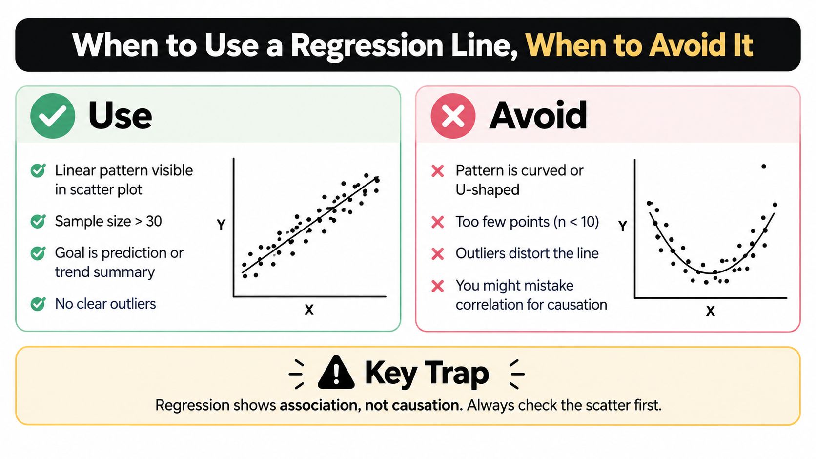
Situations where the line earns its place
Use a regression line when the scatter plot shows a reasonably consistent linear pattern and your goal is summary or prediction. It can also work well as a first-pass benchmark before you test richer models.
Good use cases include operational forecasting, calibration curves, and exploratory checks of whether a proposed relationship is directionally plausible.
Situations where it misleads
Avoid adding a simple line when the data are clearly curved, split into distinct subgroups, or dominated by a few influential points. In those cases, the line may be mathematically valid but substantively wrong.
A common trap is using the line as rhetorical decoration. People see a line and infer law-like structure even when the underlying dots are chaotic.
Should You Add a Regression Line
| Data Pattern | Add Regression Line | Better Alternative |
|---|---|---|
| Roughly straight upward or downward band | Yes, often useful | Keep the line, then check residuals |
| Clear curve or plateau | Usually no | Transform variables or fit a nonlinear model |
| Distinct clusters by subgroup | Not as a single pooled line | Fit separate lines or stratify the plot |
| Strong outliers at the extremes | Only with caution | Investigate influential points first |
| Very sparse points | Often unstable | Use descriptive plotting and collect more data if possible |
Judgment beats habit
Analysts often ask for a line by default because many tools can add one in a click. That's not the right criterion.
Use this compact decision lens instead:
- If the purpose is descriptive, ask whether the line summarizes the center of the cloud.
- If the purpose is predictive, ask whether local predictions are credible across the observed range.
- If the purpose is causal, stop and ask what design supports that claim, because the line itself doesn't.
A regression line is a modeling choice, not a chart decoration.
Diagnostics That Validate Your Regression Line
Fitting the line is easy. Trusting it is the harder part.
The key idea is simple: after fitting the model, inspect what the model got wrong. Those errors, the residuals, often tell you more than the line itself.
Residual plots and pattern checks
A residual plot shows residuals against fitted values or against x. In a well-behaved simple linear model, you want residuals scattered around zero without obvious structure.
Here's what different patterns usually imply:
- Curved residual pattern: The relationship isn't linear.
- Fan-shaped spread: Variance changes across the range. That's heteroskedasticity.
- Runs or drift: There may be omitted structure, dependence, or a time pattern.
- Single extreme residual: One case may need investigation, not immediate deletion.
If you need a dedicated treatment of changing variance, this explanation of what homoscedasticity means is worth bookmarking.
Influence matters more than surprise
Some unusual points are merely odd. Others change the fitted line materially. Those are the ones to worry about.
A point can be influential because it has an extreme x-value, because its y-value is far from the trend, or both. In practice, edge observations often pull the line more than central observations.
A useful workflow is:
- Fit the baseline model.
- Inspect residual diagnostics.
- Refit after investigating suspect points, not blindly removing them.
- Compare whether substantive conclusions change.
Confidence bands and prediction bands
This distinction confuses a lot of otherwise careful readers.
A confidence band describes uncertainty around the estimated mean trend. It answers: if x were fixed here, how uncertain are we about the average y?
A prediction band is wider because it describes uncertainty for a new individual observation. It answers: if a new case arrives at this x, what y range is plausible?
| Band type | Refers to | Typical width |
|---|---|---|
| Confidence band | Mean response | Narrower |
| Prediction band | New observation | Wider |
They usually widen near the edges of the data because the model has less support there. You're estimating where the line goes with fewer nearby observations.
Use confidence bands when discussing the trend. Use prediction bands when discussing what one future case might look like.
What to do when assumptions fail
Diagnostics don't exist to shame the model. They tell you what adjustment is needed.
- Nonlinearity: Try transformations, splines, or a nonlinear specification.
- Heteroskedasticity: Use standard errors or a model better matched to the variance structure.
- Influential points: Investigate data quality, subgroup structure, and whether the point is substantively special.
- Non-normal residuals: Focus on whether inference is affected, not whether the histogram looks textbook-perfect.
That's the difference between plotting for appearance and analyzing for decisions.
Production Ready Workflow for Plotting and Analysis
A production workflow starts with a practical question. You receive an updated dataset on Monday, your manager asks whether the relationship still holds, and by Friday someone else needs to reproduce the chart, the model, and the decisions made along the way. A scatter plot with a fitted line is only useful if that chain can be rerun and inspected.
The working pattern is simple: inspect the relationship, fit the model, stress-test it, then package the result so another analyst can verify it. Good analysis works like lab notes. The figure matters, but the record of how you got there matters just as much.
A practical Python path
In Python, that usually means four layers of work.
- Prepare the data. Check types, missing values, duplicates, and any filtering rules.
- Fit the model. Estimate the line on a clearly defined dataset.
- Validate the fit. Review residual plots and interval estimates before treating the line as decision-ready.
- Export the artifact. Save the figure, model summary, and code so the result can be rerun later.
For the presentation layer after the analysis is sound, this guide to data visualization best practices is a useful reference.
Here is a compact example with pandas, seaborn, matplotlib, and statsmodels:
import pandas as pd
import seaborn as sns
import matplotlib.pyplot as plt
import statsmodels.api as sm
from statsmodels.sandbox.regression.predstd import wls_prediction_std

df = pd.read_csv("data.csv").dropna(subset=["x", "y"])

X = sm.add_constant(df["x"])
model = sm.OLS(df["y"], X).fit()

# fitted values
df["y_hat"] = model.predict(X)

# prediction intervals
prstd, iv_l, iv_u = wls_prediction_std(model)

# scatter + line
fig, ax = plt.subplots(figsize=(8, 5))
sns.scatterplot(data=df, x="x", y="y", ax=ax)
ax.plot(df["x"], df["y_hat"], color="black")

# prediction band
order = df["x"].argsort()
x_sorted = df["x"].iloc[order]
ax.fill_between(x_sorted, iv_l[order], iv_u[order], alpha=0.2)

ax.set_title("Scatter Plot with Regression Line")
plt.tight_layout()
plt.show()
This code is a starting point, not the finished workflow.
Two details often trip people up. First, the line should be plotted on sorted x values, or it can zigzag visually even when the model is correct. Second, production analysis usually computes confidence intervals and prediction intervals separately, then saves residual diagnostics as their own figures so the main chart stays readable.
Where manual coding gets slow
The hard part is rarely writing sm.OLS(...). The hard part is making judgment calls consistently.
A real project raises questions like these:
- Which missing values reflect bad collection, and which are meaningful absences?
- Should extreme values be investigated, capped, modeled separately, or left untouched?
- Does the apparent line hold across the full range, or only in one region of the plot?
- If a colleague reruns the notebook next week, will they get the same filtered data and the same figure?
That is why scatter plot analysis works better as an investigative workflow than as a single chart command. You move from pattern to prediction to verification. The plot suggests a relationship. The regression line summarizes it. Residual diagnostics check whether that summary is trustworthy enough to support action.
Local, reproducible analysis with PlotStudio
PlotStudio AI fits into that workflow as a local, reproducible analysis environment rather than a chart generator. You can upload a dataset, review or edit the plan, run Python, inspect outputs, and keep the resulting charts, code, and statistical summaries together as one analysis record.
That setup is useful for regression work because the main risk is not failing to draw a line. The risk is losing the reasoning around the line. An analyst may revisit a model weeks later and need to confirm why certain rows were excluded, whether the fitted relationship changed after cleaning, and what the residual checks looked like at the time.
Agentic analytics helps with that audit trail. A chat assistant may produce a plotting snippet. An agentic system handles the larger loop: plan the task, run the code, review results, revise when diagnostics show a problem, and preserve the full sequence as a reusable artifact.
An independent review by The Effortless Academic describes this style of analysis as closer to a personal data analyst workflow for research tasks such as data-quality review and figure generation. That framing fits regression analysis well. The job is not only to produce a clean chart, but to preserve a method someone else can inspect and reproduce.
Frequently Asked Questions About Scatter Plots and Regression Lines
A scatter plot often starts the investigation, but the questions usually arrive after the chart is on the screen. Can you trust the slope? Does the shaded band describe the mean response or a future case? What should you do when one unusual point seems to pull the whole line sideways? These are the questions that separate a quick visual from an analysis you can defend.
Can a scatter plot and regression line prove causation?
No. A scatter plot and its fitted line show association between variables under the model you chose. Causal claims require a design that addresses confounding, timing, selection, and alternative explanations.
A useful practical test is this: if you changed x on purpose, do you have a reason to expect y would change because of that intervention, rather than because both variables are reacting to something else? The chart alone cannot answer that.
What's the difference between slope and R²?
They describe different parts of the model.
The slope is the rate of change. If the slope is 2, the fitted line increases by 2 units in y for each 1-unit increase in x, on average, within the range you modeled.
R² is a summary of fit. It describes how much of the variation in y is captured by the linear model in a descriptive sense. A model can have a meaningful slope and still have a modest R² if the data are noisy. It can also have a high R² and still be poorly specified if the relationship is curved or driven by a subgroup.
Slope answers, "How much does the fitted mean change?" R² answers, "How tightly do the points follow this linear summary?"
Should I use confidence bands or prediction bands?
Use confidence bands when you want uncertainty around the estimated mean relationship. Use prediction bands when you want the expected range for a new observation.
The distinction is easier if you picture two tasks. In the first, you want to estimate the average sales level for stores with a given foot-traffic value. That calls for a confidence band around the mean line. In the second, you want to predict next month's sales for one specific store at that traffic level. That calls for a prediction band.
Prediction bands are wider because they include two sources of uncertainty: uncertainty in the fitted line and the ordinary scatter of individual points around that line.
What should I do if one outlier changes the regression line a lot?
Treat it as an investigation, not a cleanup step.
First, confirm the row is valid. A misplaced decimal or unit mismatch can create a false outlier. Next, check whether the point belongs to a different process or subgroup. A wholesale customer mixed into a retail dataset can bend the line for a reason that has nothing to do with error.
If the point is real and relevant, keep it in the analysis and report its influence. Then compare models with and without it, inspect residuals, and explain the consequence for decisions. Influence is not the same as mistake.
Does a regression line always belong on a scatter plot?
No. If the pattern is clearly curved, segmented, or driven by a few clusters, a straight line can hide structure instead of clarifying it. In that case, the better workflow is to start with the scatter plot, test the linear assumption, then choose a different model or transform the variables.
That is why analysts move from pattern to prediction to verification. The line is only one step.
For teams doing this repeatedly, PlotStudio AI can keep that workflow in one reproducible record: chart, Python, fitted model, residual checks, and revisions prompted by diagnostics. The research partners program is also available at PlotStudio's research partners page.