Julius AI vs PlotStudio AI: Which Is Better for Real Data Analysis?
- One tool produced an analysis. The other produced a summary. PlotStudio documented cleaning, defined an explicit comparison group, ran proportional tests, caveated by sample size, and ended with an actionable strategy. Julius listed counts of what appeared in the group — no cleaning, no comparison, no caveats.
- Before you ask a single question, PlotStudio already:— scored the data (Clean / Usable / Needs Cleaning)— classified missingness (MNAR, MAR, MCAR per column)— wrote an executive summary of the dataset— rendered a full column explorer with distributions and correlationsJulius showed an empty chat.
- Because Julius never ran a comparison, it missed a counterintuitive finding PlotStudio surfaced: fences are actually less common in the outlier group than in the rest. Counts don’t tell you that. Comparisons do.
- PlotStudio’s Quick Analysis mode matches Julius on speed — so you don’t have to choose between the tools. One tool, whichever depth the question calls for.
Julius was tested on its free tier — Julius 1.1 Lite. To give Julius the benefit of the doubt, we downgraded PlotStudio too: instead of running our Deep Reasoning mode, we used our weaker Standard Reasoning. Julius got the weakest PlotStudio we have.
Same dataset. Same question. Same moment.
We gave Julius AI and PlotStudio AI the exact same CSV and the exact same question. What came back wasn’t just different answers — it was two fundamentally different kinds of output. One tool produced an analysis. The other produced a summary. That distinction is the whole story, and it’s what this article is about.
Why We Ran This Test
There are dozens of AI data analysis tools on the market right now, all making similar promises: upload your data, ask a question in plain English, get instant insight. But promises are easy. What actually matters is the quality of the analysis — especially when someone is going to make a real decision based on it. (For a broader view of why this matters, see our piece on agentic analytics and the future of the data analyst role.)
We wanted to answer a simple question: if you give two AI analytics tools the exact same dataset and the exact same question, do you get the same answer?
The answer turned out to be no. And the reason why tells you everything about the difference between a chatbot that summarizes data and a tool that actually analyzes it.
The Setup: Same Data, Same Question
Dataset: Ames Housing Dataset — 1,460 residential home sales with 81 features including quality ratings, square footage, neighborhood, and sale price.
The question:
“Which houses with below-average overall quality still command top quartile sale prices, and what unusual features do they have?”
Both tools received the same CSV. Both received the same question. Both were run at the same time. Here’s what happened.
Before the Analysis Even Starts
This is where the first major difference shows up — before either tool has answered a single question.
Julius AI: Waits for You to Ask
Julius AI accepted the upload and waited for a question. Clean interface, fast to get going. That’s it. No profiling, no quality assessment, no column-level intelligence — just a chat window and a cursor.
PlotStudio AI: Already Working
PlotStudio AI didn’t wait. Within 35 seconds of upload, before a single question was asked, it had streamed two complete documents to the screen: a Data Cleaning Assessment and an Executive Summary with Analytical Value Assessment.
This is the thing Julius doesn’t do. Here’s a compact view of what actually appeared on the screen in those 35 seconds:
| Document | Section | What PlotStudio delivered on the Ames dataset | Julius |
|---|---|---|---|
| Cleaning | Overall Assessment | “Usable but not fully clean” — 6.62% missing, no dupes, Id intact, dtypes correct. | Not generated |
| Cleaning | Missingness Analysis | 11 columns classified: PoolQC 99.5% MNAR, LotFrontage 17.7% MAR, Electrical 0.1% MCAR, etc. | Not generated |
| Cleaning | Columns of Interest | Every flagged column with a one-line reason and recommended handling. | Not generated |
| Cleaning | Data Cleaning Actions | 11 actions with priority + column + rationale (9 recommended, 2 critical). | Not generated |
| Cleaning | Completion Guarantee | Executing the plan brings the dataset to “Clean” status, no critical loss. | Not generated |
| Summary | Overview | Cross-sectional, 81 columns, individual home sales. | Not generated |
| Summary | Temporal Coverage | 2006–2010, year + month granularity, no gaps, non-longitudinal. | Not generated |
| Summary | Column Categories | 6 themes: Location, Structure, Interior, Basement/Garage, Outdoor, Transaction. | Not generated |
| Summary | Scope & Limits | Residential only, one locality, no demographics, no coordinates. | Not generated |
| Analytical Value | Important Columns | 15 high-signal columns named with why each matters. | Not generated |
| Analytical Value | Interpretation Gotchas | 5 pitfalls: missing-as-absent, skew, multicollinearity, dominant categories, short window. | Not generated |
| Analytical Value | Audience Framing | Who cares, what language, what charts, and what NOT to present. | Not generated |
| Analytical Value | Story Angles | 3 hypotheses: Quality vs. Size, Neighborhood × SaleCondition, Remodel × Kitchen offset. | Not generated |
Thirteen sections. Real column names. Specific numbers. Before you asked a single question. Julius, by contrast, showed you the raw CSV in a table viewer and waited.
And That’s Just the Start — The Data Explorer
The profiling is only the headline. Click into the Data Explorer and PlotStudio shows you the full picture of your data, column by column, before you ask a single thing:
- Column-level intelligence: type detection, unique value count, completeness bars (green/yellow/red), and per-column summary statistics (min, max, mean, std, skewness) for every numeric column
- Distribution charts rendered automatically for every column — histograms for numeric, top-N value bars for categorical
- Top values tables with counts and percentages for every categorical column
- Hover analytics on any column header for an instant quick-peek without opening the full profile
The Relationships Explorer — A Full EDA You Didn’t Ask For
Click the Relationships tab and PlotStudio turns the dataset into a browsable relationship map. Pick any column on the left — every other column is ranked by how strongly it relates to it, split into numeric vs. categorical, with a strength score next to each. Click any pair and PlotStudio picks the right visualization automatically:
- Numeric × numeric renders a scatter plot with a fitted regression line, marginal histograms on both axes, and a stats panel showing correlation score, R² / variance explained, sample size, “per unit increase, Y changes by X”, and typical prediction error. Example from the Ames dataset: YearBuilt × GarageYrBlt — correlation 0.8959, 88.2% of variance explained, prediction error ±10.0 years.
- Numeric × categorical renders a per-category box plot with overlaid points, plus a group-statistics table on the right showing mean/median/spread per category. Example: Neighborhood × YearBuilt, with group stats laid out neighborhood-by-neighborhood.
- Distribution by group panel sits below every chart — overlapping histograms so you can see not just the central tendency but the full shape of the relationship.
- Adjusted sample size and % rows used are reported per pair, so you know when missingness has thinned the dataset for that comparison.
This is a full exploratory data analysis dashboard — scatter, regression, grouped statistics, marginal distributions, variance decomposition — rendered for every pair of columns, available on click. No notebook. No code. No AI prompt.
And if you want to see where the data is missing, one click renders a missing-data heatmap across the entire dataset:
And Then There’s the Question Itself
Julius doesn’t just leave the data untouched — it leaves you untouched too. Staring at a blinking cursor, trying to figure out what’s worth asking. PlotStudio populates dozens of dataset-specific suggested questions across six categories the moment profiling finishes — each one referencing actual column names in your data and runnable in a single click.
| Category | What it covers | Example question (from the Ames dataset) |
|---|---|---|
| 🧹 Clean or Transform | Data preprocessing actions | “Fill MNAR categoricals (PoolQC, Alley, Fence) with a "None" category” |
| 🔍 Explore & Discover | Distributions, missingness, categories, correlations, outliers, temporal patterns | “How strongly are garage size and the number of cars it holds related?” |
| 📈 Business Analytics | Trends, KPIs, segmentation, neighborhood & home-age effects | “Which neighborhoods generate the highest average home sale prices?” |
| 🧪 Statistical Analysis | Hypothesis tests, correlations, causal evidence, outlier influence | “Does the overall quality rating have a statistically significant effect on sale price?” |
| 🤖 Predictive Modeling | Classification, forecasting, optimization, early-warning indicators | “Can we classify houses into underpricing risk categories based on remodel year, condition, and neighborhood?” |
| 🔮 Hidden Insights | Surprising patterns, paradoxes, non-obvious connections | “Are there cases where older homes with recent remodels sell for more than brand-new builds without remodeling?” |
Each category is split into sub-themes (e.g. Distribution and Spread of Key Features, Missing and Sparse Data Patterns, Correlations and Relationships Between Features) with 3–4 questions each, plus a “Generate more” button if none of them are quite right. Every question references real column names from your CSV — not generic placeholders.
Julius asked “what do you want to do?” PlotStudio had already done something. What a tool does before you ask a question reveals whether it’s built for data analysis or built for chat. A real analyst doesn’t wait to be asked — they profile the data first. (This is the same design philosophy we wrote about in the emotional trust gap in AI analytics — showing the work is what builds trust.)
Analysis vs. Summary: The Real Difference
Here are both reports side-by-side — the answers before the breakdown. Scroll through each, then keep reading for exactly where the analysis falls apart.
If you skim the two PDFs, the first thing you notice is how different they feel. One reads like a research report. The other reads like a blog post.
That’s not stylistic. It’s structural. Julius AI produced a summary. PlotStudio AI produced an analysis. Those are two different things — and the gap between them is the whole story of this test.
What a Summary Looks Like
Julius’s 5-page output reads like a well-written observation. It opens with a narrative (“The answer reveals 37 homes that defy expectations...”), tallies the most common neighborhoods, lists features that appeared frequently in the group (11 homes had multiple fireplaces, 8 had big living areas), spotlights a few extreme examples, and closes with four bullet points under “Key Takeaways.”
Every number in the report is a count. There is no comparison group. There is no documented cleaning step. There are no caveats. The recommendation at the end — “Quality scores alone are an incomplete picture of home value” — is a restatement of the question. It describes what’s in the group. It doesn’t explain why those features matter or whether they’re actually distinctive.
What an Analysis Looks Like
PlotStudio’s 7-page output is structured the way a data scientist would structure a report. Each section has a job, and the output earns every conclusion with a method you can follow:
| Section | What it does |
|---|---|
| Groundwork — Analytical Sample Defined | Documents cleaning: dropped rows with missing MasVnrArea/Electrical, recoded MNAR categoricals as None. 1,460 → 1,451 homes. |
| Group Definitions | Explicitly defines two groups: 36 outliers (below-mean quality + top-quartile price) vs. 873 comparison homes (below-mean quality, rest of the price range). |
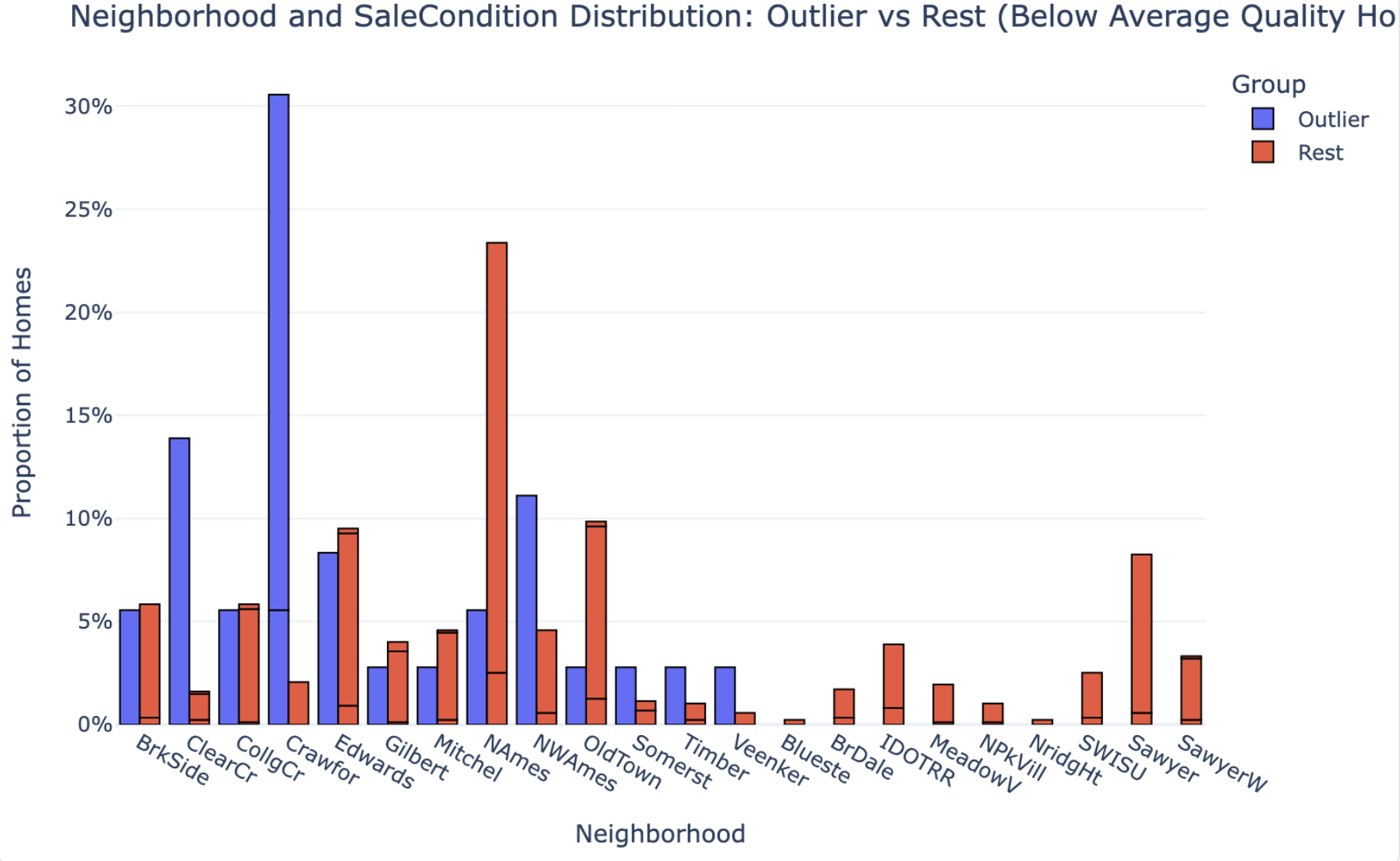
| Key Patterns & Observations | Runs proportional comparisons on 8 features, box-plot distribution comparisons on 5 size features, and neighborhood distributions — outliers vs. comparison group. |
| Interpretation & Implications | Translates the statistical evidence into a causal story: what drives the price premium, what amplifies it, and what doesn’t matter. |
| Caveats | Flags that n=36 is too small for granular neighborhood claims. Notes timing is a multiplier, not a primary cause. |
| Strategy Recommendation | Concrete actionable guidance for investors/sellers: where to deploy capital (finished space, post-2000 remodels, 2+ car garages) vs. what not to chase. |
A summary tells you what’s in the group. An analysis tells you why it’s in the group and what to do about it. Julius delivered the first. PlotStudio delivered the second.
The 37 vs. 36 Gap Is Evidence of the Difference
The two tools didn’t even agree on how many outlier homes exist in the dataset. Julius found 37. PlotStudio found 36. Same CSV, same question — but one tool worked on raw data and the other worked on a cleaned analytical sample:
- PlotStudio filled MNAR (Missing Not at Random) categorical fields — fields where missingness means absence, like pools or alleys — with an explicit
Nonecategory - Dropped rows with missing
MasVnrAreaorElectricalvalues - Arrived at a clean analytical sample of 1,451 homes, down from 1,460
Julius went straight from upload to output. If it cleaned anything, it didn’t say so. And that’s the point: the one-home discrepancy isn’t the problem. The problem is that you can’t tell which number to trust — because only one of the two tools showed its work.
Depth of Comparison: Observations vs. Findings
This is where the analytical gap becomes most visible.
Julius AI: Counts Without Context
Julius AI identified features that appeared frequently in outlier homes. For example:
- 11 homes had large second floors
- 11 homes had multiple fireplaces
- 8 homes had big above-grade living areas
These are observations. They tell you what’s in the group. But they don’t tell you whether those features are unusual — because Julius never compared the outliers to the rest of the dataset.
PlotStudio AI: Proper Group Comparison
PlotStudio AI ran a proper group comparison — the 36 outliers against the 873 other below-average-quality homes — and reported actual proportions:
| Feature | Outlier % | Non-Outlier % |
|---|---|---|
| GarageCars ≥ 2 | 94.4% | 51.3% |
| Basement Quality Good/Excellent | 52.8% | 26.7% |
| Recent Remodel (≥ 2000) | 38.9% | 20.0% |
| Garage Finished Interior | 61.1% | 32.9% |
| Pool | 2.8% | 0.2% |
| Fence | 16.7% | 26.2% |
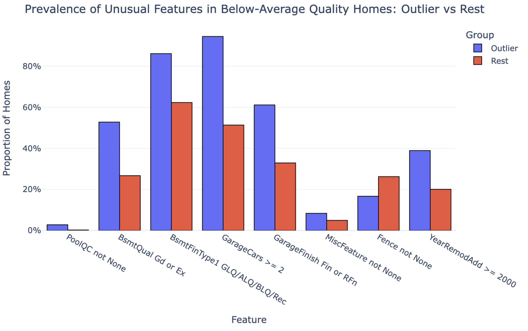
The difference in analytical approach is fundamental. Julius can tell you “11 homes have multiple fireplaces.” PlotStudio can tell you whether fireplaces actually distinguish outliers from non-outliers. Those are not the same thing.
The first is a count. The second is a finding. If the output is going to inform a decision, you need findings, not counts.
What Each Tool Missed
Every tool makes trade-offs. Here’s what each one failed to surface.
What Julius AI Missed
- The comparison group. Without benchmarking outlier features against the rest of the below-average-quality homes, you can’t know which features actually drive premium pricing vs. which just happen to be present.
- Data cleaning transparency. No documentation of what was done to the data before analysis.
- The neighborhood claim was unverified. Julius called neighborhood the “strongest card” — but never tested that statistically. It’s an assertion, not a finding.
- No sample-size caveats. Julius made confident neighborhood claims with 37 homes. With that small a subset, neighborhood-level conclusions should be caveated, not stated outright.
What PlotStudio AI Surfaced (That Julius Didn’t)
- Fences don’t matter. PlotStudio found that fences are actually less common in outlier homes than in the rest of the group (16.7% vs. 26.2%). This is a counterintuitive finding Julius never reached — because Julius never ran the comparison.
- Timing is a multiplier, not a cause. PlotStudio explicitly noted that outliers selling in stronger market years is an amplifier of their size and amenity advantages — not an independent driver. Julius didn’t address timing causality at all.
- The neighborhood finding was appropriately caveated. With only 36 homes, PlotStudio flagged that neighborhood-level claims were limited by sample size. Julius made confident neighborhood claims with 37 homes and no caveat.
Output Quality: Side-by-Side
| Metric | Julius AI | PlotStudio AI |
|---|---|---|
| Time to complete | ~1–2 min | 3m 31s |
| Pages | 5 | 7 |
| Charts | 1 | 3 |
| Data cleaning documented | ❌ | ✅ |
| Comparison group defined | ❌ | ✅ |
| Proportional statistics | ❌ | ✅ |
| Counterintuitive findings surfaced | ❌ | ✅ (fences) |
| Sample size caveats | ❌ | ✅ |
| Reproducible / auditable | ❌ | ✅ |
| Jupyter notebook export | ❌ | ✅ |
| Cleaning decisions visible | ❌ | ✅ |
| Actionable implications | Generic | Specific |
The full PDFs of both outputs are shown side-by-side in the Analysis vs. Summary section above — scroll up if you want to re-examine them after reading the breakdown.
The Final Recommendation: Generic vs. Actionable
Both tools ended with a conclusion. Here’s the difference.
Julius AI Concluded:
“Quality scores alone are an incomplete picture of home value.”
True. But this is something any real estate professional already knows. It’s a restatement of the question, not an answer to it.
PlotStudio AI Concluded:
For investors, appraisers, or sellers dealing with structurally middling properties, the data suggests a clear strategy: focus capital on finished space and visible modernization — finished basements, 2+ car garages, post-2000 remodels — rather than trying to move the overall quality rating itself. When combined with normal (non-distressed) sale timing, these upgrades can be sufficient to push even below-average-quality homes into the top quartile of sale prices.
This is a recommendation you can act on. It tells you where to spend money, what to prioritize, and what conditions need to be in place. That’s the difference between analysis and insight.
Verdict: Which Tool Should You Use?
If the only thing you cared about was speed, Julius AI is fast and produces clean-looking output. But the moment the output matters — when a client, a manager, or a decision is riding on it — the gaps become serious:
- No data cleaning documentation means you can’t defend your numbers
- No comparison group means you can’t know what’s actually significant
- No sample size caveats means overconfidence in findings that don’t support it
Here’s the part worth underlining: you don’t actually have to choose between speed and depth. PlotStudio AI ships with three analysis modes you toggle per question — so it can match Julius’s speed when you want a quick answer, and go deeper when you need a defensible report.
That means the choice isn’t “Julius for speed, PlotStudio for rigor.” It’s:
Response Only
Instant text answer, no code — for a quick read on the data, or for asking follow-up questions about an analysis you’ve already run.
Quick Analysis
Single code run with chart and stats in seconds. This is where PlotStudio matches Julius on speed.
Planned Analysis
Multi-step investigation with a written plan, cleaning, group comparisons, and a full report. The mode we used in this test.
So the honest recommendation isn’t to pick between the two tools. It’s to use PlotStudio in Quick Analysis mode when you want the Julius-style fast answer, and let it go deeper when the output has to hold up to scrutiny. One tool, whichever depth the question actually calls for.
The Takeaway
If you zoom out past the tool comparison, this test is really a reminder of what separates analysis from summary — and what separates a good analyst’s workflow from a fast one:
- Strong analysis starts before the question. Profiling the data — quality, missingness, distributions, correlations — is a core analyst step, not an optional preamble. Skip it and every downstream number is built on ground you haven’t checked.
- Real analysis requires cleaning, defined comparison groups, and statistical testing. Without all three, you’re summarizing surface patterns. A list of what’s in the group is not a finding — a comparison against the right reference group is.
- The key differentiator of a good analyst is defensible, actionable insight with clear methodology and caveats. Not just observations. Anyone can list counts; what’s rare is a report that tells you why the pattern exists, what you should do about it, and where the claim stops being safe.
Julius’s output skipped all three. PlotStudio’s output was structured around them. That’s the difference — and that’s why the same dataset and the same question produced two fundamentally different kinds of answer.
Want to see the difference on your own data?
Upload a dataset and see what agentic analytics actually delivers.