
Data quality and data security rank at 7.9 out of 10 among leading BI priorities, so business intelligence best practices should begin well before dashboard design. The ten practices below cover decision scoping, metric definitions, ingestion checks, provenance, data modeling, analytical discipline, uncertainty, reproducibility, decision-focused reporting, and governed AI-assisted analysis, including how AI tools for researchers such as PlotStudio AI can automate profiling, cleaning, and routine modeling while analysts retain judgment and validation.
Why Defensible Numbers Start Before the Dashboard
The popular advice says to build a single source of truth, choose clear charts, and enable self-service reporting. Those practices matter, but they don't solve the most common failure. Most BI disputes begin with definitions, ownership, or undocumented transformations. Two teams calculate the same metric differently, and both appear correct because nobody agreed on the underlying rules.
Business intelligence developed from decision-support systems, data warehouses, executive information systems, and analytical tools designed to connect operational data with managerial decisions. That history points to a practical conclusion: start with the decision, not the dashboard. Define what someone needs to decide, which evidence could change that decision, and who is accountable for the result. Only then should the team choose a data model, visualization, statistical method, or automation layer. The historical development of BI supports this decision-first view.
The practices below apply to enterprise BI and academic research data analysis. A public health team can use them for surveillance reporting, a clinical group can use them for trial endpoints, and a researcher can use them to defend a regression, figure, or cleaned dataset during peer review.
Practical rule: If nobody can name the decision, owner, data lineage, and validation step behind a number, the number isn't ready for publication or action.
1. Tie Every BI Initiative to a Named Decision and Owner
A BI strategy should begin with a decision inventory. For each report, dashboard, or analysis, record what decision it supports, who makes that decision, how often it occurs, and what evidence would change the choice. The owner isn't necessarily the person who builds the dashboard. It's the person accountable for interpreting the result and acting on it.
Ask one question before approving new work: What will someone do differently if this number changes? If the answer is unclear, the request may be a request for information rather than a decision-support product. That distinction helps teams avoid building large catalogs of metrics that attract attention but don't influence action. Guidance on business intelligence automation is useful when deciding which recurring analytical tasks should be automated after their purpose is clear.
A public health department might map surveillance reports to vaccine outreach allocation and retire three legacy reports with no identifiable decision owner. A clinical research group might separate trial endpoints used for interim safety decisions from exploratory secondary analyses, applying a stricter validation process to the former.
Role-based review
- BI lead: Maintain the decision inventory and review ownership quarterly.
- Domain owner: Define the action threshold and acceptable evidence.
- Research analyst: Label work as operational monitoring, exploratory analysis, or confirmatory analysis.
- Reviewer: Verify that the published output names the decision, owner, population, period, and data source.
The validation step is simple but powerful. Ask the named owner to explain the action they would take under at least two plausible result scenarios. If they can't, the work needs tighter scoping before modeling or visualization begins.
2. Maintain a Single Governed Definition for Every Metric
Metric disputes often look like technical disagreements but are usually definition disagreements. “Active user,” “response rate,” “retention,” and “household income” can all change meaning depending on inclusion rules, time windows, population, denominator, and data grain.
A governed metric dictionary stores each definition with its formula, inclusion criteria, grain, time logic, source system, calculation owner, and version history. Dashboards and analysis notebooks should reference that definition instead of recreating logic in separate SQL queries, spreadsheet formulas, or visualization layers. The same principle applies to research data. An economics team might define household income once, document imputation rules for missing values, and cite that definition in every working paper.
Tools such as LookML and dbt's semantic layer support reusable metric logic, but the technology doesn't remove the need for review. A semantic layer can standardize a bad definition just as efficiently as a good one. Start with the metrics that appear most often in executive reporting, regulatory work, or publications, then expand deliberately. A data governance framework provides a useful structure for assigning ownership and managing change.
A single source of truth isn't a single dashboard. It's a reviewed definition that every downstream output can trace back to.
Review controls
- Metric owner: Approve the business meaning and denominator.
- Analytics engineer: Store the calculation in version control.
- Researcher: Separate certified measures from exploratory derived variables.
- Reviewer: Recalculate a sample from source records and compare it with the published metric.
The validation step should include a definition challenge. Give two analysts the same source data and ask them to calculate the metric independently from the dictionary. Differences should trigger a clarification or a controlled change, not another private formula.
3. Profile and Score Data Quality at the Point of Ingestion
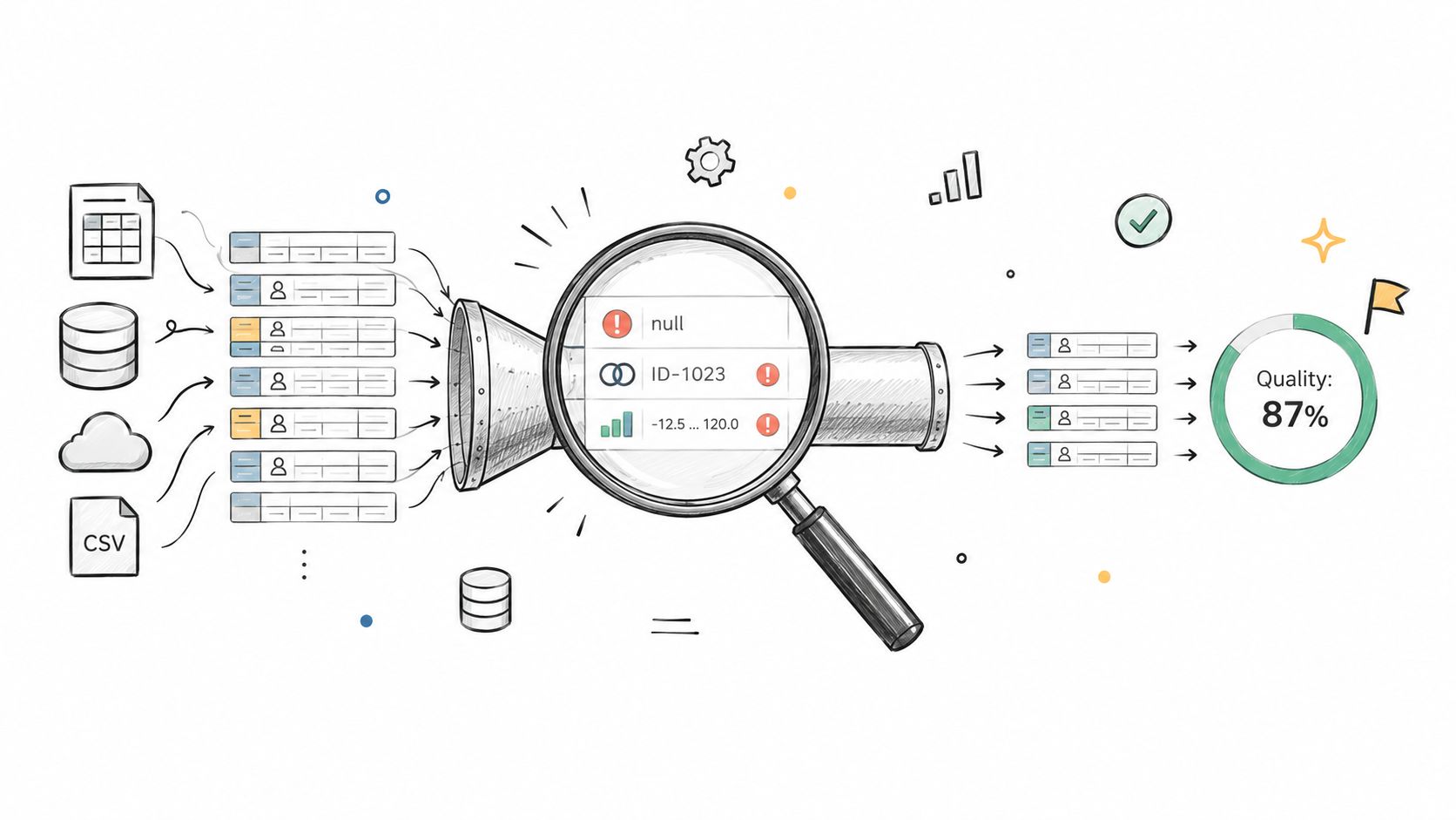
Data quality checks are most useful when they run as soon as data arrives. Waiting until a dashboard breaks or a manuscript reaches peer review turns a routine ingestion problem into an expensive investigation. A useful profile records row counts, data types, missingness, ranges, duplicate keys, invalid values, and distribution changes.
A clinical registry might profile every monthly extract and flag a sudden increase in missing blood pressure values at one site. The team could then trace the issue to a changed data-entry form before the values enter a model. An agricultural trial workflow might check that every plot ID appears exactly once per replicate before running ANOVA, catching a duplicated field-book entry at the correct stage.
The Global Data Quality Benchmarking initiative uses standardized metrics and pseudonymized samples to compare data quality across organizations. One reported benchmark found that general B2B data had a 15.3% pre- and in-survey removal rate. That figure doesn't predict the quality of every dataset, but it demonstrates why teams should quantify rejected and excluded records rather than hiding them in a final score. The benchmarking report also supports reporting denominators, time windows, and rejection reasons.
Quality checks by role
- Data engineer: Keep raw data immutable and make cleaning steps rerunnable.
- Analyst: Record whether missingness appears compatible with MCAR, MAR, or MNAR assumptions.
- Domain specialist: Decide whether an invalid value is impossible, unusual, or plausible.
- Reviewer: Inspect numerator, denominator, sampling period, exclusion rules, and rejection reasons.
Use a data quality scorecard to make these checks visible. The validation step is a pre-analysis gate: no model or dashboard should run until critical flags have an owner disposition.
4. Document Metadata, Lineage, and Provenance Using FAIR Principles
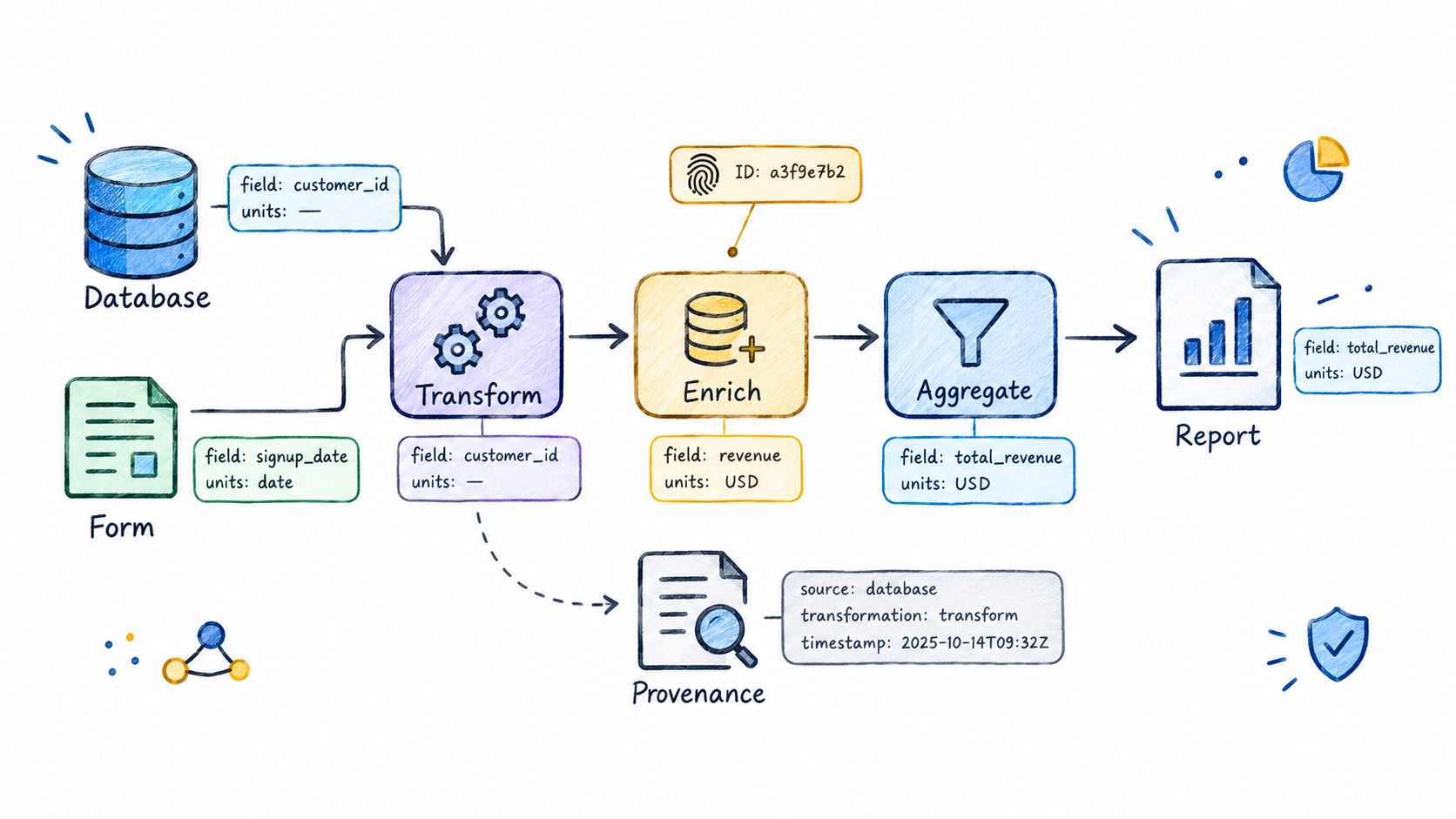
A published number needs more than a source-system name. Reviewers need to know which version of the data was used, what transformations occurred, what each field means, and how the final value connects to the original observation. Lineage answers where a number came from. Provenance records the history of decisions and transformations. Metadata explains units, definitions, collection context, and limitations.
The FAIR principles, Findable, Accessible, Interoperable, and Reusable, were published in 2016 and offer a practical framework for both research data and enterprise BI. The principles don't require every dataset to be public. They require teams to make permitted data discoverable, interpretable, and usable by authorized people.
A multi-site cohort study might assign persistent participant IDs and log each harmonization step, allowing a reviewer to trace a hazard ratio back to raw intake forms. A government statistics team might publish a codebook with every release so secondary analysts can interpret revised category codes correctly. Data lineage and provenance should be treated as related controls, not interchangeable labels.
What to preserve
- Data steward: Attach the data dictionary to the dataset or release package.
- Engineer: Generate lineage automatically where possible.
- Research analyst: Record manual transformations in code comments or a changelog.
- Reviewer: Confirm that the dataset version, code version, and output version identify the same analytical run.
For comparative work, even external inputs need provenance. A project using wine market data should record the source release, extraction date, geographic scope, and any harmonization applied before comparison.
5. Model Data for Analysis With Tidy Structures and Dimensional Design
A strong dashboard cannot repair an ambiguous table grain. Analytical structures should make observations, measures, dimensions, and relationships explicit before anyone builds a chart or statistical model.
Dimensional design separates measurable facts, such as sales, test scores, or administered doses, from descriptive dimensions, such as date, region, product, participant, or treatment. Tidy data follows a related discipline: one observation per row, one variable per column, and one observational unit per table. These structures make joins more predictable and reduce accidental double-counting.
A longitudinal study usually benefits from long-format data with participant, visit, and outcome fields. That structure supports mixed models and repeated-measures ANOVA without reshaping the data for every analysis. A retail team might define its sales fact table at order-line grain. Joining order-level totals to line-level items without documenting the grain can multiply totals.
Join validation
- Model owner: State the grain of every table in its documentation.
- Analytics engineer: Test key uniqueness, relationship cardinality, and match rates.
- Researcher: Confirm that repeated observations represent the intended unit of analysis.
- Reviewer: Reconcile totals before and after each join.
Keep wide-format tables when a reporting tool requires them, but derive them from a tidy analytical source. The validation step is a join audit. Inspect unmatched records, unexpected many-to-many relationships, duplicate keys, and aggregate totals before interpreting any result. Data warehouse architecture can help teams formalize these layers.
Product analysis follows the same logic. If a team performs product segmentation for Performance Max, it should document whether the unit is a product, campaign, customer, or transaction before comparing segments.
6. Separate Exploratory From Confirmatory Analysis and Pre-Specify Where It Matters
Exploration generates hypotheses. Confirmation tests a specified claim using a declared method. Treating an observed pattern as confirmed evidence can overstate its strength when analysts have examined many comparisons, subgroups, outcomes, or model specifications.
A clinical trial might pre-specify its primary endpoint while labeling subgroup analyses as hypothesis-generating. A BI team could identify a suspected conversion driver during exploration, then test it against a holdout month instead of presenting the discovery as proof. Both approaches retain exploration's value while keeping its evidential status clear.
Pre-specification does not prevent analysts from learning from new findings. It creates an audit trail for decisions and changes. The plan should identify the population, outcome definition, covariates, exclusion rules, statistical test, missing-data approach, and intended interpretation. Plan Mode can support a reviewable planning workflow for AI-assisted research data analysis, while the analyst remains responsible for approving the method.
A defensible separation
- Exploratory output: Label patterns as hypothesis-generating.
- Confirmatory output: Timestamp and approve the analysis plan before execution where feasible.
- Multiple testing control: Report the number of comparisons made, not only selected findings.
- Deviation record: Explain changes to covariates, exclusions, transformations, or endpoints.
The validation step is a plan-to-execution comparison. The reviewer should be able to identify the intended method, reproduce what ran, inspect each deviation, and determine whether a change affected the conclusion. That record separates a useful discovery from a claim ready for confirmation.
7. Quantify Uncertainty With Effect Sizes, Intervals, and Sensitivity Checks
A bar chart and a p-value rarely provide enough information to judge a result. Effect sizes describe magnitude, intervals describe precision, and sensitivity analyses show whether a conclusion survives reasonable changes in assumptions.
The American Statistical Association's 2016 statement on p-values emphasized that a p-value doesn't measure effect size or practical importance. A research report should therefore explain the estimate in domain units, not only as statistically significant or nonsignificant. A BI report should also show whether a difference is large enough to influence the decision it supports.
For example, a diet study might report a mean weight difference of 1.2 kg, with a 95% confidence interval from 0.3 to 2.1 kg, and show whether the estimate persists when the two most influential participants are excluded. A marketing team might present a lift estimate with an interval, then disclose that the effect disappears when it uses an alternative control-group definition. The first example illustrates how uncertainty is communicated, while the second exposes sensitivity to a design choice.
Reviewer checks
- Statistician: Select an interval appropriate to the estimand and model.
- Analyst: Report the denominator, comparison, and missing-data handling.
- Domain owner: Interpret the effect in meaningful units and decision thresholds.
- Reviewer: Request at least one reasonable sensitivity analysis for each headline result.
Place intervals on comparison charts where they can be read, not only in an appendix. The validation step is an assumption challenge: vary a defensible modeling choice, exclusion rule, or missing-data method and record whether the conclusion remains stable.
8. Make Analyses Reproducible With Versioned Code and Exportable Artifacts
Reproducibility means another analyst can rerun the workflow on the same inputs and obtain the same results. That requires more than saving a final spreadsheet. Preserve versioned code, input files, package versions, random seeds, transformation steps, figures, tables, and execution notes.
Sandve and colleagues' 2013 “Ten Simple Rules for Reproducible Computational Research” remains a practical reference for computational workflows. The underlying discipline is useful in BI as well as research. A genotype-by-environment trial package might include the Python or R script, a raw field-data snapshot, and an environment definition. A policy team might export a Jupyter notebook with its data and plots so a successor can rerun the analysis after a source migration.
PlotStudio AI is relevant here because its workflow can save an investigation as a persistent Analysis Page and expose the generated code, methodology, charts, statistics, and interpretation. That doesn't make the result automatically correct. It gives the analyst an inspectable artifact to review, export, and share.
Reproducibility gate
- Analyst: Restart and run the complete script or notebook before export.
- Engineer: Record package versions, random seeds, and input file identifiers.
- Research lead: Confirm that restricted data and derived outputs are handled under approved controls.
- Reviewer: Run the workflow from a clean environment and compare key outputs.
The validation step is a clean rerun by someone other than the original author. If the output changes, investigate whether the cause is data drift, nondeterministic code, environment differences, or an undocumented manual step.
9. Design Dashboards and Reports Around Decisions, Not Available Data
A dashboard shouldn't display every metric a warehouse can produce. It should present the evidence required for a specific decision, with enough context to prevent misinterpretation. Useful context includes targets, prior periods, denominators, comparison groups, uncertainty, definitions, and links to methodology.
A hospital operations dashboard might show one readmission rate, its 30-day trend, a risk-adjusted comparison, and a link to the case-mix method. A research figure might use a forest plot with intervals instead of a bar chart that hides uncertainty in a caption. Stephen Few's dashboard design principles emphasize meaningful comparisons and restraint, which applies equally to executive reporting and publication figures.
Accessible delivery is part of analytical quality. The University of Washington recommends pairing visualizations with a table, using a representative sample when a dataset contains more than 20 rows, and making raw data available for download where appropriate. Interactive details also need keyboard and screen-reader access. The University of Washington's data visualization guidance explains these practical requirements.
Design validation
- Report owner: Limit each page to the metrics needed for one decision.
- Designer: Use chart forms that match the analytical question and avoid decorative elements.
- Accessibility reviewer: Test keyboard navigation, screen-reader access, tables, and downloads.
- Decision owner: State the main takeaway without relying on the author's explanation.
Contrast should be tested rather than judged by eye. WCAG-oriented guidance recommends 3:1 contrast for non-text graphical elements and large text, and 4.5:1 for smaller text. Oregon's accessibility checklist provides the graphical contrast threshold. The validation step is a short comprehension test: ask a non-author to state the main decision and supporting evidence within 30 seconds.
For teams designing a decision-focused bank dashboard, this dashboard design resource offers a relevant example of aligning presentation with operational use.
10. Use Agentic Analytics and Govern AI-Assisted Analytics
Agentic analytics is data analysis performed by AI agents that can plan an investigation, execute analytical steps with real tools and code, inspect intermediate results, revise the approach, validate outputs, and synthesize a complete analysis. The distinction matters for both BI teams and researchers: an answer is an output, while an analysis is an investigation with an inspectable chain of decisions.
AI tools for researchers can profile uploaded data, identify missingness, propose models, execute Python, inspect diagnostics, generate charts, and save a reproducible analysis. PlotStudio AI supports this workflow through local Python execution, Analysis Pages, Plan Mode, domain skills, workspace insights, Jupyter and PDF export, and bring-your-own-key options. Researchers can use it as a fast assistant, but they retain responsibility for the research question, method choice, interpretation, and approval.
Governance determines whether generated work can enter a decision or publication. A global survey of 812 data leaders found that 59% had experienced business problems caused by AI hallucinations or inaccuracies during the prior year, while 80% considered an accurate but unexplainable AI decision riskier than a wrong but explainable one. The survey report supports a strict operating rule: inspect and validate generated work before using it.
Production BI also requires controls after release. Teams should monitor report logic, dashboard outputs, data freshness, and model changes rather than treating deployment as the end of review. Post-deployment testing belongs in the operating process, with named owners, documented thresholds, and an escalation path for failed checks.
Human review controls
- Analyst: Review the plan before execution, especially covariates, exclusions, and outcome definitions.
- Researcher: Read the generated code instead of relying only on the narrative.
- Privacy lead: Classify data sensitivity and map each class to permitted tools and processing locations.
- Compliance office: Confirm procurement, institutional review, and data-processing requirements before restricted data is uploaded.
- Reviewer: Require every AI-generated statistic and figure to trace to inspectable code.
A postdoc might request a Cox proportional hazards analysis on a cohort extract, review the proposed plan in Plan Mode, edit the covariate set, and export a notebook for a co-author. An academic medical center could permit local-execution AI analysis for identifiable clinical data only after its institutional review board and security office confirm the processing path. Another research group might use bring-your-own-key access to its institution's contracted model provider under existing data agreements. Each choice trades convenience against data-control, procurement, and audit requirements.
The validation step is an evidence-chain review. Confirm the input version, data-quality checks, transformations, statistical method, assumptions, generated code, diagnostics, human edits, and limitations. An inspectable workflow can still be wrong, so the team must perform pre-execution planning, post-execution validation, regression testing, and explicit uncertainty reporting.
BI Best Practices, 10-Point Comparison
| Practice | 🔄 Complexity (implementation) | ⚡ Resource requirements | 📊 Expected outcomes | ⭐ Key advantages | 💡 Ideal use cases |
|---|---|---|---|---|---|
| Tie Every BI Initiative to a Named Decision and Owner | Medium–High, cross-team governance & ongoing reviews | Moderate, stakeholder time for inventory and owners | Focused assets, reduced dashboard sprawl, measurable ROI | Clear accountability; decision-aligned scope; appropriate rigor | Organizations with many unused reports or mixed operational/strategic KPIs |
| Maintain a Single Governed Definition for Every Metric | Medium, semantic layer and change-control processes | Moderate, modeling effort, tooling, governance reviews | Consistent numbers across reports; faster reuse; audit trail | Eliminates conflicting metrics; reusability; traceability | Teams with recurring metric disputes or regulated reporting needs |
| Profile and Score Data Quality at the Point of Ingestion | Medium, automated profiling pipelines and alert tuning | Moderate, validation tooling, storage, operator time | Early detection of upstream issues; quality history; fewer incidents downstream | Catches schema/drift early; explicit missingness; cheaper fixes | Pipelines with schema drift, many sources, or frequent ETL changes |
| Document Metadata, Lineage, and Provenance Using FAIR Principles | High, cross-system lineage capture and sustained documentation | High, metadata platforms, engineers, governance overhead | Traceable provenance; faster audits; greater dataset reuse | Supports audits/regulatory needs; onboarding; reproducibility | Regulated environments, multi-site research, enterprise data sharing |
| Model Data for Analysis: Tidy Structures and Dimensional Design | Medium, upfront grain and dimensional modelling | Moderate, ETL/modeling effort and design reviews | Fewer join errors; simpler models; scalable analysis | Predictable joins; correct aggregations; simpler statistical work | Analytical teams building models or large-scale reporting pipelines |
| Separate Exploratory from Confirmatory Analysis and Pre‑Specify Where It Matters | Low–Medium, culture and process for plans and labels | Low, analyst time for pre-specification and holdouts | Reduced false positives; transparent evidence strength | Protects against overinterpretation; improves credibility | Experiments, research, and BI that surface exploratory patterns |
| Quantify Uncertainty: Effect Sizes, Intervals, and Sensitivity Checks | Medium, statistical methods and richer visualizations | Low–Moderate, analyst expertise; occasional resampling compute | Clear magnitude/precision; detection of fragile conclusions | Realistic risk communication; stronger decision support | Decisions requiring risk appraisal, experiments, and publications |
| Make Analyses Reproducible: Versioned Code, Environments, and Exportable Artifacts | Medium, version control, environment pinning, CI/containers | Moderate, devops, storage, CI, containerization effort | Repeatable results; easier audits, handover, and rework reduction | Traceability from code to figure; dependable replication | Academic research, regulated reports, long-lived analyses |
| Design Dashboards and Reports Around Decisions, Not Available Data | Low–Medium, UX, decision mapping and discipline | Low, analyst/designer time; often reduces build effort | Faster interpretation; less clutter; decision-focused actions | Improves speed & accuracy of decisions; reduces noise | Operational dashboards, executive reporting, stakeholder-facing BI |
| Use Agentic Analytics and Govern AI‑Assisted Analytics | High, orchestration of agents, reviewable plans, governance | High, compute, secure local execution, compliance and tooling | Accelerated analyses; auditable AI workflows; productivity gains | Automates routine work; visible audit trail; scales analyst capacity | Teams needing scalable automation with strict privacy/governance needs |
Turn These Ten Practices Into a Repeatable Review Cycle
The ten practices work best as a cycle rather than a one-time implementation project. Start with the decision inventory and metric dictionary, then connect each approved metric to a governed data source, quality checks, documented transformations, and a reviewable output. The order matters because downstream polish can't compensate for upstream ambiguity.
Choose two practices to start this quarter. First, write a decision inventory with named owners. Include operational monitoring, exploratory analysis, and confirmatory work as separate categories because they need different quality bars. Second, build a governed metric dictionary for the measures that appear most often in executive reporting, regulatory work, or research outputs. Store definitions in version control and require owners to approve changes.
Then add ingestion controls. Preserve raw data, profile new files, record missingness and validation failures, test keys and joins, and document every exclusion. Your quality report should show the numerator, denominator, sampling period, and rejection reason rather than a single unexplained score. A dashboard that hides rejected records can create confidence without reliability.
For research teams, the review cycle should also distinguish exploratory from confirmatory analysis. Record the plan before confirmatory work where feasible, identify deviations, report effect sizes and intervals, and run sensitivity checks on headline findings. For BI teams, the equivalent is to validate the metric against source records, test a report after deployment, and ask the decision owner whether the output changes an actual action.
AI-assisted analysis adds another layer. Require a reviewable plan, inspectable code, identifiable inputs, documented assumptions, and a human approval before a result reaches a publication, executive meeting, or operational workflow. Local execution, controlled processing paths, and bring-your-own-key arrangements can support privacy requirements, but they don't replace institutional compliance review.
Self-service BI should be measured as an operating capability, not only as a software feature. BARC evaluates self-service through linked dimensions including self-service, ease of use, flexibility, and performance. Its 2024 survey methodology included 1,136 respondents, providing a reference point for designing an internal assessment. Track whether users can complete analyses independently, whether outputs are reproducible, how often code needs correction, how quickly a question becomes a validated result, and how satisfaction differs between novice and expert users. BARC's survey methodology provides the measurement structure.
Governance also needs an operating model. BARC's global 2025 trend research, based on 1,795 data professionals, ranked data security and privacy as the leading priority and data-quality management as the second. A separate enterprise-data-governance preview found an almost even split between centralized and federated governance models, with 36% each and hybrid approaches at 29%. These findings suggest that organizations shouldn't copy an operating model without considering ownership, domain expertise, privacy, and the way analysts work.
The final review should be practical. Can a reviewer identify the decision owner? Can they reproduce the metric? Can they trace the result to a source version? Can they see excluded records and missingness? Can they inspect the code and assumptions? Can they distinguish an exploratory pattern from a confirmed finding? Can they access the evidence without relying on a mouse, inaccessible chart, or undocumented analyst explanation?
Researchers and analysts who want an AI tool that keeps code and methodology visible can try PlotStudio AI. Academic users can review researcher pricing and the academic option, which includes 1,000 free credits for researchers while that benefit is available. Use it for faster profiling, cleaning, modeling, and documentation, then apply the same human validation standards you would use for any other analytical workflow.