You're staring at a dashboard packed with funnels, cohorts, and feature events, yet you still can't answer a basic question: did the launch improve the product? Product manager analytics is less about collecting more numbers and more about connecting behavioral evidence to business decisions. This guide covers measurement, instrumentation, causal reasoning, qualitative evidence, and reproducible workflows, including where PlotStudio AI can support research-oriented analysis.
The Product Analytics Reality Check
A feature launch rarely fails because nobody tracked it. More often, the team tracks everything except the evidence needed to decide whether the feature created value. The dashboard shows adoption, sessions, clicks, and retention, but product, finance, engineering, and customer success still disagree about what “worked” means.
Product analytics has become a core product-management capability, but adoption remains uneven. In a global survey conducted by Pendo and Mind the Product in April and May 2023, more than 700 product managers and leaders responded across industries. 89% said their product department used product-analytics data, while 76% considered product analytics important or very important to decision-making. Yet only 38% identified evaluating business impact as their primary use. The Pendo and Mind the Product product analytics benchmarks report shows the gap between using analytics and using it to make defensible decisions.
The organizational split is just as revealing. Product teams were the most frequent users, but only 33% of executive-leadership teams, 42% of customer-success teams, and 23% of growth teams were reported to use product analytics. Predictive work was less mature still, with 30% of respondents using analytics to predict customer churn, including 33% among SaaS companies, according to the same report.
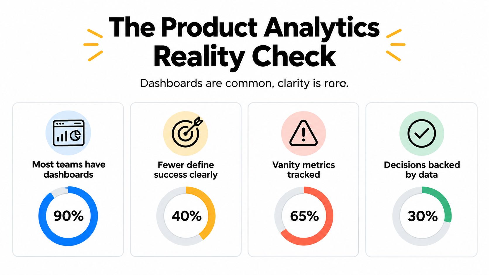
The practical lesson is uncomfortable. A dashboard can describe behavior without establishing impact, and a product team can be data-rich while remaining decision-poor. Teams evaluating whether data analysts are becoming obsolete should ask a sharper question: who validates the assumptions behind the numbers?
Practical rule: A metric becomes decision-ready only when its definition, owner, comparison point, and intended action are clear.
Core Analytics Concepts Product Managers Need
Good product manager analytics starts with a small set of concepts applied consistently. The challenge isn't memorizing metric names. It's choosing measures that match the decision in front of you.
Metrics should distinguish activity from value. A login count may indicate access, but it doesn't show whether users completed an important task. A north-star metric can summarize the product's central value exchange, while counter-metrics protect against harmful optimization. For example, a team improving activation might also monitor support requests or cancellation behavior so that a faster onboarding flow doesn't create low-quality accounts.
Funnels diagnose progression through a defined journey. A sign-up funnel might move from account creation to setup, first meaningful action, and repeated use. The useful question isn't only where users drop off. It's whether the drop-off reflects confusion, an unnecessary requirement, an unsuitable audience, or a technical failure. Break the funnel down by acquisition source, user role, plan, and device before deciding what to fix.
Retention measures continued use within a defined cohort and time window. Cohort analysis separates users who started under different conditions, which helps prevent a recent acquisition mix change from being mistaken for a product improvement. Retention is also easy to misread. A user may return without completing a valuable task, so pair return behavior with meaningful usage.
Experimentation adds a stronger basis for causal claims. In an A/B test, define the treatment, outcome, eligibility rule, analysis window, and guardrails before inspecting results. Statistical significance isn't the same as practical importance. Report effect sizes and confidence intervals, inspect heterogeneous effects, and distinguish a prespecified test from exploratory analysis.
Use exploratory data analysis in product work to discover patterns, but don't present exploratory patterns as confirmed effects. Observational data can identify associations and generate hypotheses. It usually can't prove that a feature caused a change without stronger design, such as randomization or a credible quasi-experimental approach.
Measurement and Instrumentation Best Practices
Instrumentation should begin before implementation, not after a launch has already produced ambiguous data. Define the user actions that matter, the properties attached to each event, the identity rules, and the expected sequence. Then test those events against realistic journeys, including failed attempts, retries, account switching, and users who abandon the flow.
A useful event specification answers five questions:
- Event meaning: What user or system action does this event represent?
- Actor identity: Is the event tied to a person, account, workspace, or automated process?
- Properties: Which attributes are needed for segmentation and interpretation?
- Quality checks: What validates that the event fired once and at the right time?
- Ownership: Who approves changes to the definition?

Missing values, inconsistent naming, duplicate events, and silent tracking gaps can undermine an analysis without producing an obvious error. A metric dictionary should document the numerator, denominator, population, time window, exclusions, and known biases. When the product changes, version the definition instead of rewriting historical meaning.
Reproducibility matters because stakeholders need to understand how a result was produced. Preserve the source data reference, transformations, assumptions, code, outputs, and interpretation. An Analysis Page can serve as a persistent record of that investigation, keeping methodology, charts, statistics, and narrative together rather than leaving the reasoning scattered across a dashboard, notebook, and meeting thread.
Audit test: Another analyst should be able to identify what changed, rerun the relevant steps, and understand why the team made its decision.
A practical product metrics analysis workflow should also record the date of each definition change and whether earlier results remain comparable. If a new event changes the meaning of “activated user,” label the break in the time series. Clean historical continuity is less valuable than honest continuity.
Measuring Impact When Metrics Conflict
Revenue, retention, engagement, and customer satisfaction often point in different directions. A feature can increase usage while adding support burden, improve satisfaction among existing customers while reducing short-term conversion, or raise revenue while weakening long-term retention. The product manager's job isn't to pretend these conflicts don't exist. It's to make the trade-off explicit.
A Product Focus industry survey reports that 34% of product professionals have no clear primary metric, meaning roughly one in three lacks a shared scoreboard for product decisions. The same survey reports that teams with clearly defined responsibilities hit deadlines 78% of the time, compared with 48% when responsibilities are unclear. The Product Focus Industry Survey Report connects measurement ambiguity with a broader governance problem. Teams need ownership and decision rights, not another dashboard.

Start by agreeing on the decision, then select the metric hierarchy.
| Measurement layer | Purpose | Example question |
|---|---|---|
| Primary metric | Defines the intended outcome | Did the feature improve retained customer value? |
| Leading indicator | Shows early movement | Are eligible users completing the key action? |
| Counter-metric | Detects unintended harm | Did support burden or cancellation behavior worsen? |
| Diagnostic segment | Explains variation | Does the effect differ by plan or user role? |
| Decision threshold | Triggers action | What result warrants expansion, iteration, or rollback? |
Metric ownership should sit with a named team, while the definition receives cross-functional approval. Document what evidence could change the primary metric, how conflicting results will be resolved, and which outcomes have priority when they cannot all improve together. If disagreement persists, structured methods to find better research frameworks can help teams make assumptions visible rather than hiding them behind consensus language.
Leading indicators are useful for fast iteration, but they aren't proof of business impact. Lagging indicators confirm outcomes later, but they may arrive too late to guide the next decision. Segmenting the result can reveal that an average effect hides meaningful differences, yet segmentation should support a predefined question rather than become a search for a favorable slice. Strong causal inference analysis makes those distinctions explicit.
Combining Quantitative and Qualitative Evidence
Event data tells you what users did. It rarely tells you what they intended, what blocked them, or why they chose an alternative. Customer interviews, support tickets, survey responses, and sales notes provide context, but those sources can overrepresent unusually active, frustrated, or motivated users.
The 2025 State of Product Analytics report found that only 15.7% of teams use customer feedback as a primary data source, even though about half rely on it when deciding what to build. The mismatch suggests that qualitative evidence influences prioritization without being systematically connected to behavioral data. The report also found that 90.2% of teams segment product data, while retention had overtaken revenue as the leading analytics-program goal. The 2025 State of Product Analytics report provides useful context for this evidence-integration gap.
A disciplined workflow treats qualitative evidence as a source of hypotheses:
- Collect the signal: Group interviews, support requests, and survey comments by problem rather than by anecdote.
- State the hypothesis: Specify the expected behavior, affected population, and outcome.
- Check the data: Compare the relevant behavior across exposed and unexposed users or appropriate cohorts.
- Test after launch: Look for the predicted change, plus counter-metrics that could disconfirm the story.
- Record uncertainty: Note sampling bias, missing segments, concurrent changes, and alternative explanations.
Segmentation improves visibility into heterogeneous behavior, but it doesn't establish causality. A retention difference between users who adopted a feature and those who didn't may reflect motivation, plan type, acquisition source, or prior engagement. Pre-registering the main hypothesis, outcome, comparison, and analysis window reduces the temptation to select a convenient explanation after seeing the results.
The best synthesis isn't “customers said X, therefore build X.” It's “customers described X, the behavior suggests Y, and this test can distinguish between the competing explanations.” That standard respects qualitative depth without treating it as automatically representative.
Example Analysis of Investigating Feature Impact
A product manager wants to know whether Feature X improves 7-day retention. The tempting approach is to compare users who adopted the feature with those who didn't. That comparison is informative, but it isn't automatically causal because adopters may already be more engaged.
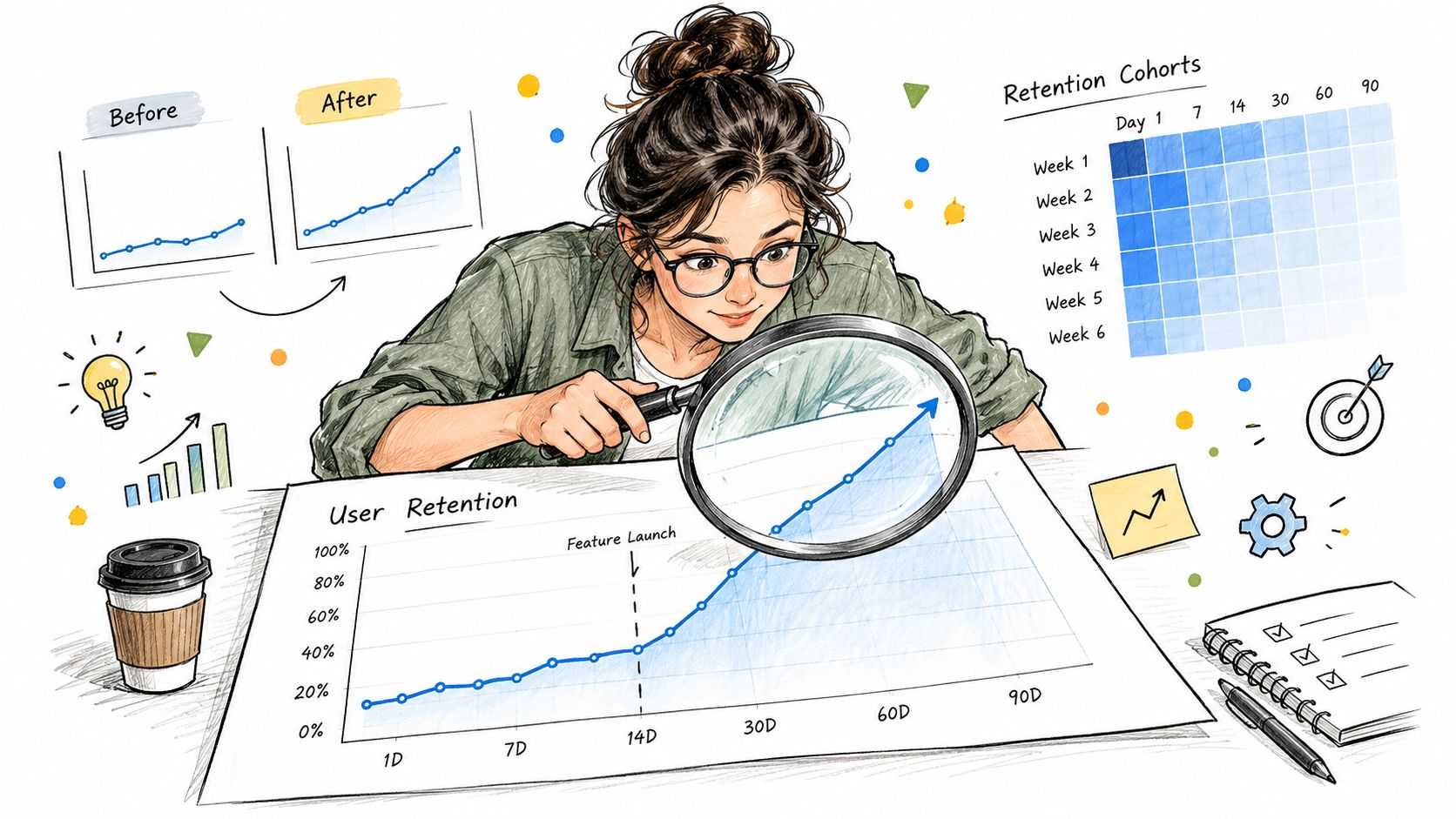
A stronger investigation begins with a defined estimand: the change in 7-day retention attributable to being offered Feature X among eligible new users during the launch window. The analyst then checks event completeness, removes or labels ineligible users, defines the cohort start, and documents whether concurrent onboarding changes could affect the outcome.
The workflow might look like this:
- Prepare the data: Validate user identifiers, timestamps, eligibility, exposure status, retention outcome, acquisition source, plan, and prior activity.
- Explore the cohorts: Compare retention by launch period and important user segments. Inspect missingness and unusual observations.
- Estimate the effect: If assignment was randomized, compare treatment and control using an appropriate model. If not, treat the result as observational and adjust for measured confounders with clear caveats.
- Quantify uncertainty: Report the effect size and confidence interval, not only a p-value. Check whether the conclusion changes under alternative definitions.
- Interpret carefully: Separate evidence that Feature X caused a change from evidence that adoption correlates with retention.
An Analysis Page should preserve the question, estimand, data preparation, code, charts, statistical test, assumptions, sensitivity checks, and limitations. A stakeholder can read the narrative, while an analyst can inspect the exact Python used to produce every result. For a broader guide to A/B test analysis, the same principles apply: define the comparison before looking for a winning outcome.
The final recommendation might be to expand the feature, revise onboarding, run a better experiment, or withhold judgment. “No causal conclusion yet” is a valid product decision when the design cannot support one.
Why More Analytics Can Worsen Decisions
More data can improve a decision, but only when the team has a clear question and a process for evaluating evidence. Otherwise, dashboards encourage metric myopia. Teams optimize the measures that are easiest to display while losing sight of customer value, product quality, or long-term consequences.
Reproducibility research offers a warning beyond product management. A Nature review distinguishes reproducibility, whether the original methods, data, and code support a claim, from replication, whether a similar effect appears in another population or model. In one large replication effort summarized by the review, only 39% of 100 independently performed replications were judged successful, and average effects were approximately half the size of the originals. A broader pool of 212 replications produced a higher success estimate of 64%, but replicated effect sizes were still 32% smaller. The Nature review on reproducibility and replication shows why a compelling result needs more than a polished chart.
Product teams face analogous risks:
- Confirmation bias: Analysts search until a preferred narrative appears.
- Metric shopping: Teams choose the outcome that moved favorably after launch.
- Unplanned subgrouping: Repeatedly slicing data creates opportunities for chance findings.
- Selective reporting: Unsuccessful tests disappear from the decision record.
- Method drift: Definitions change after results are known.
The remedy is governance, not less curiosity. Prespecify the primary question, retain exploratory findings separately, document deviations, and run sensitivity analyses when assumptions are uncertain. A trustworthy workflow may produce a less exciting conclusion, but it gives the team a result it can defend.
Building Your Analytics Practice
Product manager analytics improves when the team treats it as a practice rather than a software purchase. Start with five maturity checks: data quality, metric clarity, evidence integration, reproducibility, and cross-functional communication.
For data quality, create an event dictionary and test critical journeys. For metric clarity, assign owners and document primary metrics, leading indicators, counter-metrics, and decision thresholds. For evidence integration, connect customer language to behavioral hypotheses instead of storing interviews and event data in separate systems. For reproducibility, preserve code, transformations, assumptions, and outputs. For communication, write decisions in terms of evidence, uncertainty, and the next action.
A small team doesn't need a perfect stack. It needs a repeatable loop:
- Define the decision and the outcome.
- Check whether the data can answer the question.
- Combine behavioral and customer evidence.
- State what the analysis can and cannot establish.
- Save the work so another person can audit it.
PlotStudio AI is one option for teams that need a research-oriented workflow. Users can upload data, provide an objective, review a plan, run multi-step analysis with local Python execution, inspect charts and statistics, and save the result as a reproducible Analysis Page. It can complement existing product analytics systems, but it doesn't replace product judgment, measurement governance, or causal design.
The standard to aim for is simple: ask better questions, define success before launch, and preserve enough evidence for someone else to challenge the conclusion constructively.
If you're building a more auditable product analytics workflow, try PlotStudio AI with discounted researcher pricing and 1,000 free credits for researchers while the offer is active.